
Visitors were arriving.
Few were converting.
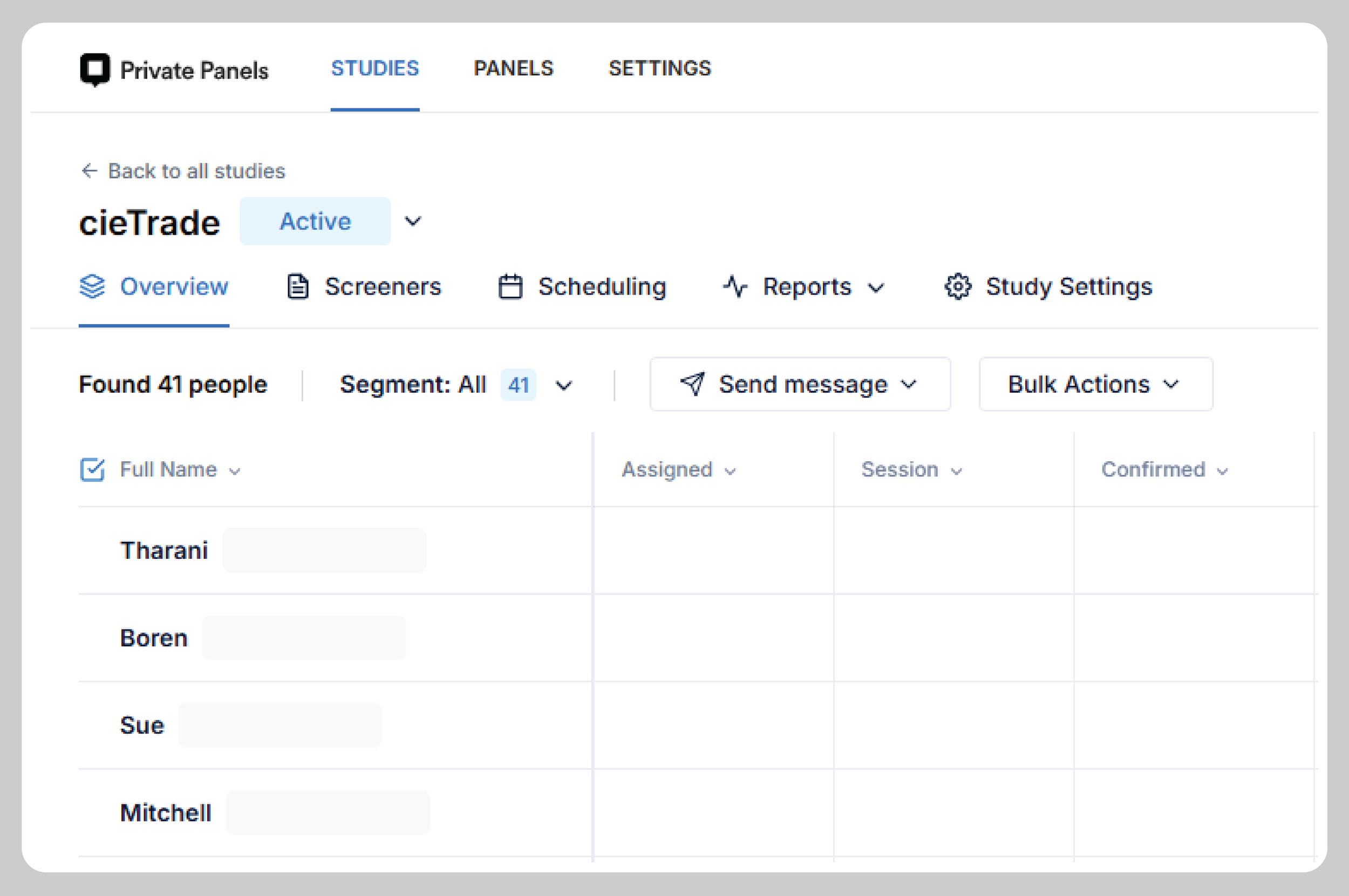
A usability study for cieTrade, a maker of enterprise software for recyclers and commodity traders
Client: cieTrade.com, through Pratt Center for Digital Experiences
My Role: UX Researcher & Moderator
Methods: Moderated Usability Testing Sessions & Task Questionnaires
Tools: Figma, Private Panels & Google Analytics
Duration: 8 weeks (2026)
01. SITUATION
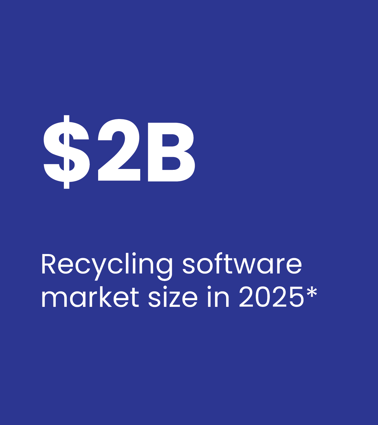
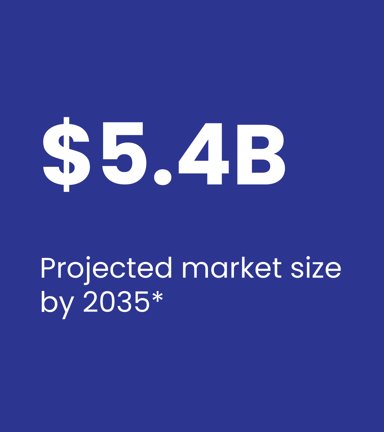
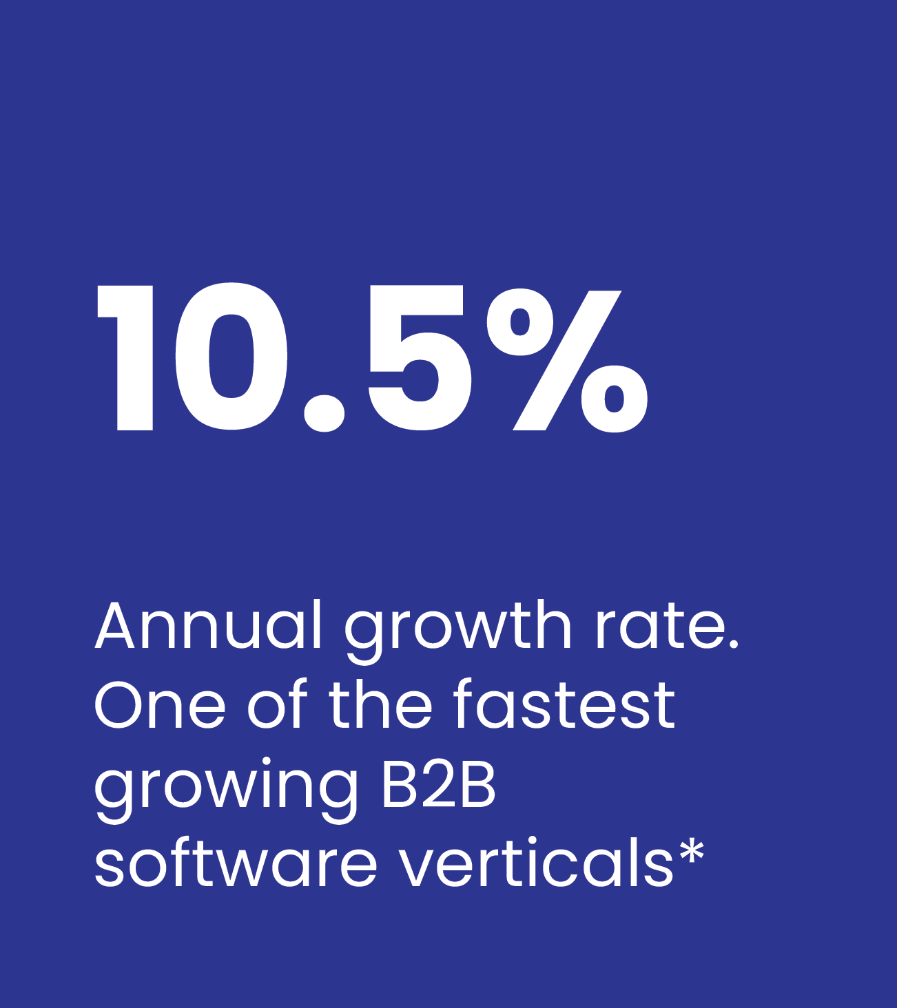
Recycling software is a $5B+ market. cieTrade has the product but the website wasn't converting
cieTrade builds enterprise software for companies that buy, sell, and process recyclable commodities: paper, plastic, scrap metal.
cieTrade’s sector is growing at 10.5% CAGR with no dominant leader. Their platform handles the full back-office operation: inventory, trading, logistics, and billing in one place. Their customers are typically small business owners who evaluate software carefully before committing.
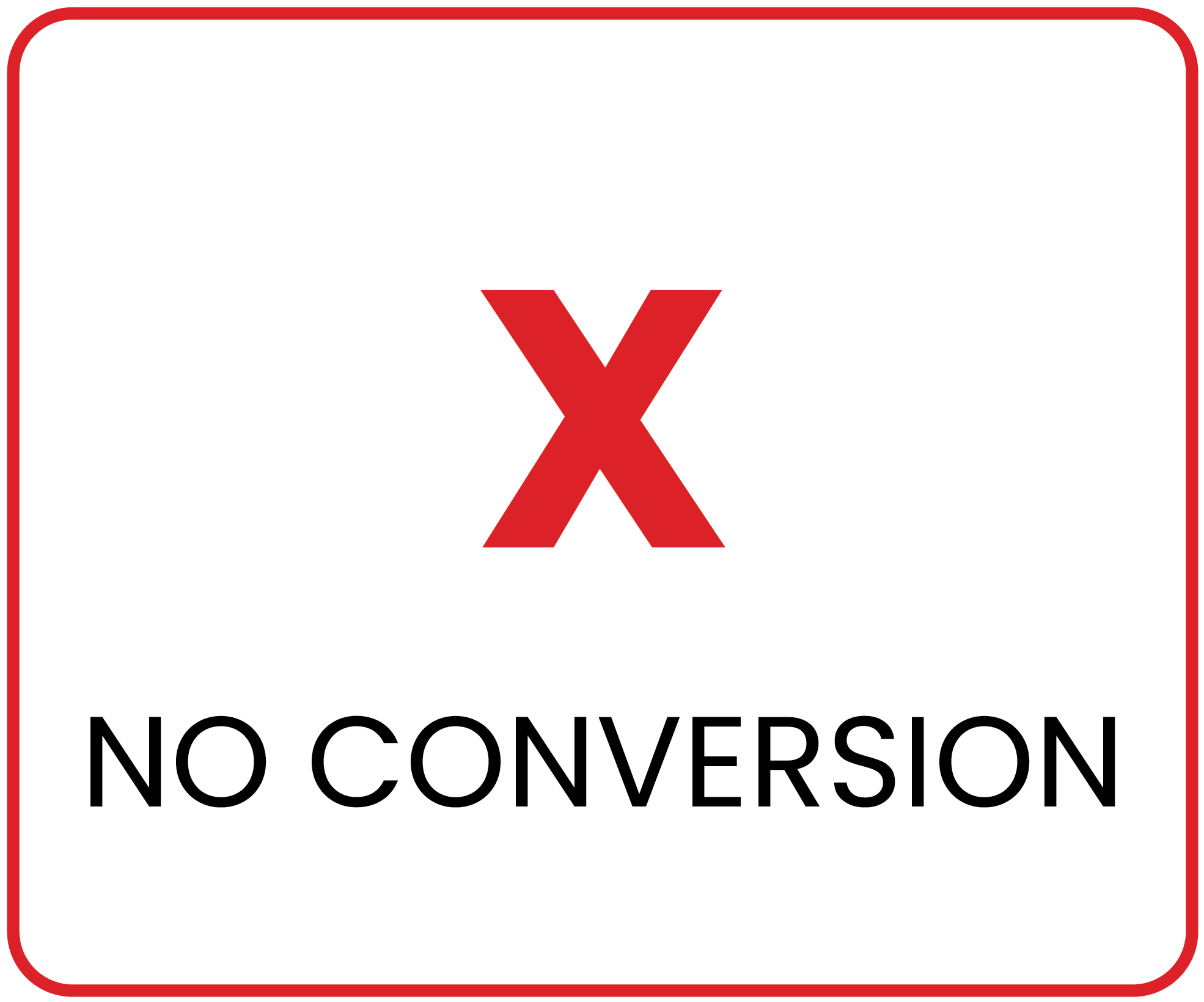
Problem: The two structured conversion flows weren't producing leads at the rate they should.
02. PROBLEM
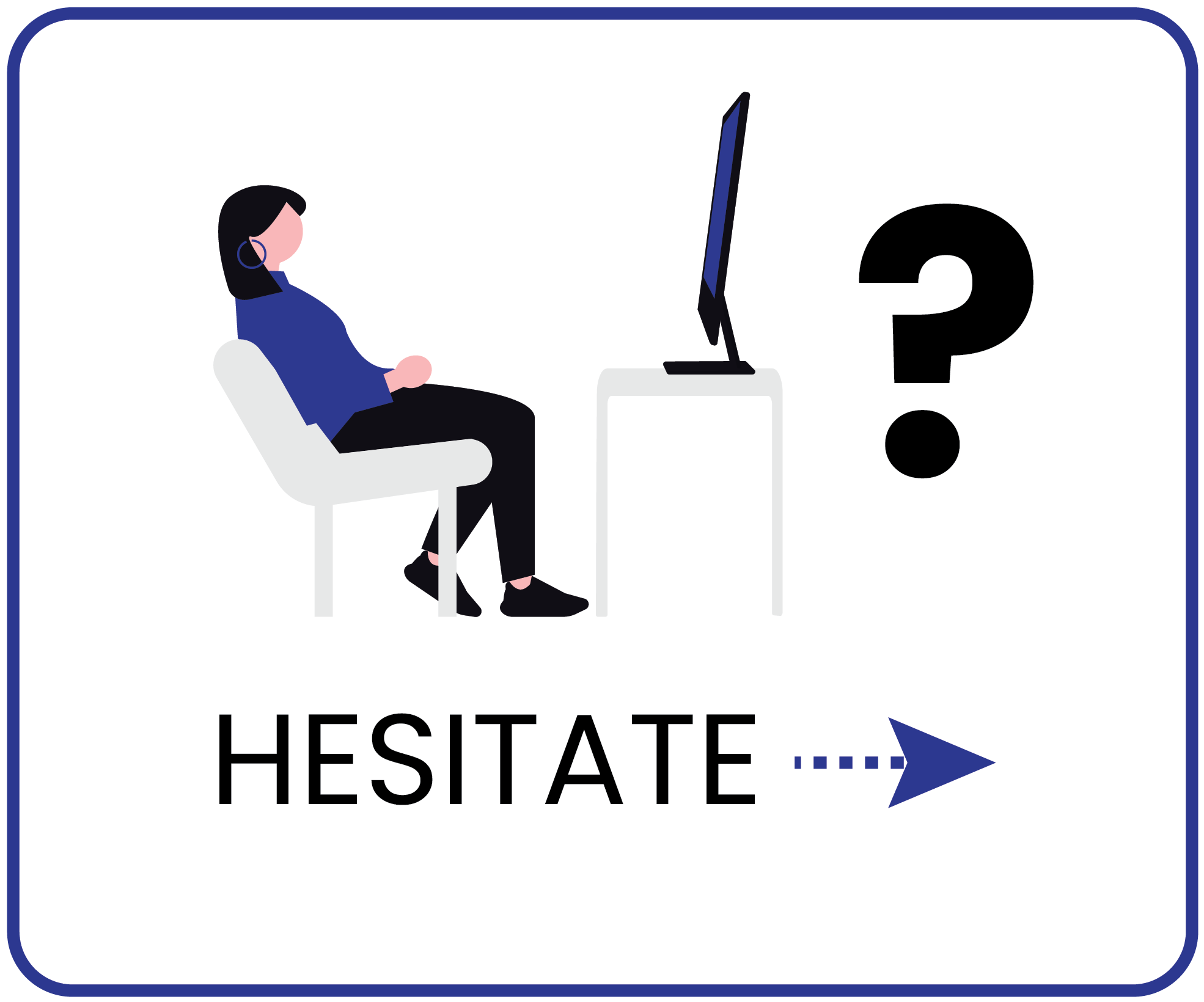
Analytics showed drop-off, but couldn't explain why
The two structured conversion flows, demo request and brochure download, weren't doing a good job producing leads. The CTAs were findable, but analytics showed that users stopped when they reached the forms, or before.
03. QUESTION
The research led to 3 core questions
How might we…


-
HMW...
Build trust with first-time visitors who know nothing about the brand?
-
HMW...
Remove friction from the brochure and demo flows without removing lead-capture value for cieTrade?
-
HMW...
Help visitors understand what cieTrade does in 18 seconds or less?
04. RESEARCH METHODOLOGY
To learn about cieTrade’s needs, we met with their marketing team
Our first step was a stakeholder kickoff with the cieTrade team to align on goals before we started planning our study. The cieTrade team told us they had four key issues they wanted us to look into:
We designed a study to watch real people make real decisions
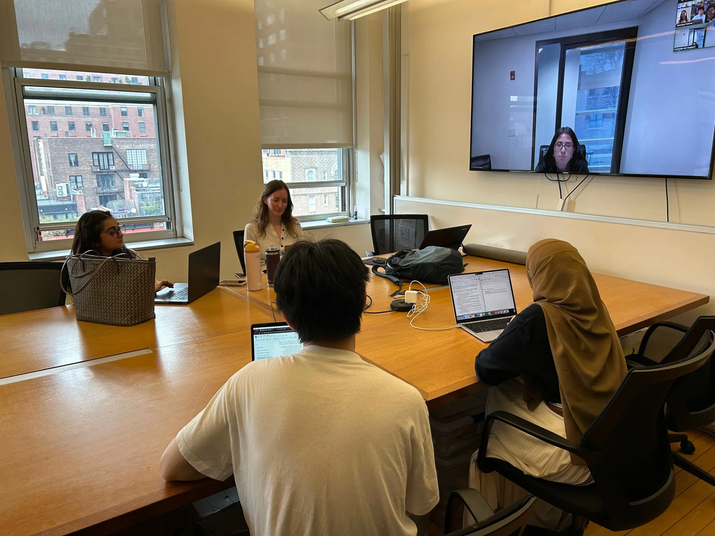
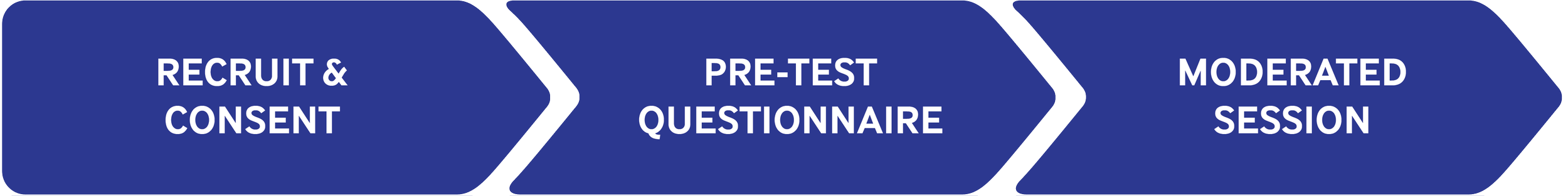
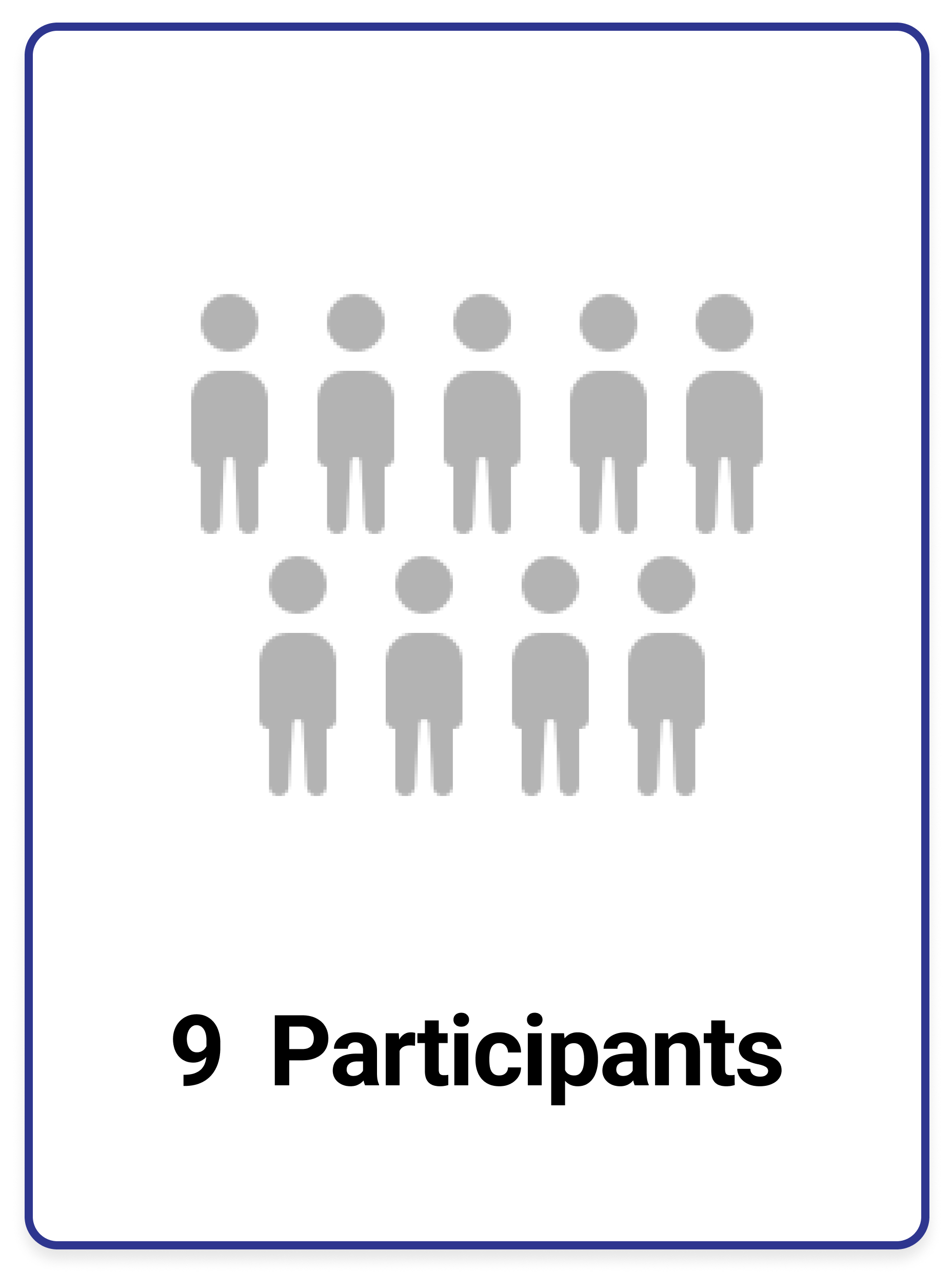
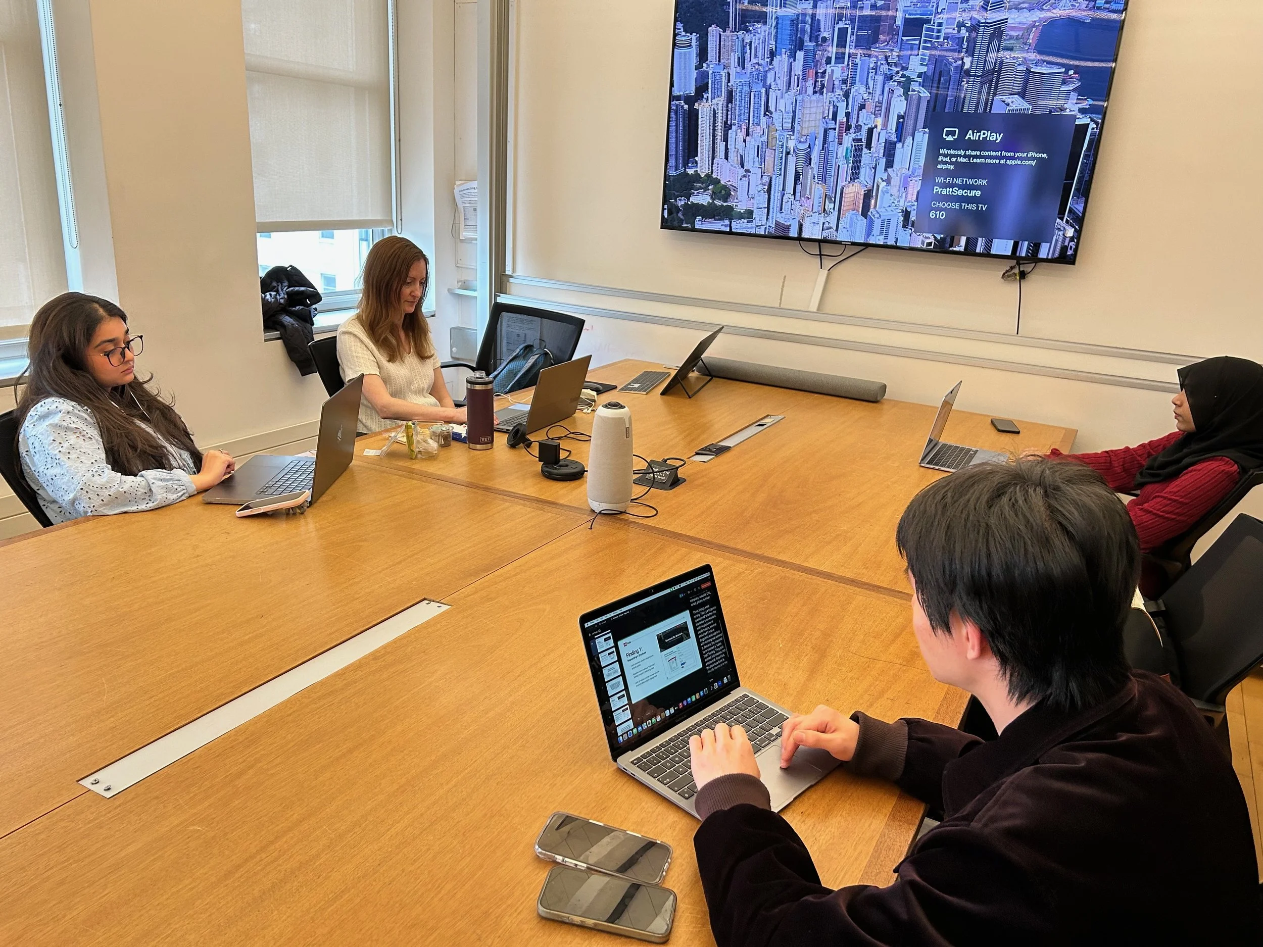
Next we planned out our usability study around our stakeholder’s needs. The study included nine participants who completed four tasks during moderated usability testing sessions. Sessions were moderated on Zoom, with pre- and post-task questionnaires. We conducted two pilot test sessions to see how long an average test would take and to make sure our tasks were the right tasks before the official sessions began.
How we ran the study

Private Panels: We used Private Panels to build and distribute a screener questionnaire, which filtered out anyone who didn't meet our participant criteria before they were invited to test. Three of our nine participants were recruited directly from the Private Panels user research database.
Industry Groups: We posted recruitment calls on social media in industry groups relevant to cieTrade's market, hoping to reach closer to cieTrade’s actual user base.
Personal Networks: We also recruited from our personal networks, focusing on individuals with relevant experience.
All participants signed consent forms before testing and were compensated for their time.

Building the right participant pool
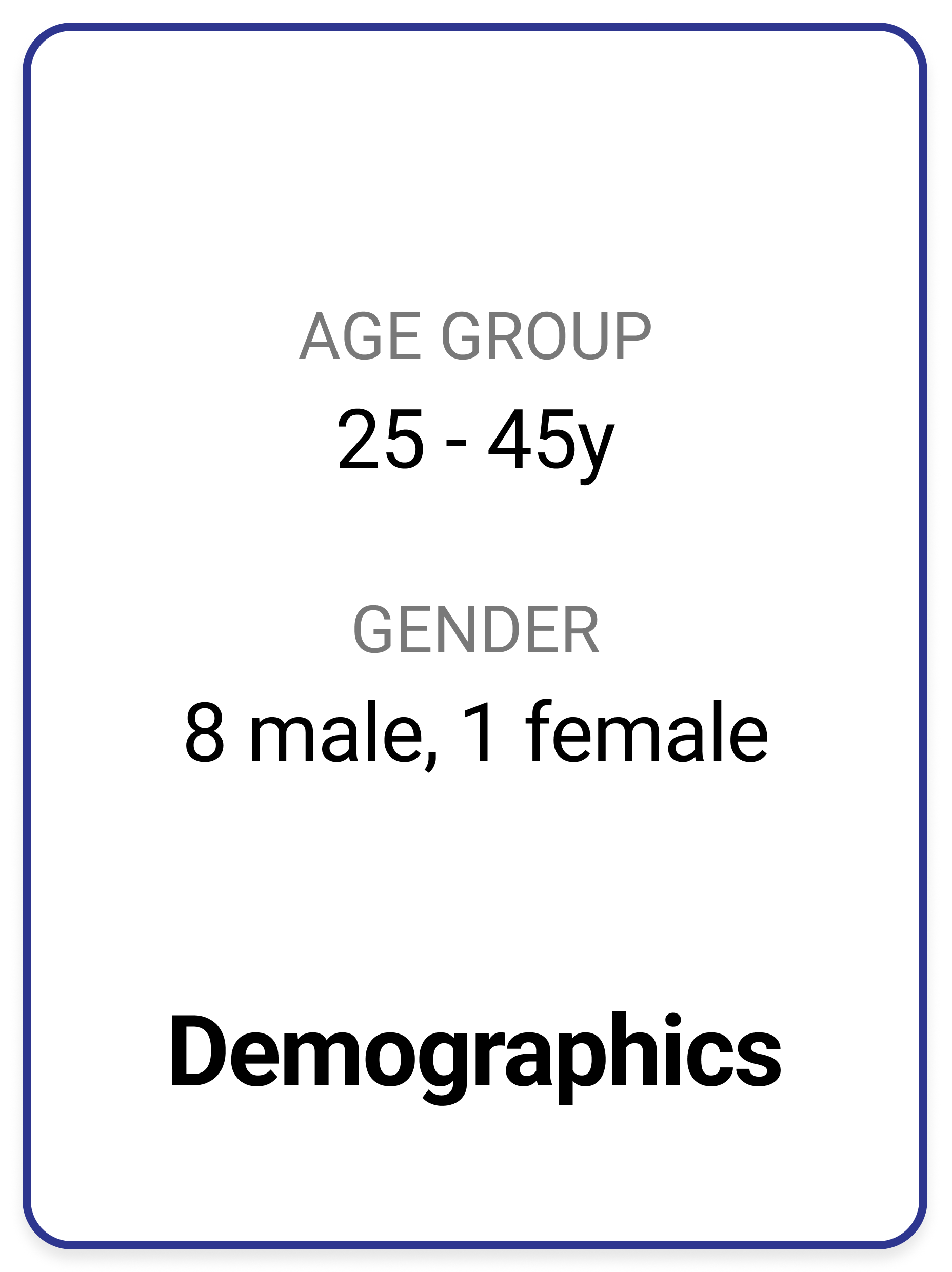
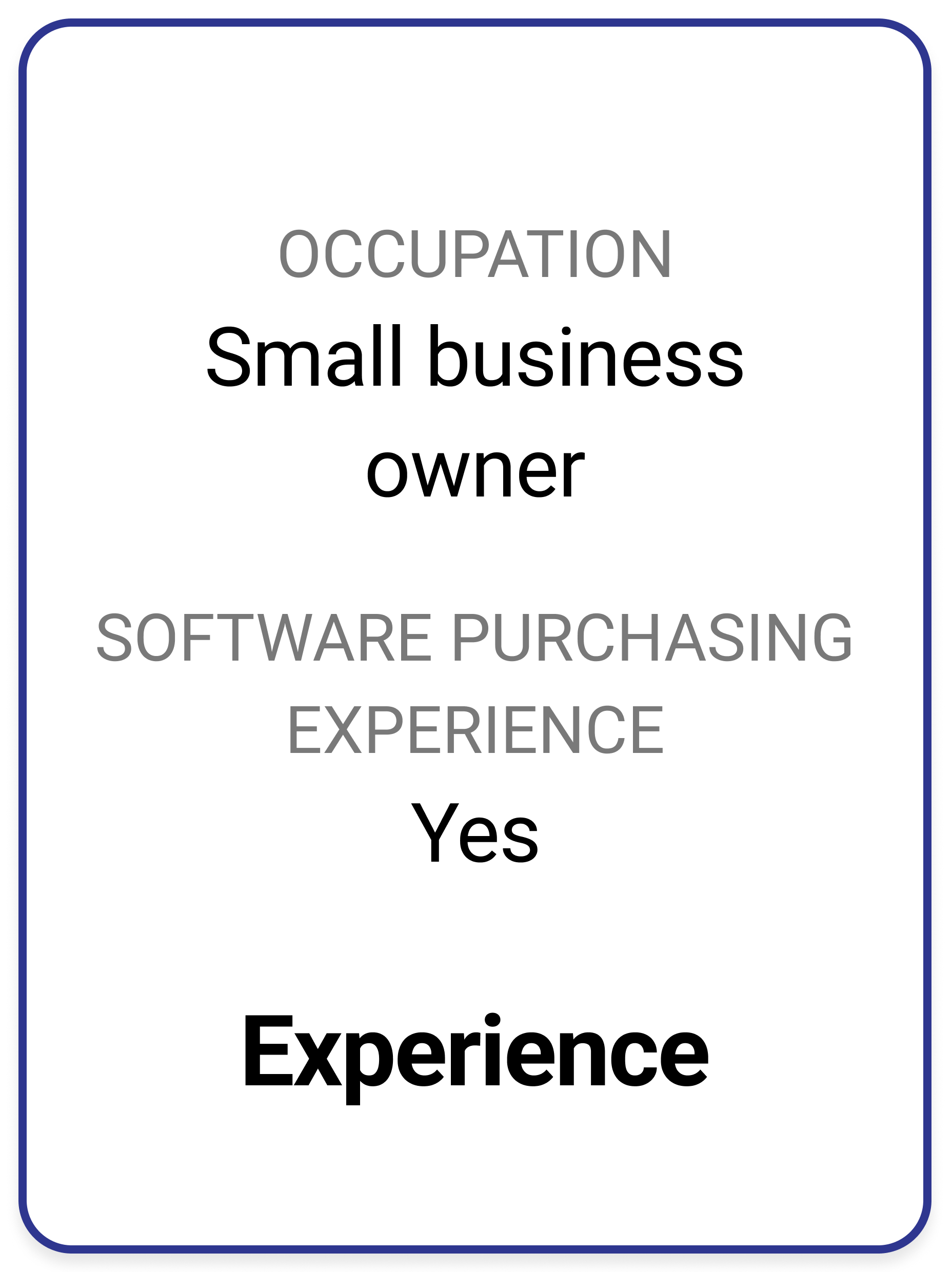
Recruiting directly from cieTrade's core industries proved difficult within our timeline. We pivoted to small business owners who had previously researched or purchased software for their business. While not an exact match for cieTrade's target user, this profile shared the key behaviors we needed to observe: evaluating unfamiliar B2B software, weighing trust signals, and making considered purchasing decisions.
We recruited small business owners with software purchasing experience
Four tasks that reflect how a real buyer actually evaluates software
All participants were given the below scenario and each completed the four tasks below during the their testing session.
Scenario: A close friend of yours who owns a small plastics recycling company asked you to check out the website cieTrade.com. He trusts your opinion and wants your feedback. He is considering using cieTrade’s software at his company to track his inventory and to streamline his daily workflows.
-
Task 1: Evaluating the homepage
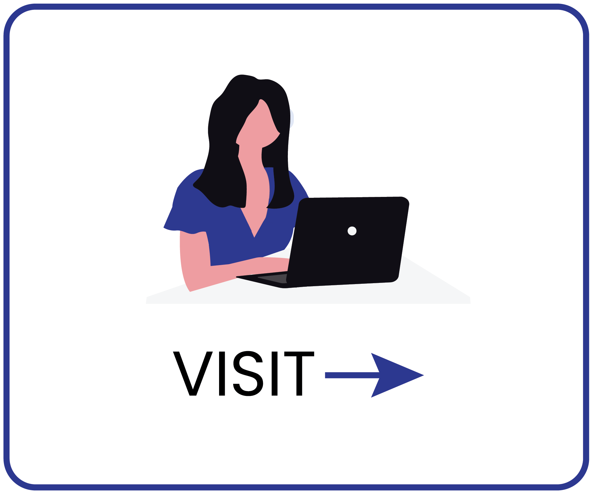
Visit cieTrade’s website. Take a few minutes to browse the homepage. Talk through what you see and what you’re thinking. What stands out to you? What feels useful or confusing? -
Task 2: Evaluating content
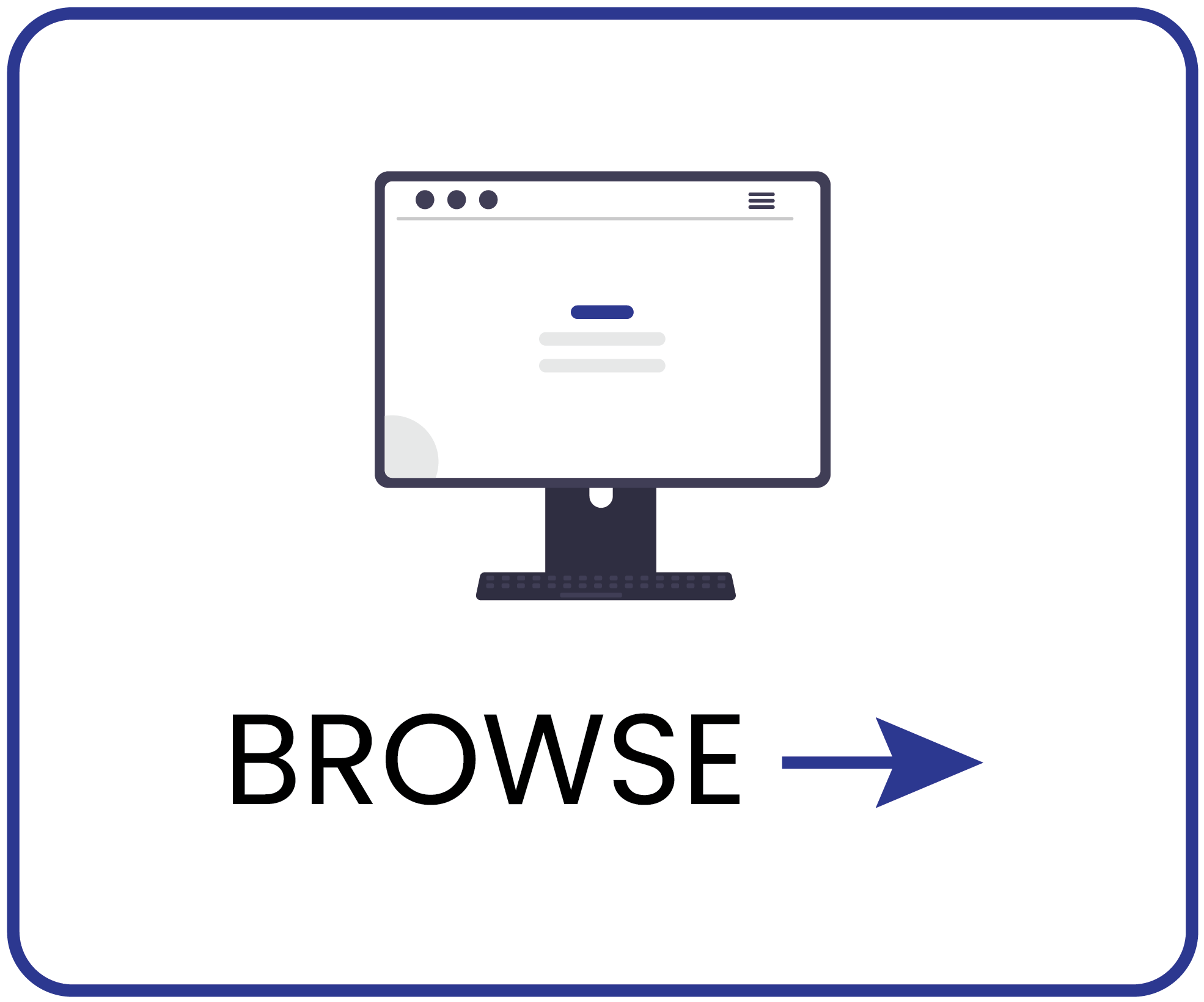
Since your friend’s company is a plastics recycling company, please go to the top menu bar and under the Industries menu, and select “Plastics Recycling”. Take a few minutes to review this page.What were your impressions of this page?
-
Task 3: Brochure download flow
Your friend is still in the early stages of researching his options and isn't ready to speak with anyone from cieTrade yet. He just wants something he can read through on his own time to learn more about what the software offers. Find a way on the website to get him that information. -
Task 4: Demo request flow
Your friend has already read through the information he found earlier and now wants to go a step further and see the software in action before making any decisions. Find a way on the website to make that happen.
05. FINDINGS SUMMARY
Navigation wasn't the problem. Trust and clarity were
The site was easy to use. But ease of use wasn't the problem. The result was a site professional enough to browse, but not compelling enough to act on.

What didn't work:
Users left with vague, sometimes inaccurate ideas of what cieTrade actually sells
Most could say "software for recycling" but couldn't describe what it does, who it's for, or why it's worth a demo
The site oriented visitors without fully informing them, and informed them without convincing them
Trust was never established at the moments that mattered most: the hero section, the brochure flow, and the demo form

What worked:
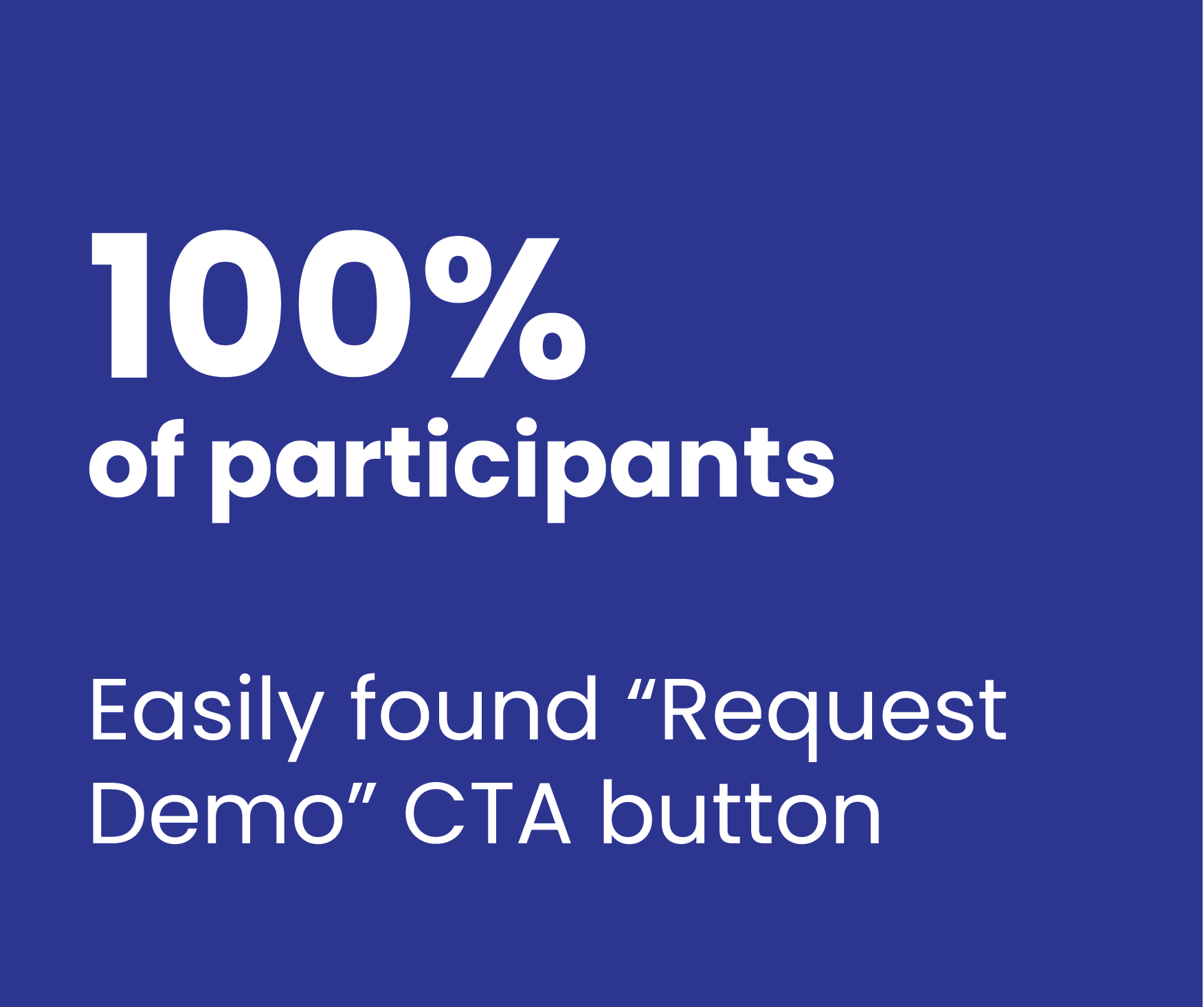
Navigation was clear and intuitive
The "Request a Demo" CTA was easy to find
Customer stories were abundant
Four friction points THAT were costing conversions
Analysis of the data gathered from the testing sessions revealed four top insights that help to explain why cieTrade wasn’t converting at the desired numbers:
-
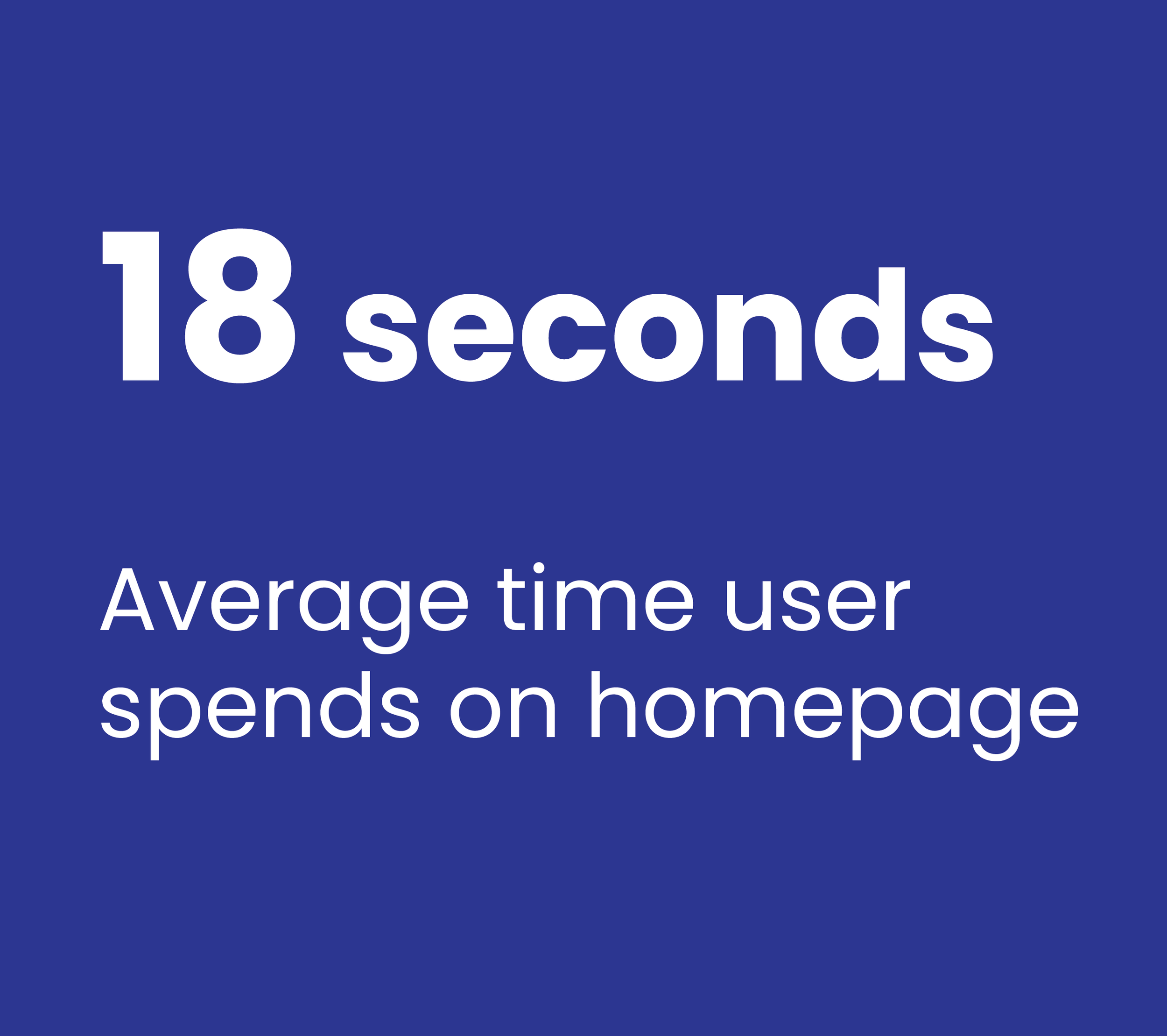
Homepage fails to engage
An awkward hero section with no sub-headline, CTA, or trust signals causes visitors bounced before understanding the product. Average homepage visit is just 18 seconds.
-
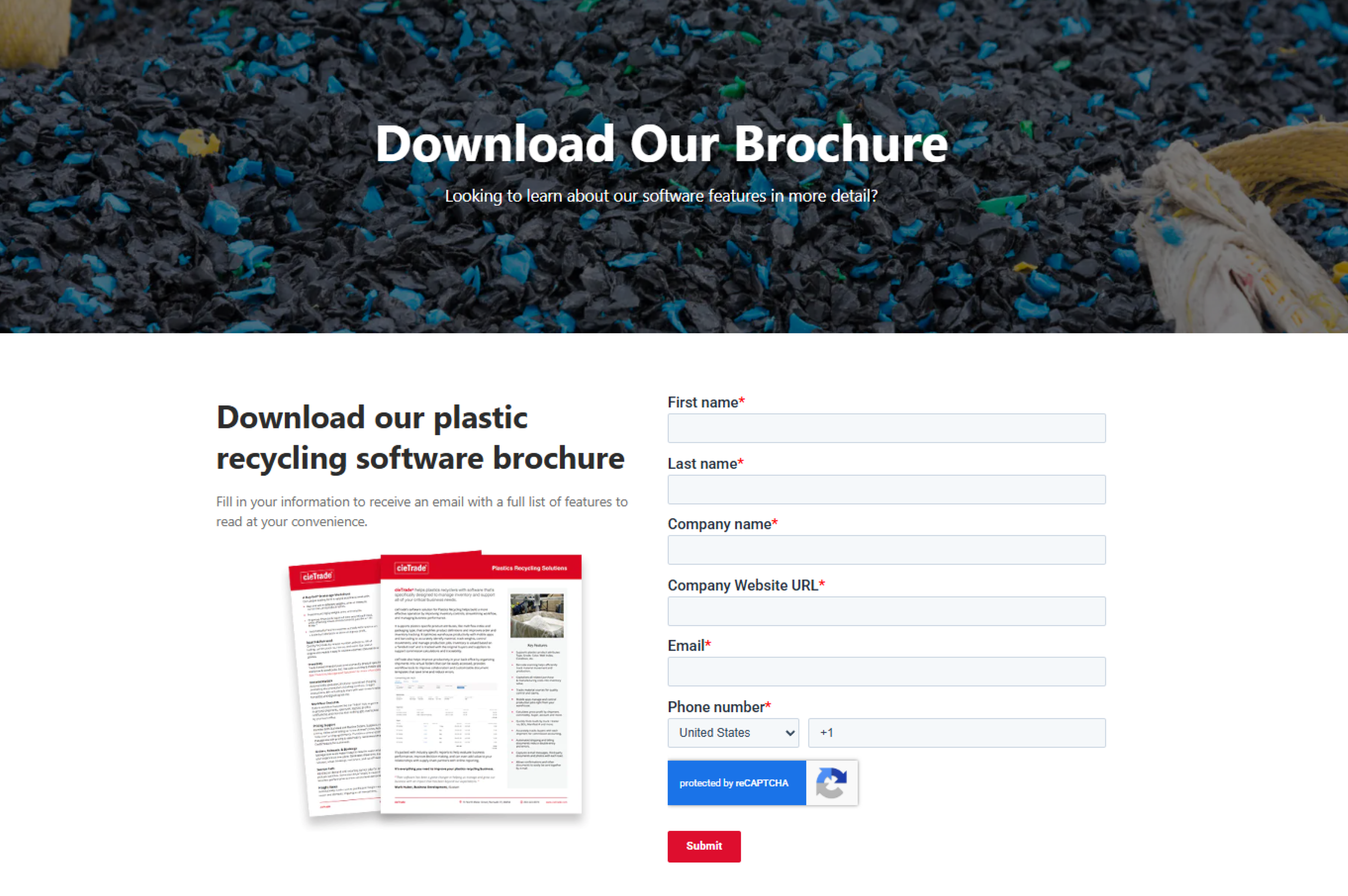
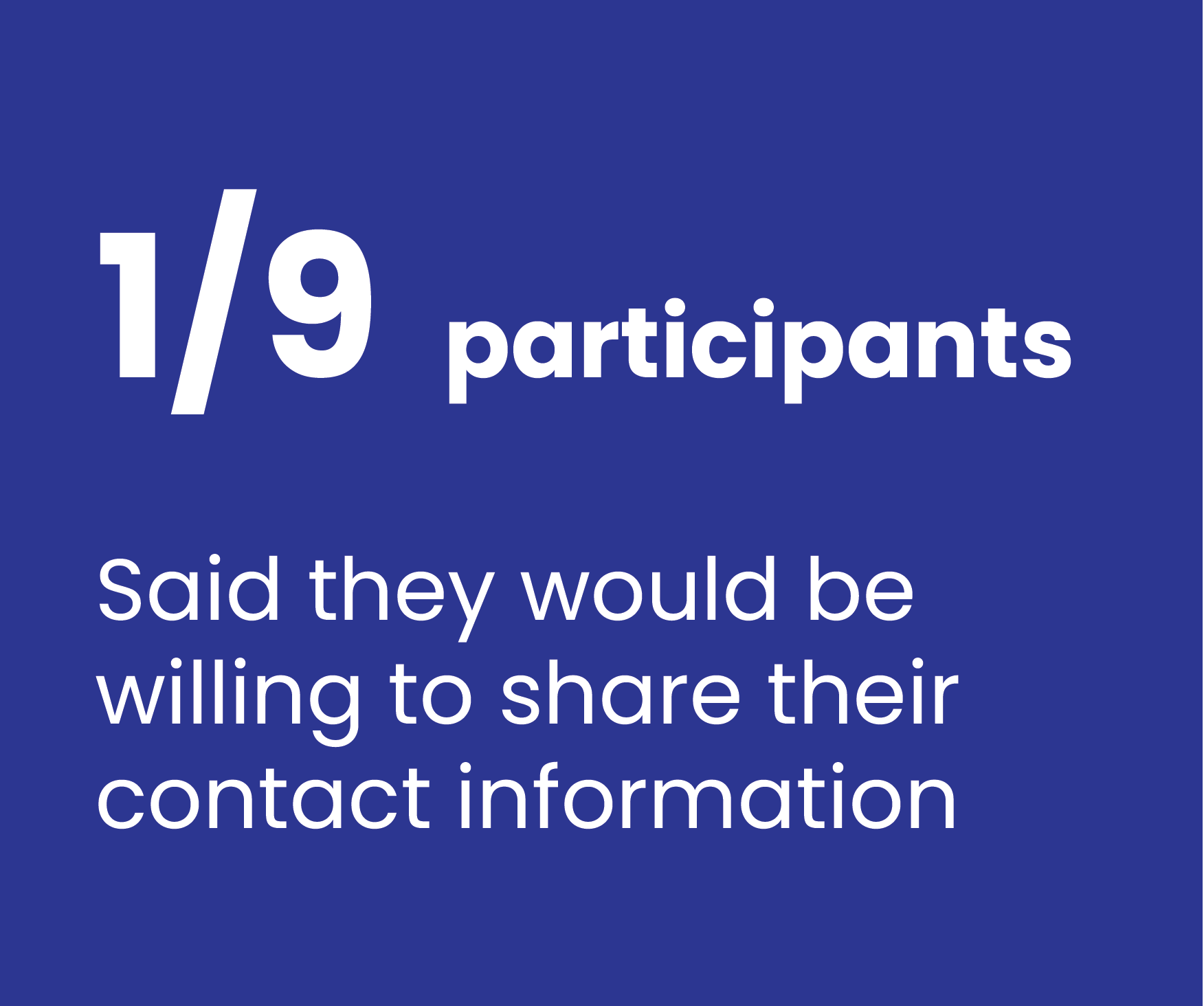
Brochure form felt like a sales trap
The mandatory full contact form caused users to question whether the brochure actually existed. And after sharing their info, users could not actually download the form.
-
Demo form asked for info before earning trust
No context for what happens after submitting. No timing, no personalization. Trust hadn’t been established so users didn’t want to share their contact info.
-
Videos sent users off-site
"Watch Video" links opened YouTube in the same tab. Users left the site entirely at the moment of peak engagement, unlikely to return.

06. RECOMMENDATIONS
The users showed us what needed to change
Each of the five recommendations below came directly from what we observed during testing, moments where users hesitated, expressed doubt, felt frustrated, or abandoned a task.
Recommendation · Brochure Flow
01. The Brochure Experience Erodes Trust Instead of Building It
Users questioned whether the cieTrade brochure even existed after being asked to share their full contact info on a mandatory, generic form that felt more like a “sales trap” than a way to learn about the software.
Even after a user shares their contact info, they still are not able to download the brochure, and instead must wait for cieTrade to contact them.
This destroyed trust and discouraged engagement, while preventing users from actually learning more about cieTrade’s product.
"I’m not sure there even is a brochure.”
— Participant, during brochure task
Recommendations
Reduce friction and prove the value upfront:
Remove required form and allow users to instantly download the full brochure
Rewrite all headlines and copy to tell a more compelling story
Add dropdowns with helpful information about the software
Make the brochure thumbnails visual the primary anchor, not the form
Increase size of thumbnail preview of the brochure to show what they will get
Add a prominent instant download CTA
Alternative approaches
If it’s important to capture contact information from users, consider one of the following approaches:
Gate behind email only. Reduce friction while still capturing a lead
If it’s not possible to share brochures without vetting the user, remove brochure option entirely and direct all lead capture energy on the Request Demo CTA
Before
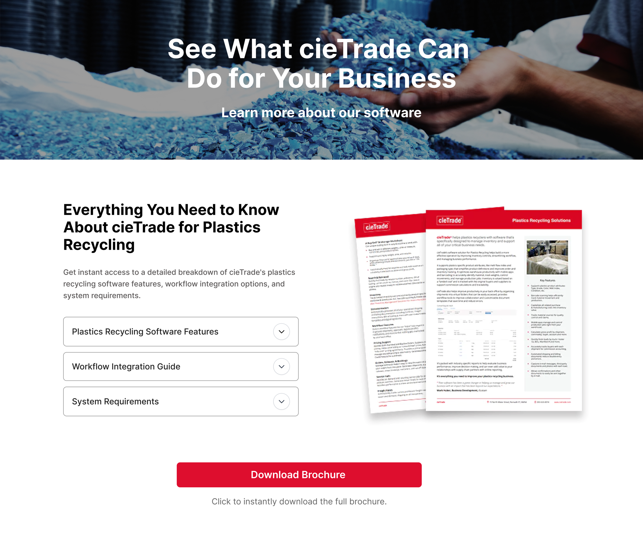
After recommendation
Recommendation · Demo Request Flow
02. The demo form left users in the dark about what they were agreeing to.
The demo CTA was findable and easy to click. But after clicking, users landed on a generic form with no context: no indication of what the demo includes, who they'd speak with, or what happens after submission. Without that context, confidence dropped and users were hesitant to share their info.
Recommendations
Make the demo feel like a conversation, not a contact form:
Add "What to expect from your demo."
Bullet what they'll see and who they'll speak with
Include an industry selector so the demo feels like it will be tailored to their specific needs
Integrate direct calendar booking. Remove the ambiguous "we'll be in touch"
Add a photo and name of the sales expert they might meet with
"If I filled this out, I’d just get a bunch of sales calls. I’d probably just end here.”
— Participant, after arriving at the Request Demo form
"It doesn't ask for the industry. I think that would be better. I know I'll be given something specific to my business.”
— Participant, during Demo Request task
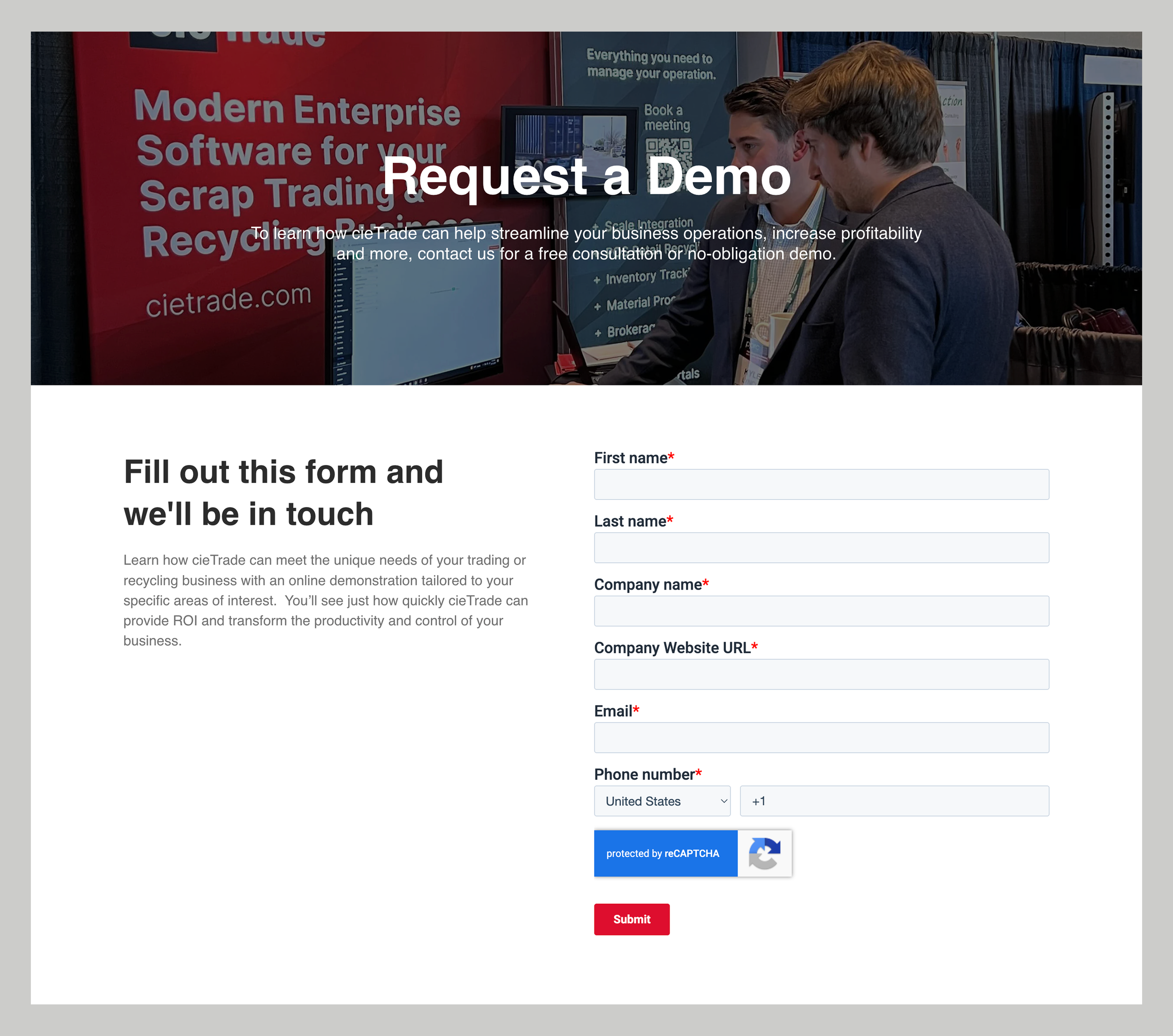
Before
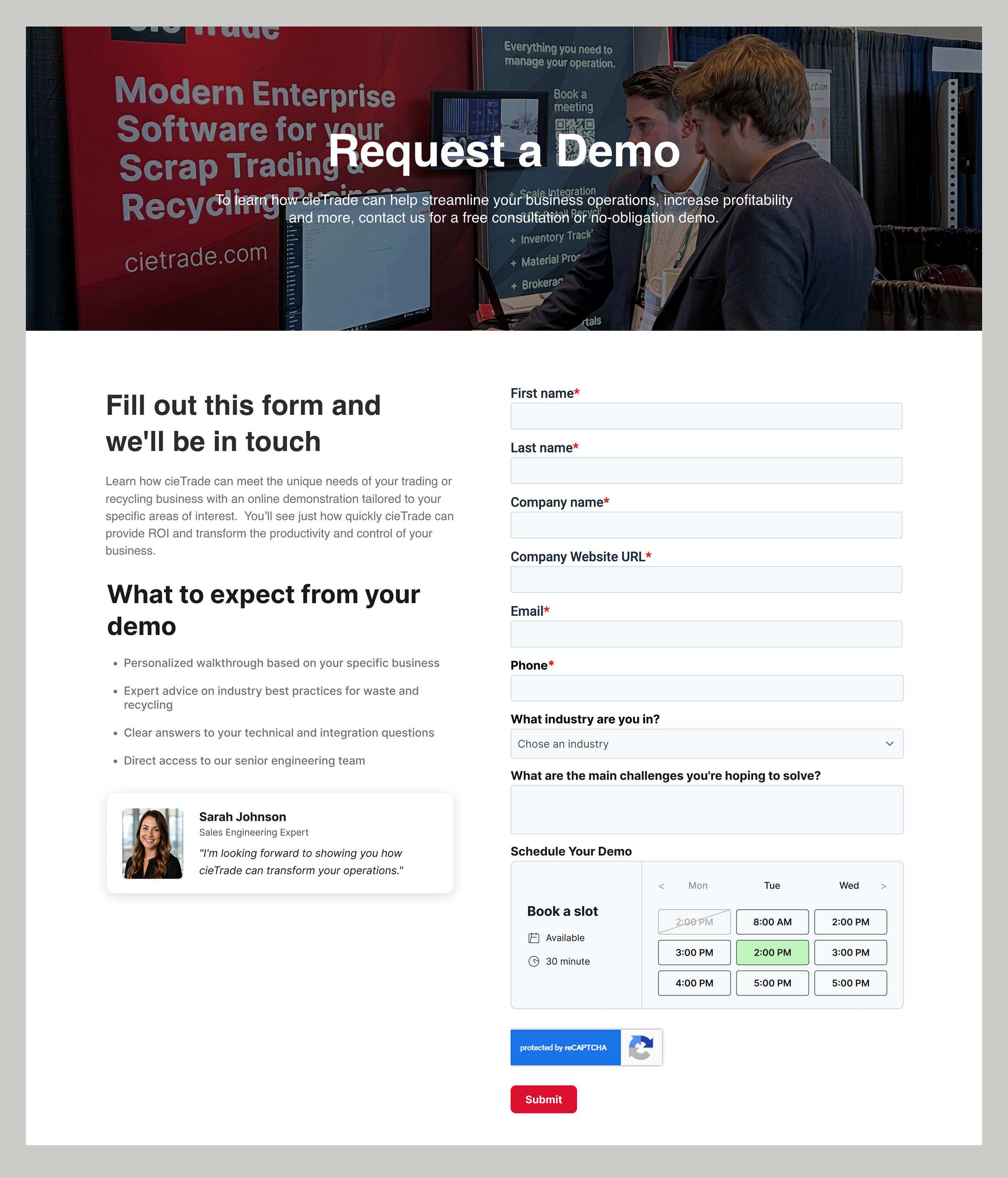
After recommendation
Recommendation · Homepage Hero
03. The homepage wasn’t communicating value or hooking customers
The hero headline didn't build trust, differentiate cieTrade, or explain its specific value. The headline was squeezed into the top of the screen, there was no sub-headline, no CTA in the hero, no client logos to build trust, and no human presence. Multiple participants finished their homepage task still unsure what cieTrade’s product actually did. In B2B, that uncertainty will kill conversion.
“The more I read the better I understand who some of the customers are, though I still don’t really know what the product does.”
— Participant, after scrolling through the homepage
Recommendations
Focus on the hero to hook visitors in the first scroll
Replace hero image with people-centered, authentic photography showing the software in use
Rewrite headline to be specific. Add a descriptive sub-headline explaining the core value proposition
Add a "Request Demo" CTA directly inside the hero section
Display client logos immediately below the hero to establish credibility at first glance

Before
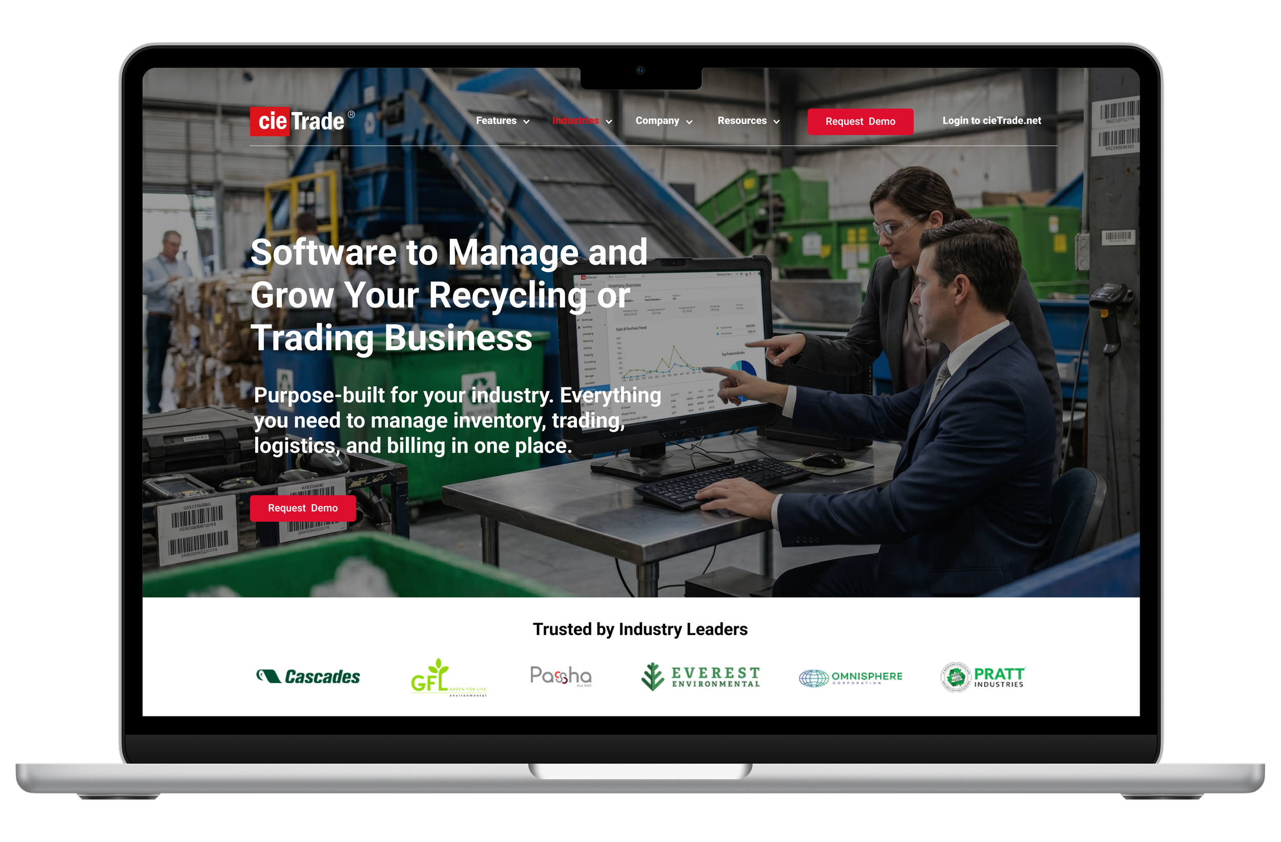
After recommendation
Recommendation · Video Content
04. Videos sent users to YouTube at the moment of peak engagement
Video buttons on the homepage and throughout the site navigate users to YouTube where the video opens externally, pulling users off the site at exactly the moment they were most curious. A short explainer video embedded on the homepage could answer "what does this product do?" in 60 seconds, doing the job the hero and text copy couldn't.
“How did I get to YouTube?”
— Participant, after clicking on a video link
Recommendations
Bring the product to life without leaving the site
Embed a short explainer video directly on the homepage using. Never link to an external platform
Video should show the software in action and put a human face on the company
Pair the embed with a brief headline, short description, and “Take a Look at the Features” CTA
Embed video content throughout the website. If videos must be hosted on YouTube, they should be embedded with iframe and should play directly on the cieTrade website
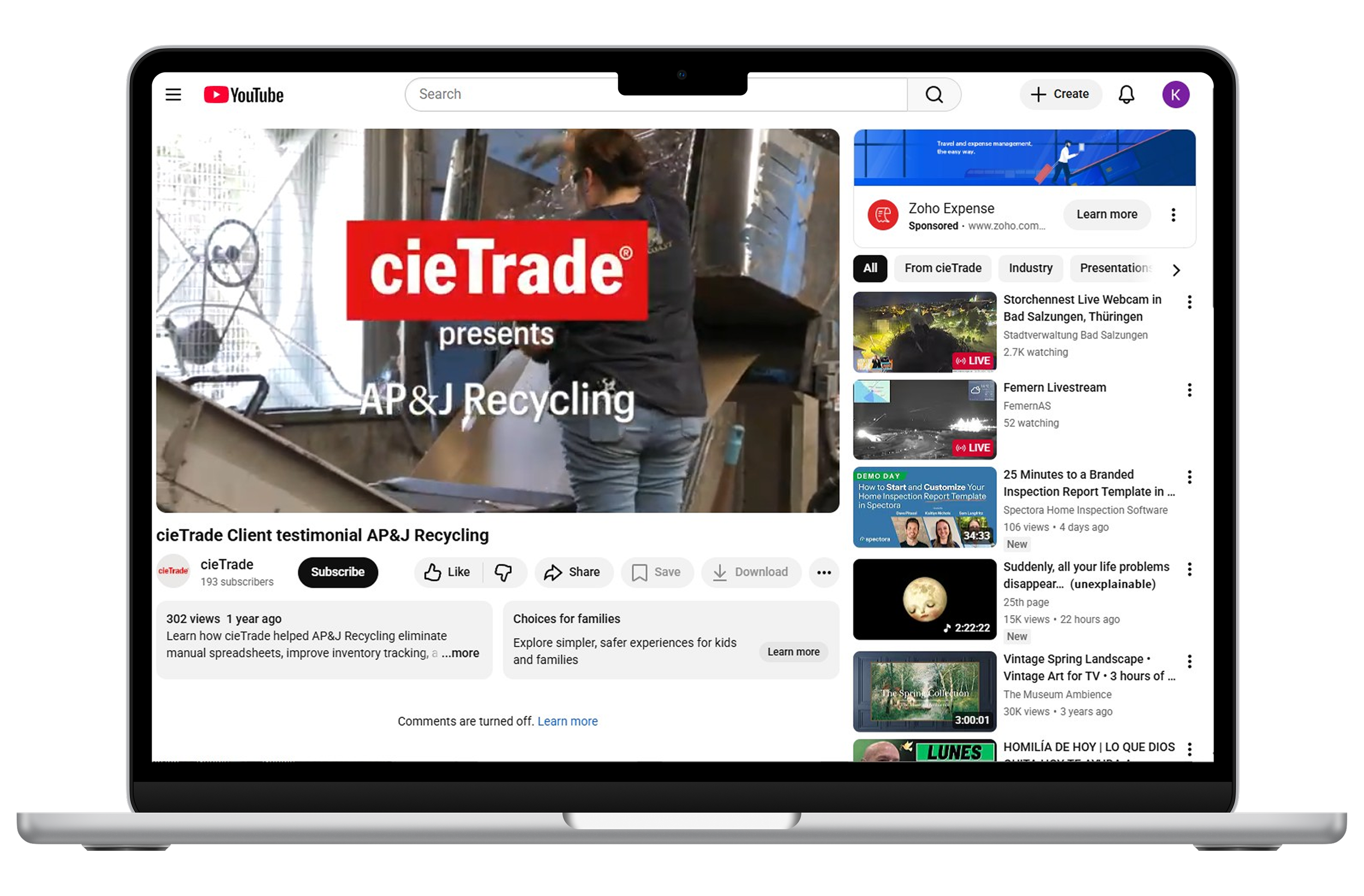
Before
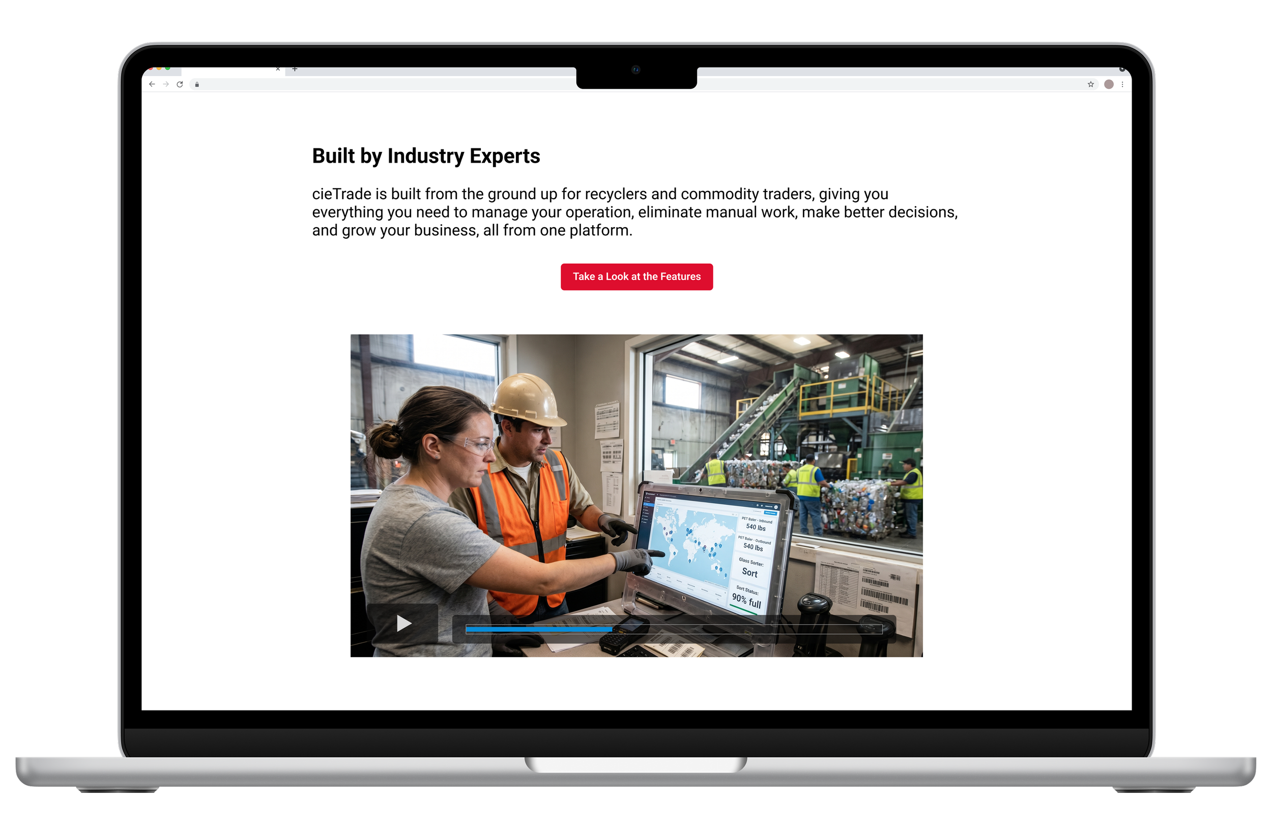
After recommendation
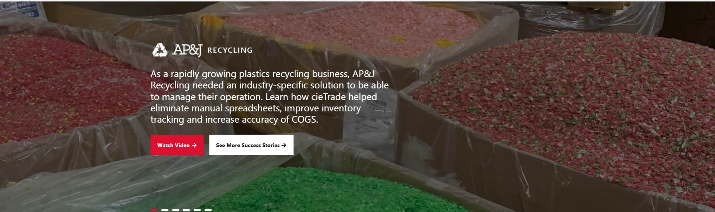
Recommendation · Homepage carousel
05. Valuable social proof that nobody ever saw
The homepage had real case studies from real clients showing real results and real social proof. But most participants never saw slide 2. Navigation dots were hard to see, slide text was too dense to scan, and the “See More Success Stories” CTA was broken and just scrolled to the top of the home page.
Recommendations
Make the carousel work as hard as the content inside it:
Auto-advance more quickly so passive viewers see more stories. Better yet, question whether a carousel is the right pattern. A group of static cards would surface the same content without requiring users to find it.
Replace invisible navigation indicators with visible, centered dot navigation
Show partial previews of adjacent slides to signal that more content exists
Shorten each slide to: client logo, two sentences (in larger text), and the CTA
Standardize every CTA to "Read Case Study." Consistent label, size, and placement across all slides
Delete the broken "See More Success Stories" link. Focus on one CTA only on each slide
Before
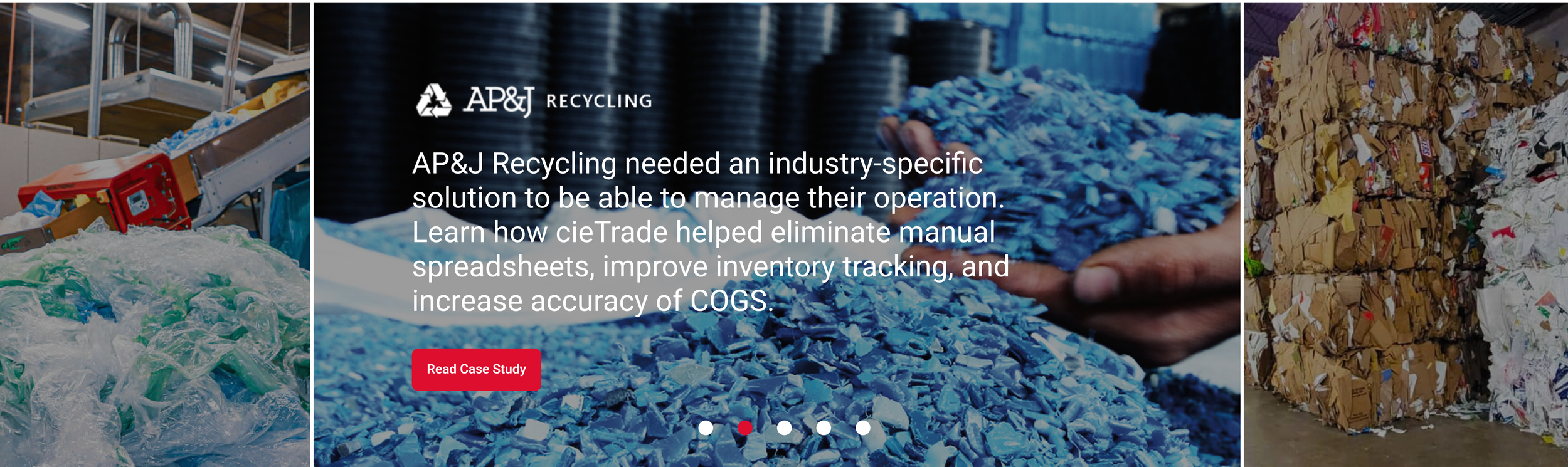
After recommendation
06. IMPACT
We delivered our findings to the cieTrade team in a stakeholder presentation
The study closed with a formal presentation to cieTrade stakeholders. Findings, before and after mockups, and prioritized recommendations were delivered via Zoom and in a written report.
The cieTrade team was receptive and asked clarifying questions about specific findings, particularly around the brochure flow and homepage recommendations.
Next step, implementation!
07. KEY TAKEAWAYS