AI-Powered Health Insights
CGM Wearable Data Visualization App Redesign
Solo Project
My Role: UX Designer & Researcher
Duration: 6 weeks (2025)
Tools: Figma, Illustrator
01. Project Overview
The Freestyle Libre 3 mobile app allows users to view real-time glucose data from their continuous glucose monitor (CGM), a medical wearable device. While the underlying technology is powerful, the app’s user experience wasn’t delivering. User feedback revealed that data visualizations were hard to understand and gain insights from—especially for users new to glucose monitoring. Also, the clinical, impersonal design, inadequate food logging process, and scattered navigation made the experience frustrating.
As a UX designer and researcher, I led a six-week redesign to improve clarity, usability, and emotional connection. I conducted user interviews, heuristic analysis, competitor benchmarking, and iterative prototyping. The result is a reimagined experience that empowers users to better understand their health data and take confident action.

02. The Challenge
-
The Problem
Many users find it difficult to interpret their glucose data and make informed health decisions using the Freestyle Libre 3 app. This leads to frustration, reduced engagement, and in some cases, abandonment of the app, ultimately impacting both individual health outcomes and product adoption.
-
How Might We...
…Make glucose data easier to understand for users of all experience levels?
…Help users accurately log meals and understand how food affects their glucose?
…Transform the app’s tone and interface into something modern, personalized, and emotionally engaging?
…Design a more intuitive structure that minimizes effort and confusion?
-
The Solution
If the app is redesigned to include clearer data interpretation, more intuitive logging features, and a more emotionally supportive design, users will gain greater understanding and confidence in managing their glucose levels. That will result in increased user satisfaction, trust, and engagement with the app, and will help users take real steps to improve their glucose management.
03. Research & Empathy
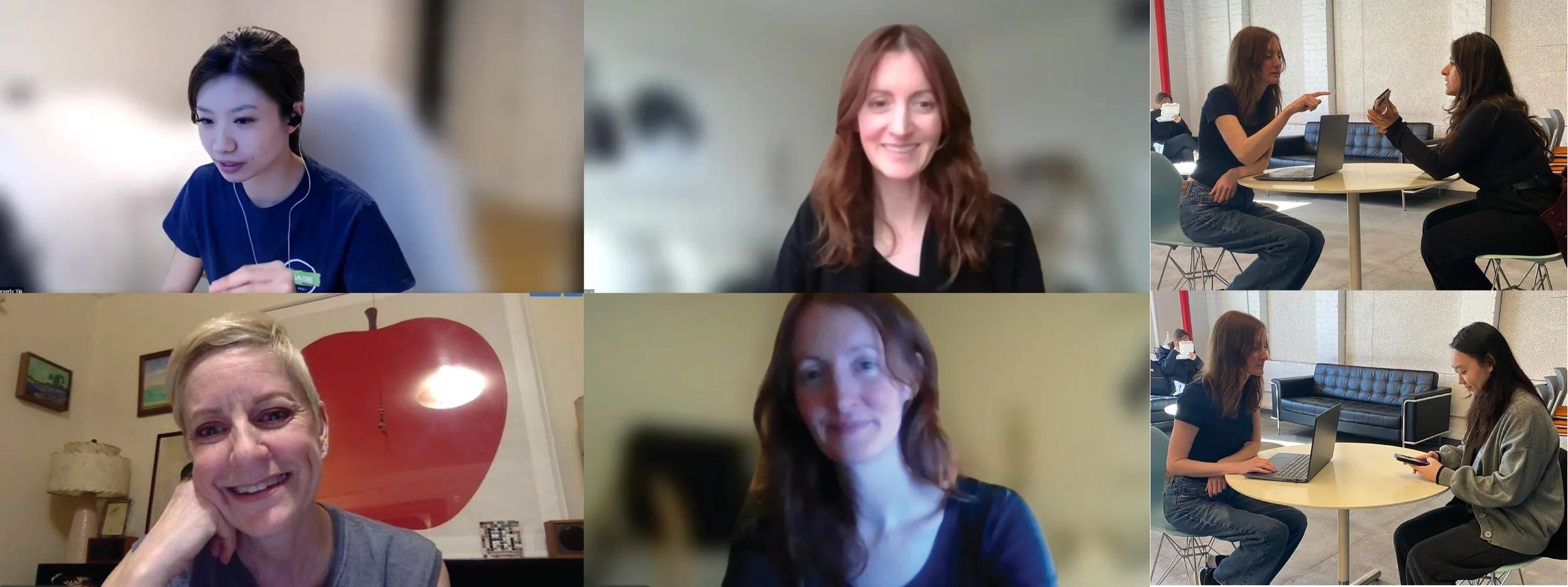
User Interviews
I interviewed 5 individuals aged 26–53, including people with Type 2 diabetes, PCOS, prediabetes, and health-conscious individuals using health wearables for fitness tracking. Experience levels ranged from complete beginners to seasoned CGM users.
Themes that emerged:
New users felt overwhelmed by the data.
Experienced users wanted more insights and better tools.
All users desired a more supportive, human interface.
Findings
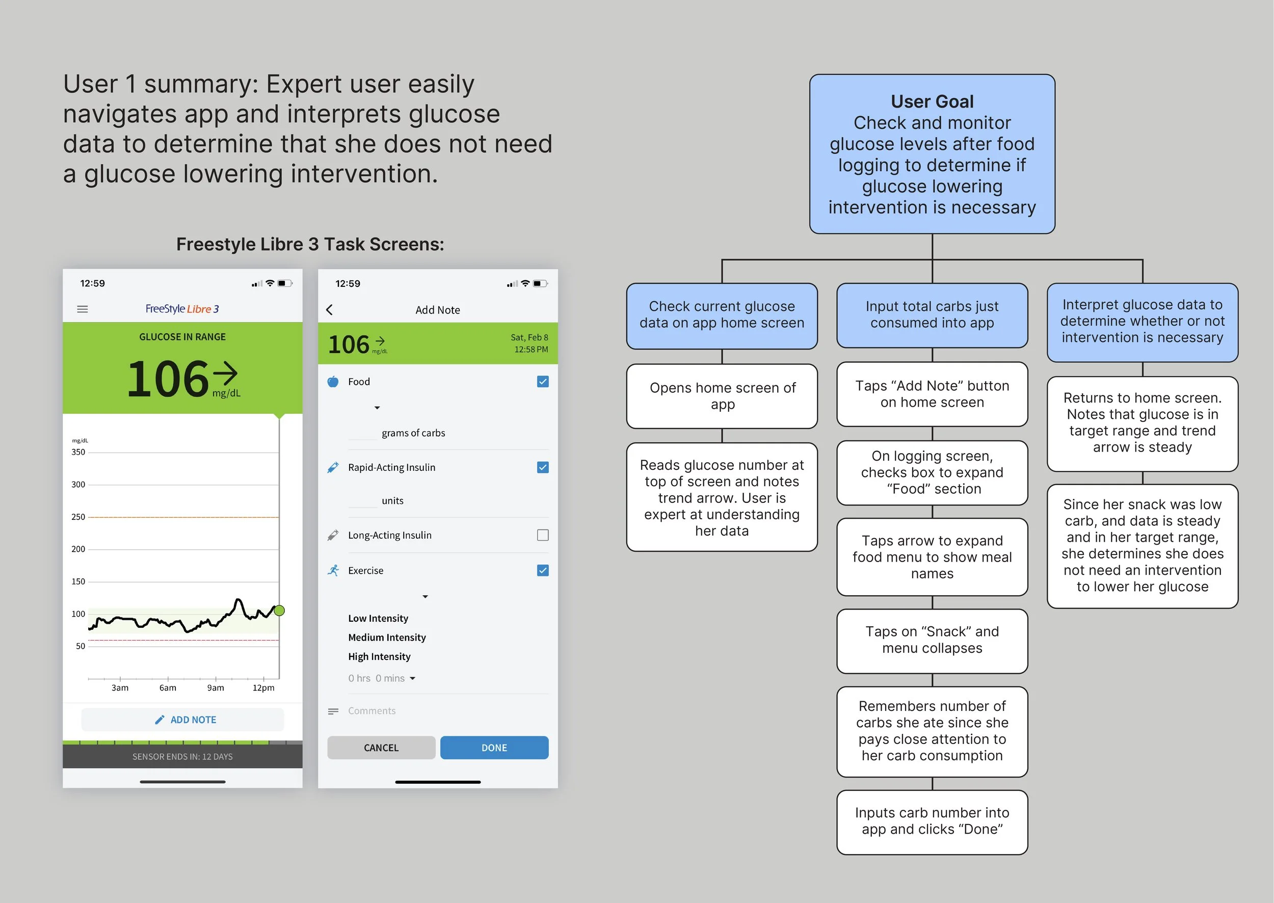
Expert users navigated easily, often relying on trend arrows and past experience.
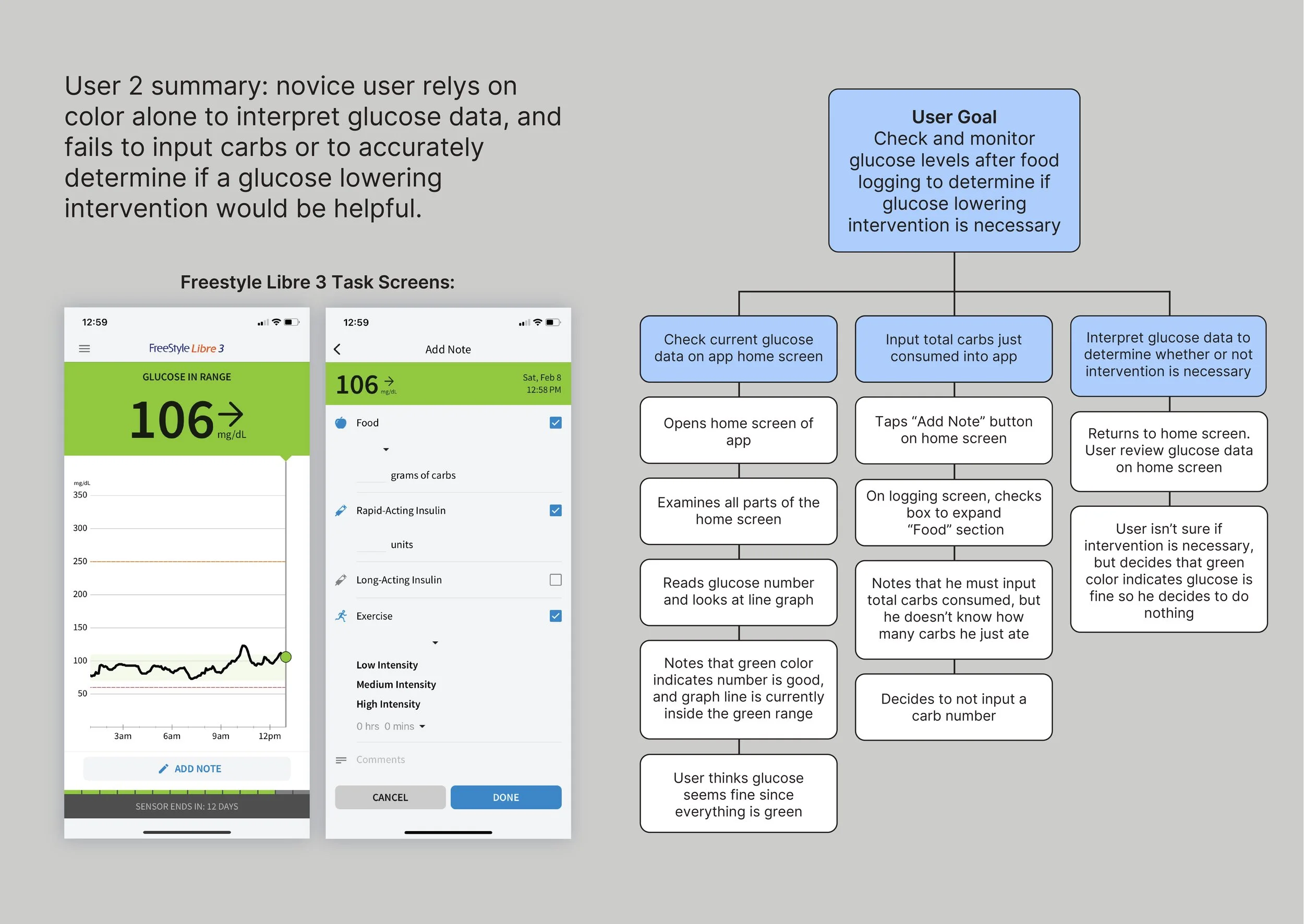
Novice users struggled to identify what the numbers meant and how to calculate or log their carbs.
Several users failed to input meals entirely or misread their data, leading to inaction or incorrect actions.
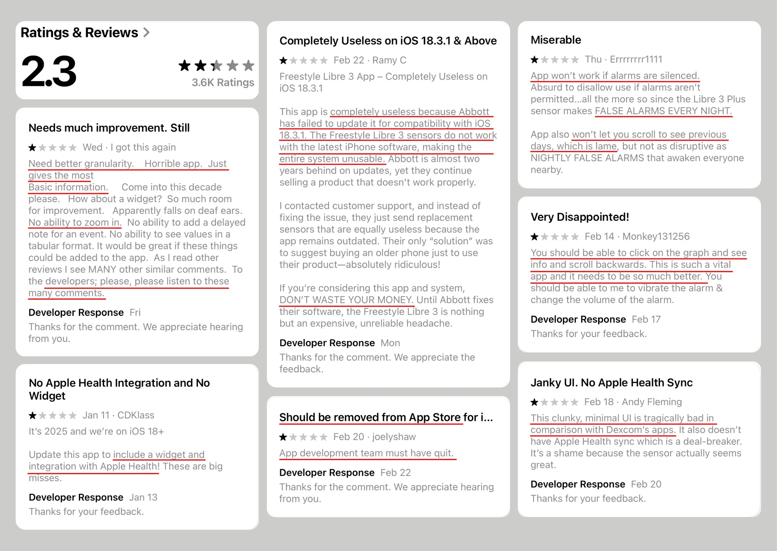
App Store Reviews
To gain further insights into the experiences of real users, I read over many reviews in the app store. User reviews revealed widespread dissatisfaction. The app had a 2.3 star rating and scathing user reviews citing:
Poor UI and functionality.
Confusing layout.
False alarms that couldn’t be silenced.
Lack of connectivity with Apple Health and smartwatches.
Lack of updates rendering app non-functional with current iOS.
App store review quotes included:
"This is such a vital app and it needs to be so much better".
"App development team must have quit". 😲
Task Analysis
To keep the scope of the project manageable, I framed the redesign around improving the user experience of a basic process many users regularly use their Freestyle Libre 3 app for: reading their current glucose data, logging carbs, then interpreting the changes in their glucose data from their carb intake. User testing was designed around this process.
I observed users attempting to complete the below set of tasks:
Read their current glucose level.
Log a recent meal.
Interpret their glucose trend after the meal to decide if action was needed.
Personas
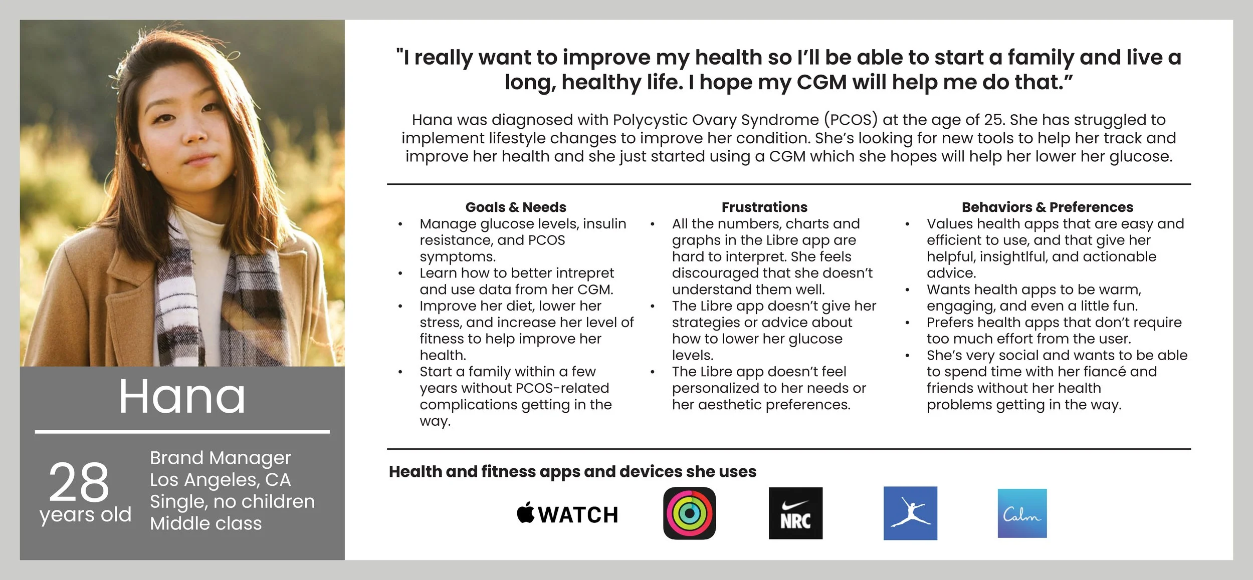
Based on the user research, and to guide design decisions, I developed three personas:
Michelle: A diabetes management expert who needs reliability and personalization.

Brian: A data-driven fitness enthusiast optimizing workouts through CGM data.

Hana: A health-conscious planner with PCOS who feels overwhelmed by graphs and numbers.
Heuristic & Accessibility Audit
I conducted a heuristic audit of the Libre app to determine what was working and what wasn’t. I also looked at accessibility.
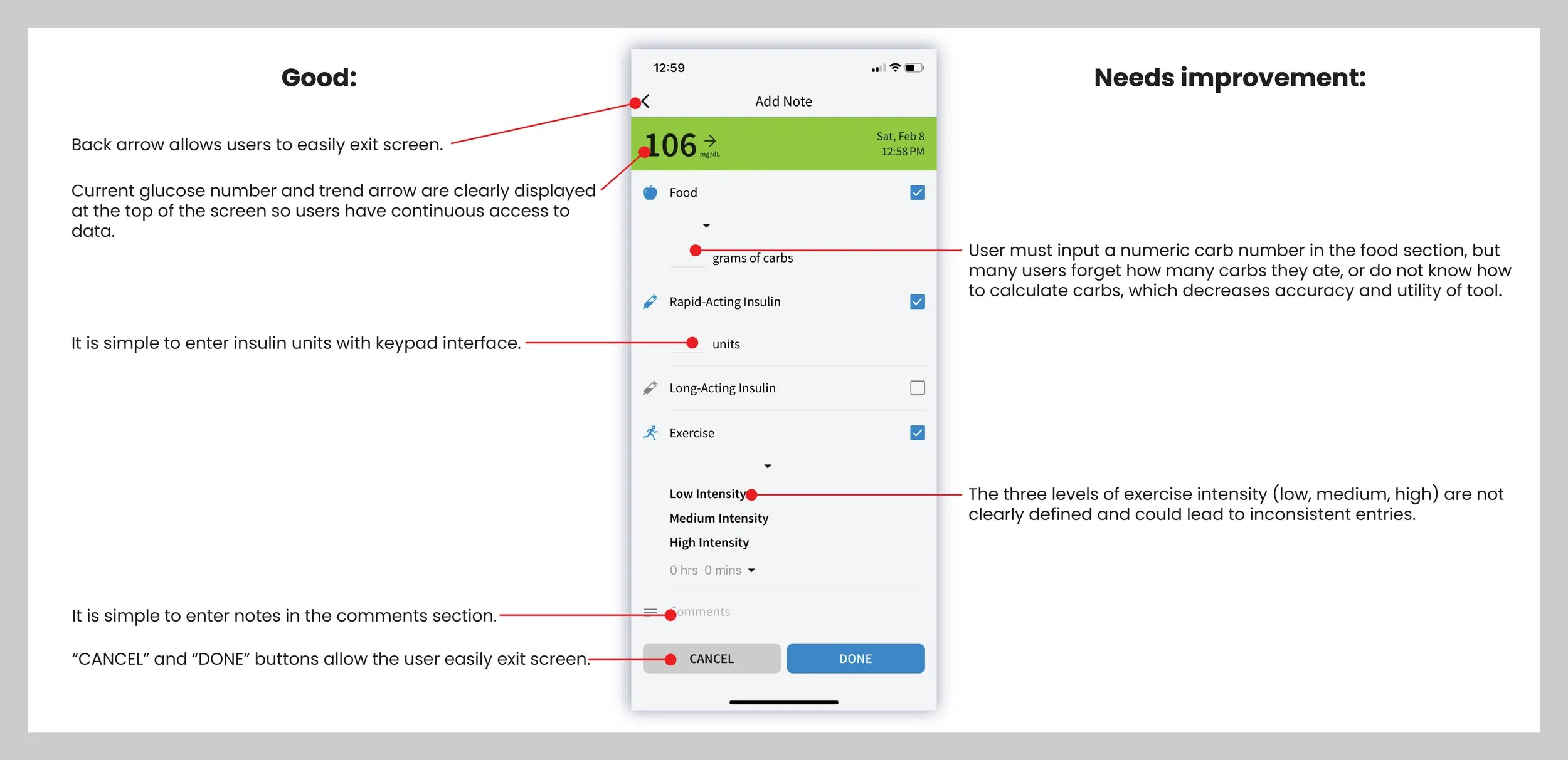
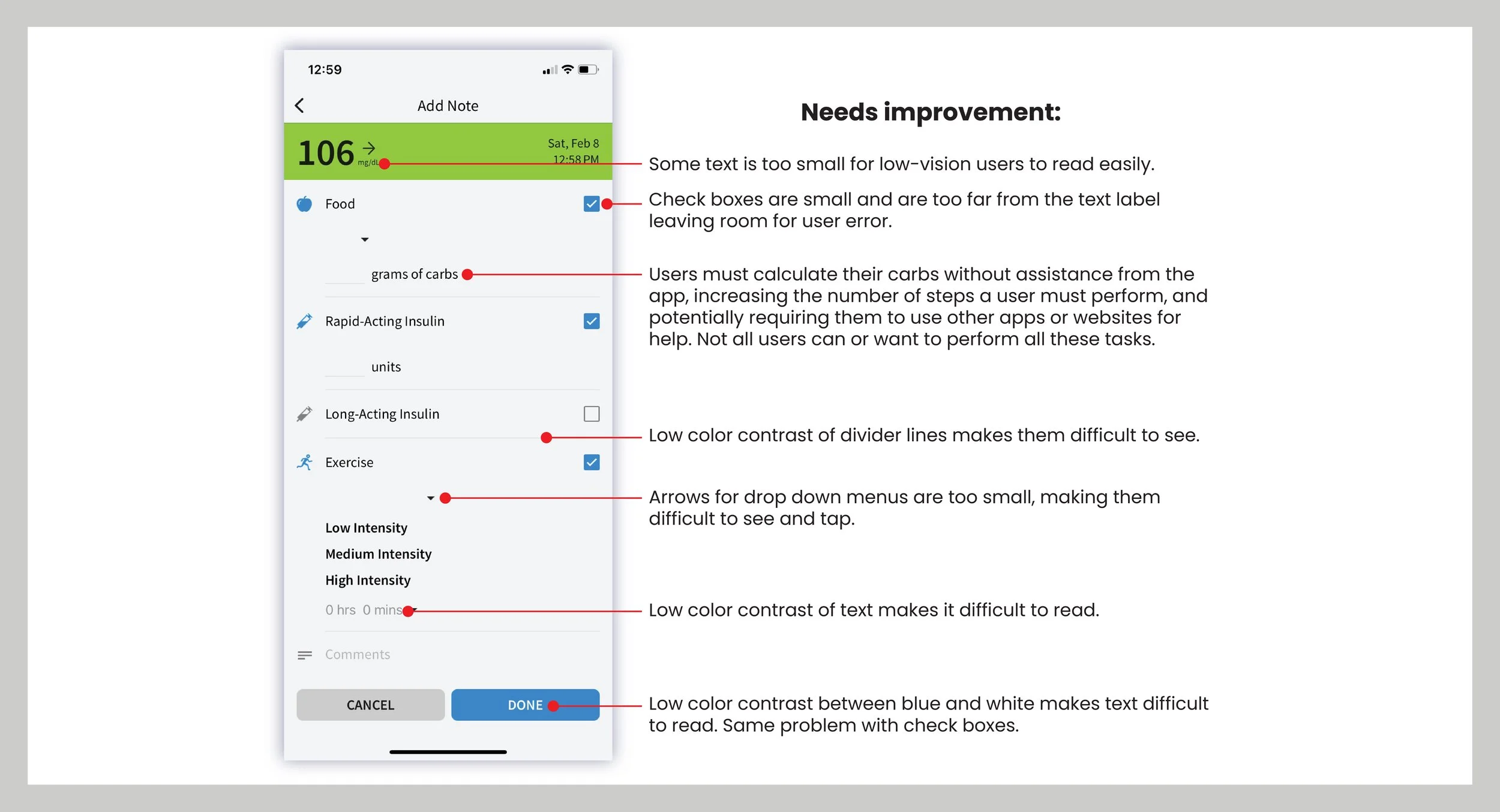
Usability issues identified included:
Confusing icons and unclear labeling (e.g., “Add Note” didn’t clearly indicate food logging).
Navigation hidden behind a hamburger menu.
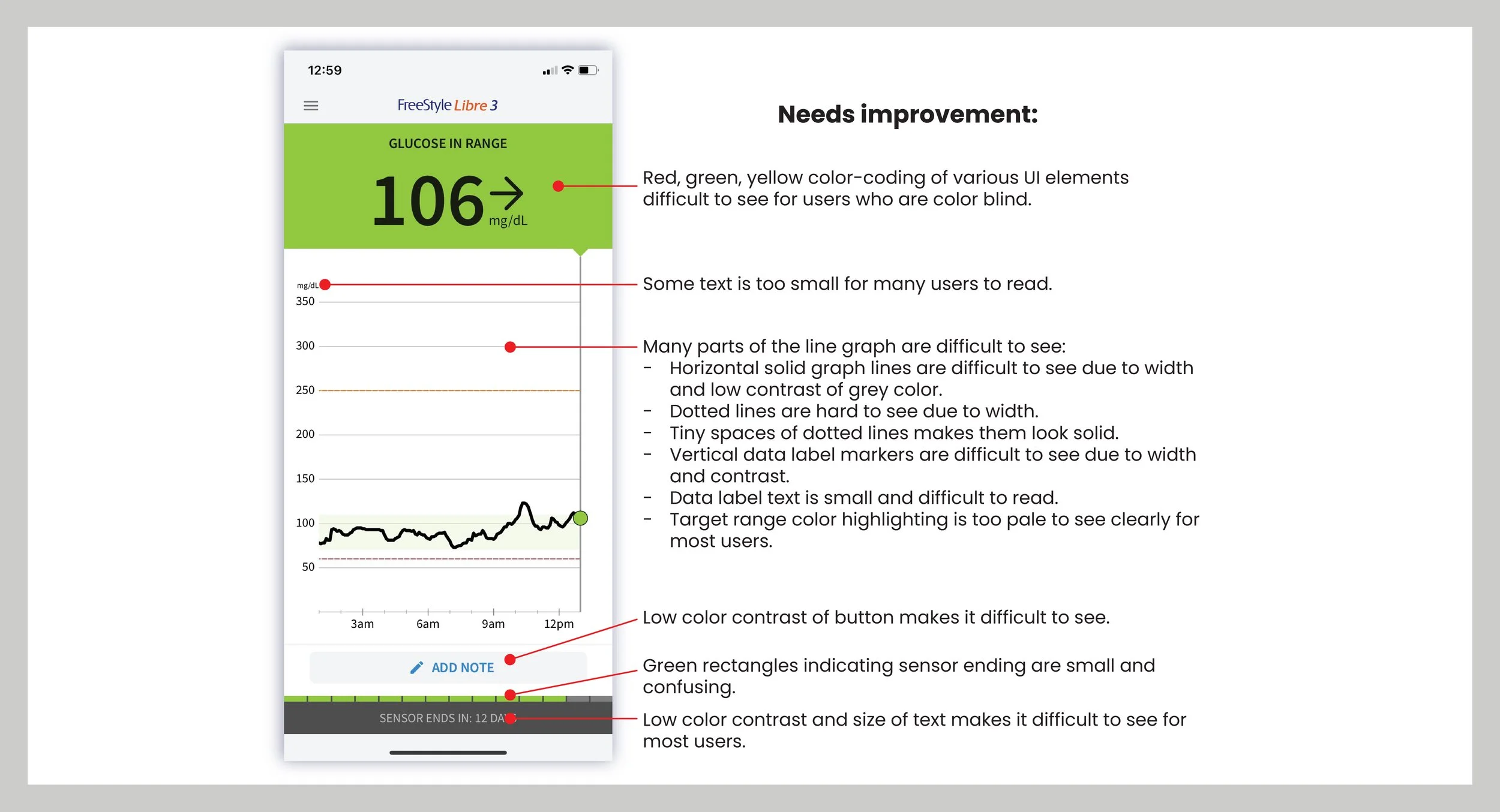
Sensor expiration graphic was cryptic and non-informative.
Trend graph lacked context and help for interpretation.

Accessibility Issues Identified:
Low color contrast in text and UI elements
Small tap targets and font sizes
Graph elements lacked clarity and failed WCAG contrast standards
Color-coding (green/yellow/red) posed issues for color-blind users
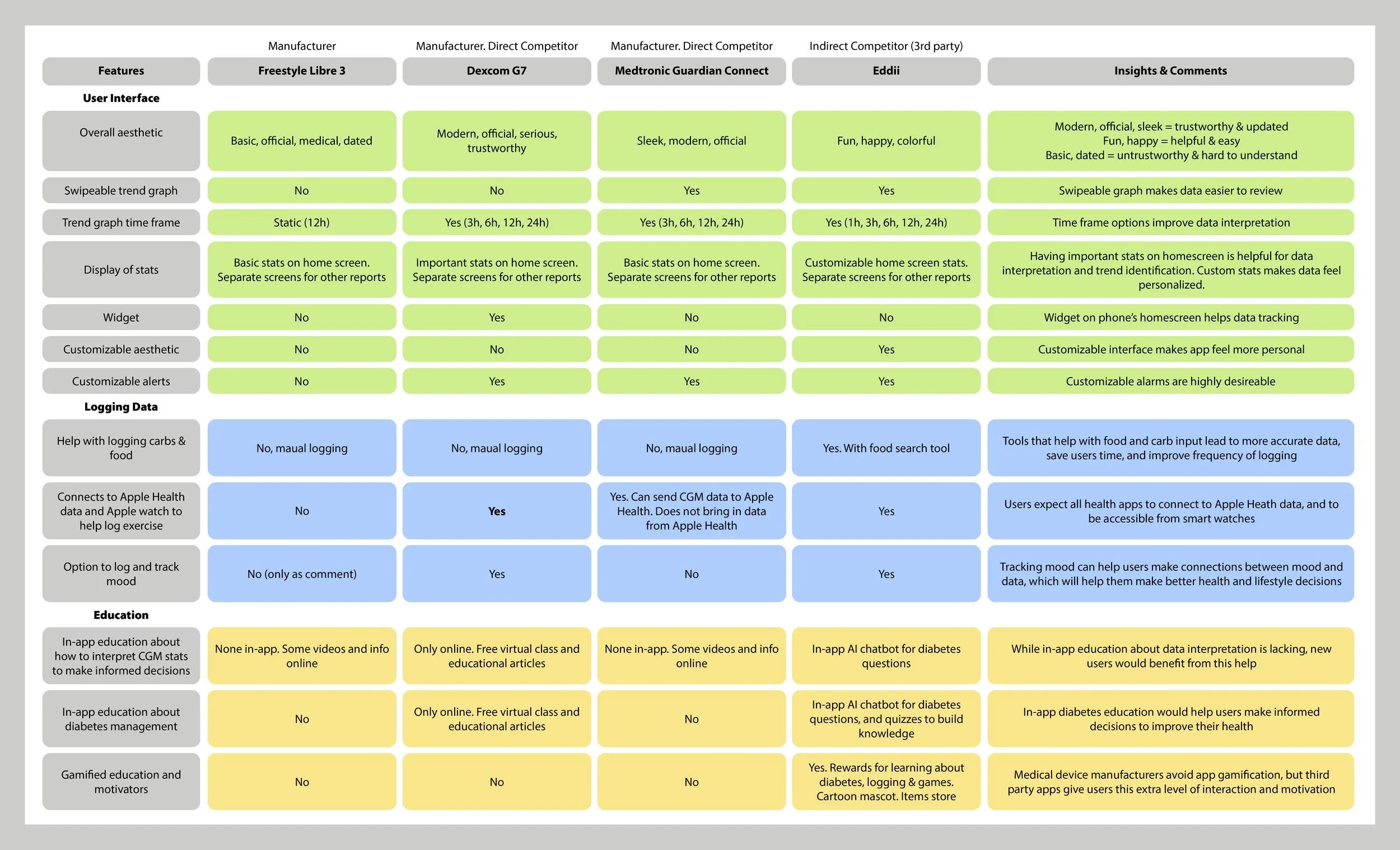
Competitor Analysis
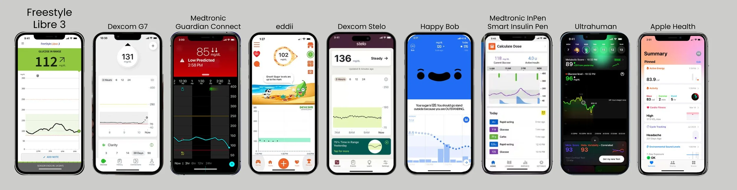
I conducted a thorough analysis of direct competitors (Dexcom G7, Medtronic Guardian Connect, Dexcom Stelo) and innovative third-party apps (Eddii, Happy Bob). I also looked at a number of other relevant apps to better understand best practices and to gather ideas (Ultrahuman, Medtronic InPen Smart Insulin Pen, Apple Health):
Competitors had: Sleek modern designs, AI integration, strong data visualization, personalized features, comprehensive data logging, mood tracking, smartwatch/Apple Health integration, and educational materials.
The Freestyle Libre 3 mostly lacked the above features.
Takeaway: Users expect more guidance, personalization, and interconnectivity from modern health apps.
Competitor Feature Analysis Chart
04. Features & Ideation
MoSCoW Analysis
Informed by the heuristic evaluation, competitor analysis, and user research, I prioritized key features for the redesign that would most effectively enhance the app’s user experience, within a manageable scope.

Feature Prioritization
The redesign incorporated a series of improvements aimed at making the app more intuitive, visually appealing, and user-centered:
A modernized, updated UI to make the app feel more relevant and visually sleek.
AI-powered personalized insights to help users make sense of their glucose patterns.
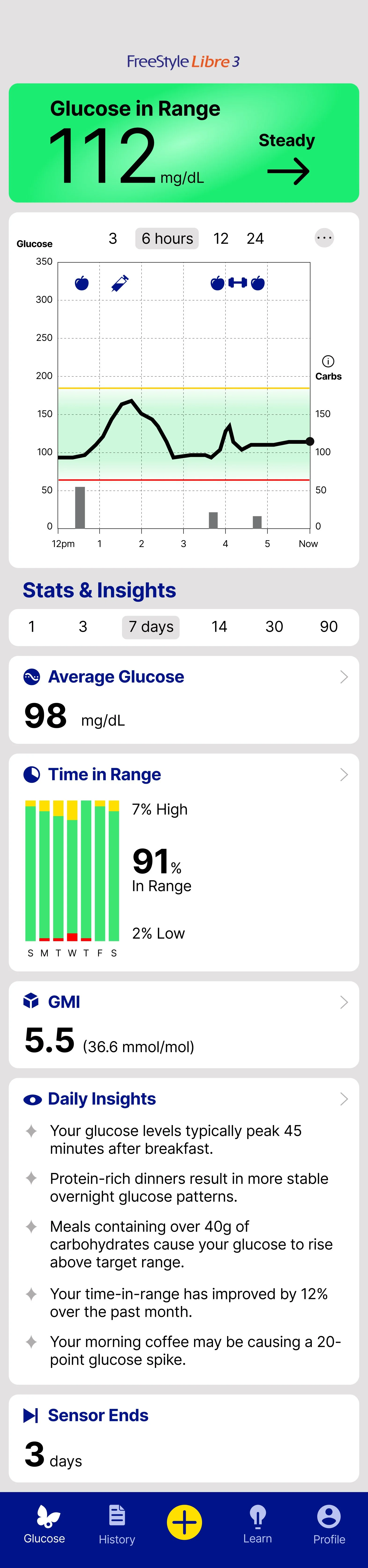
Flexible time frame views on the main glucose trend chart for improved data interpretation.
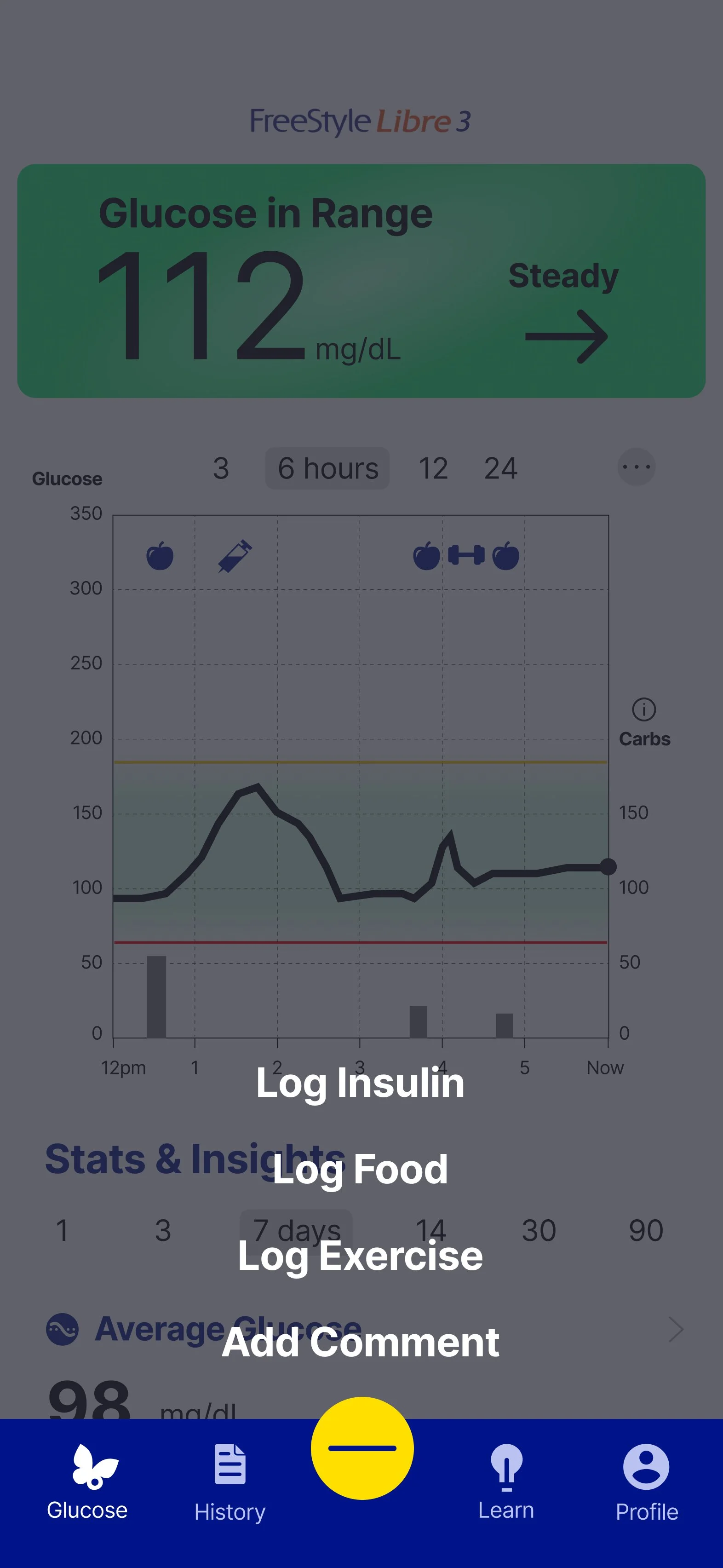
Simplified navigation through a consolidated home screen and the addition of a bottom navigation bar for faster access to key features.
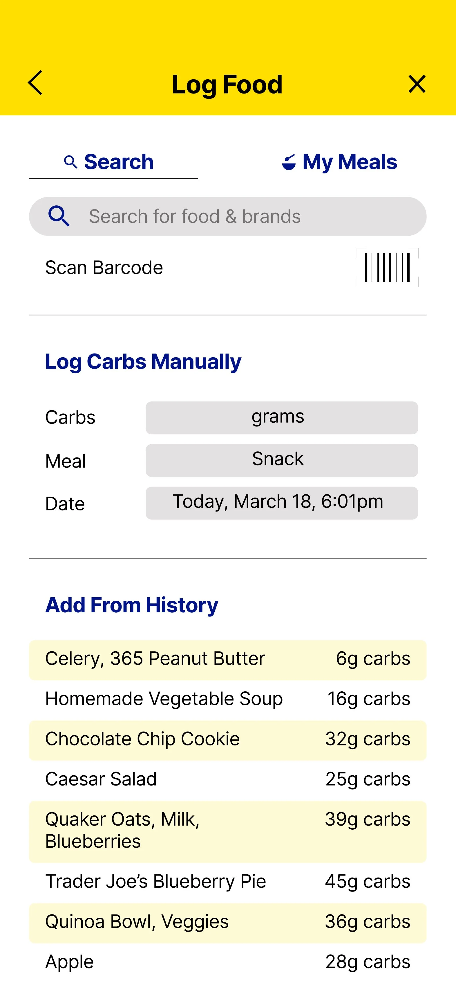
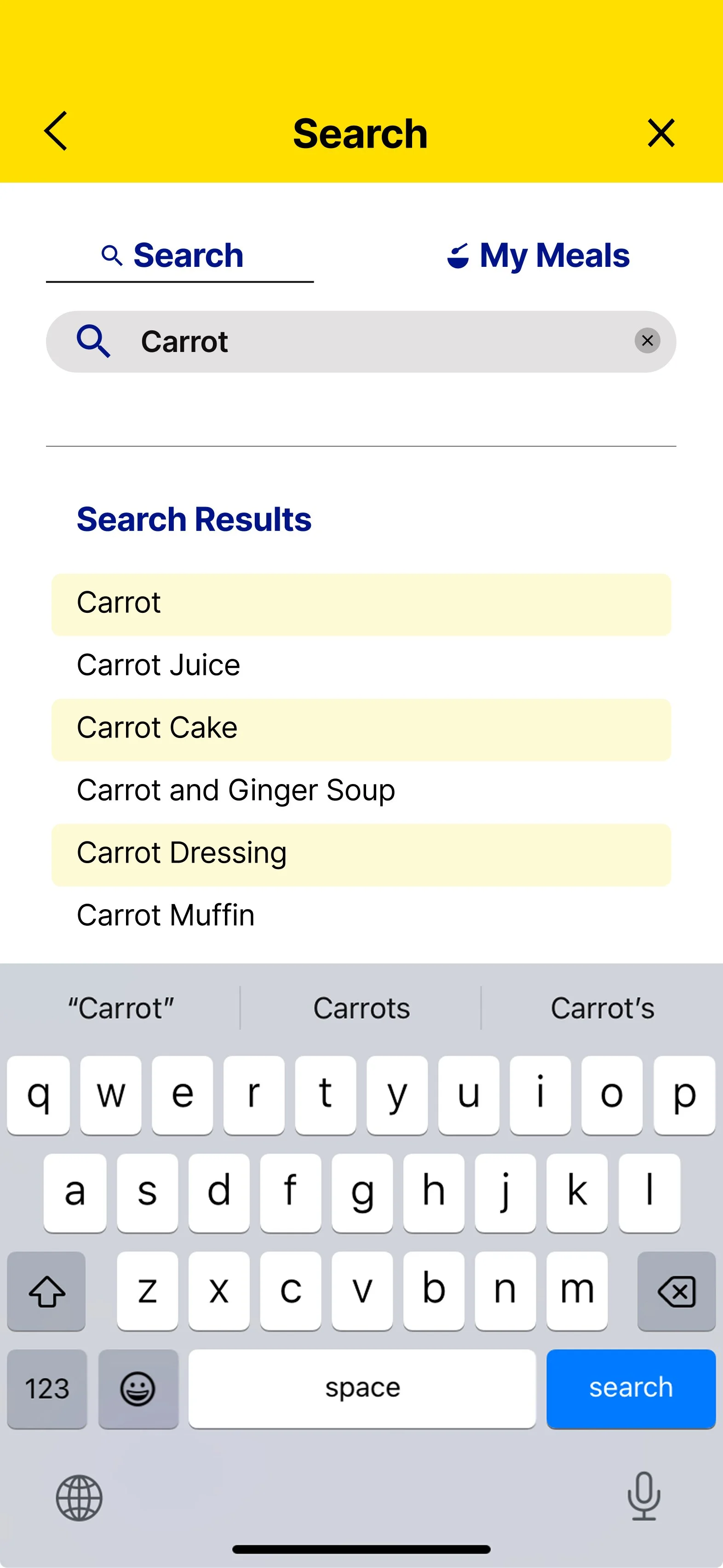
An enhanced food logging process that supports more accurate and detailed entries.
Clearer data visualizations and customizable timeframes for a more tailored view of glucose trends.
A redesigned sensor end-of-life graphic to clearly communicate when the sensor will stop working.
Food intake data added directly to the glucose graph to help users understand the impact of meals in real time.
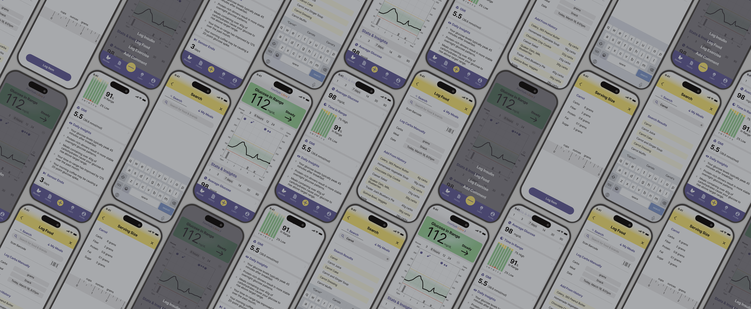
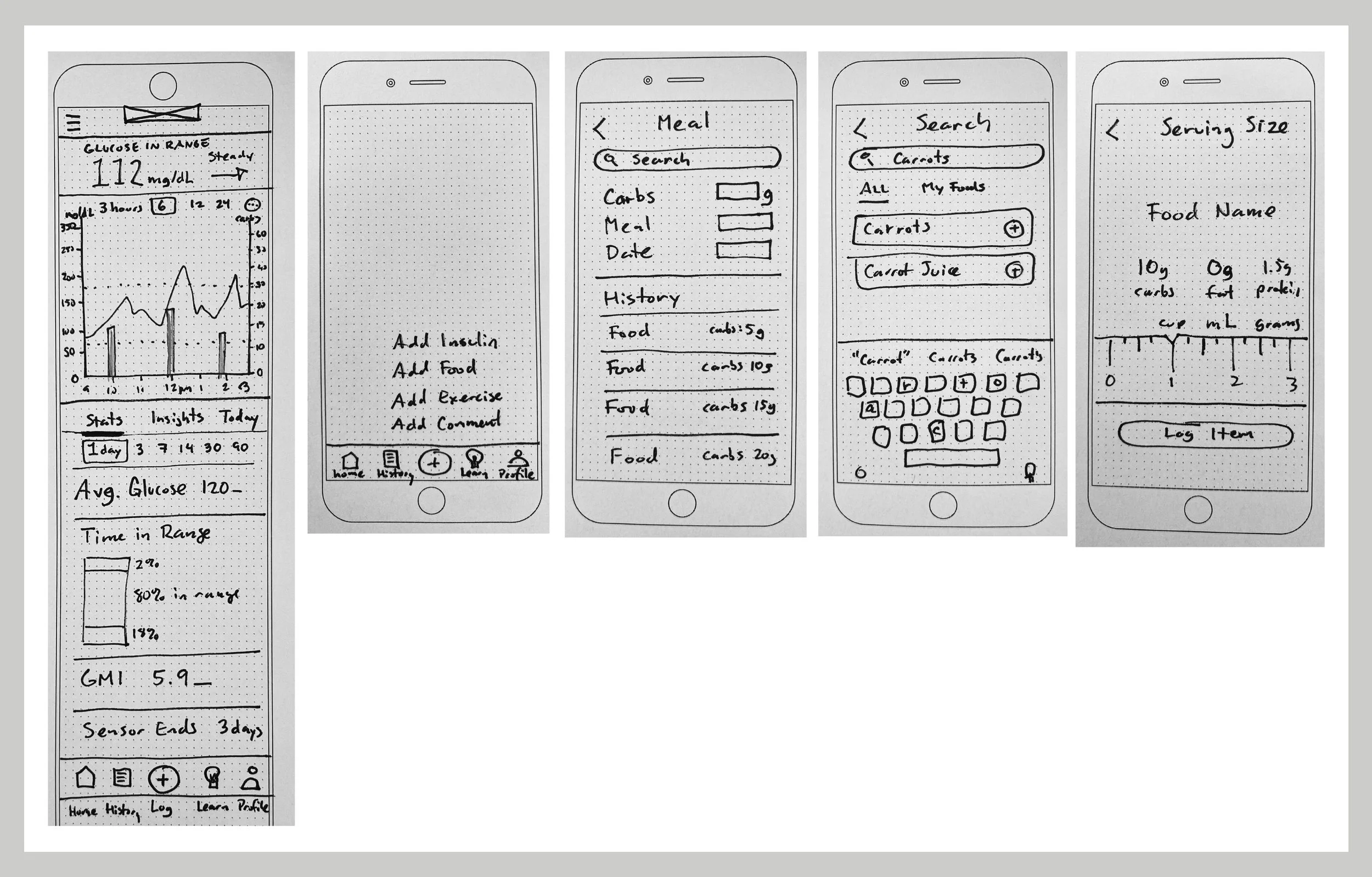
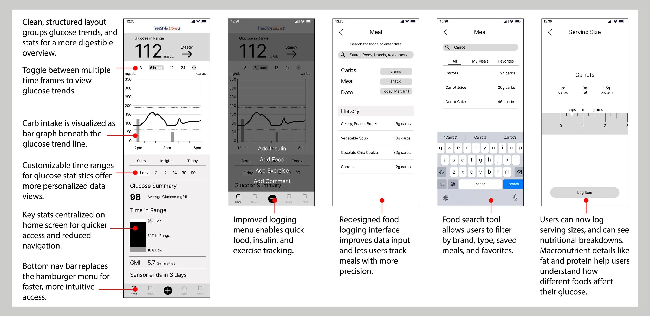
Wireframes & Initial User Testing
I sketched and prototyped the core screens needed to support the primary task I centered user testing around: viewing glucose, logging food, and understanding the data. I put the paper wireframes into Marvel and did a round of user testing with 5 users.
First round testing (paper prototypes + Marvel) insights:
Users were unsure of how to begin food logging process.
Lack of hierarchy and clear organization on the food logging screen confused users.
Wireframes
I synthesized user feedback from paper prototype testing to create improved digital wireframes that addressed key usability issues.
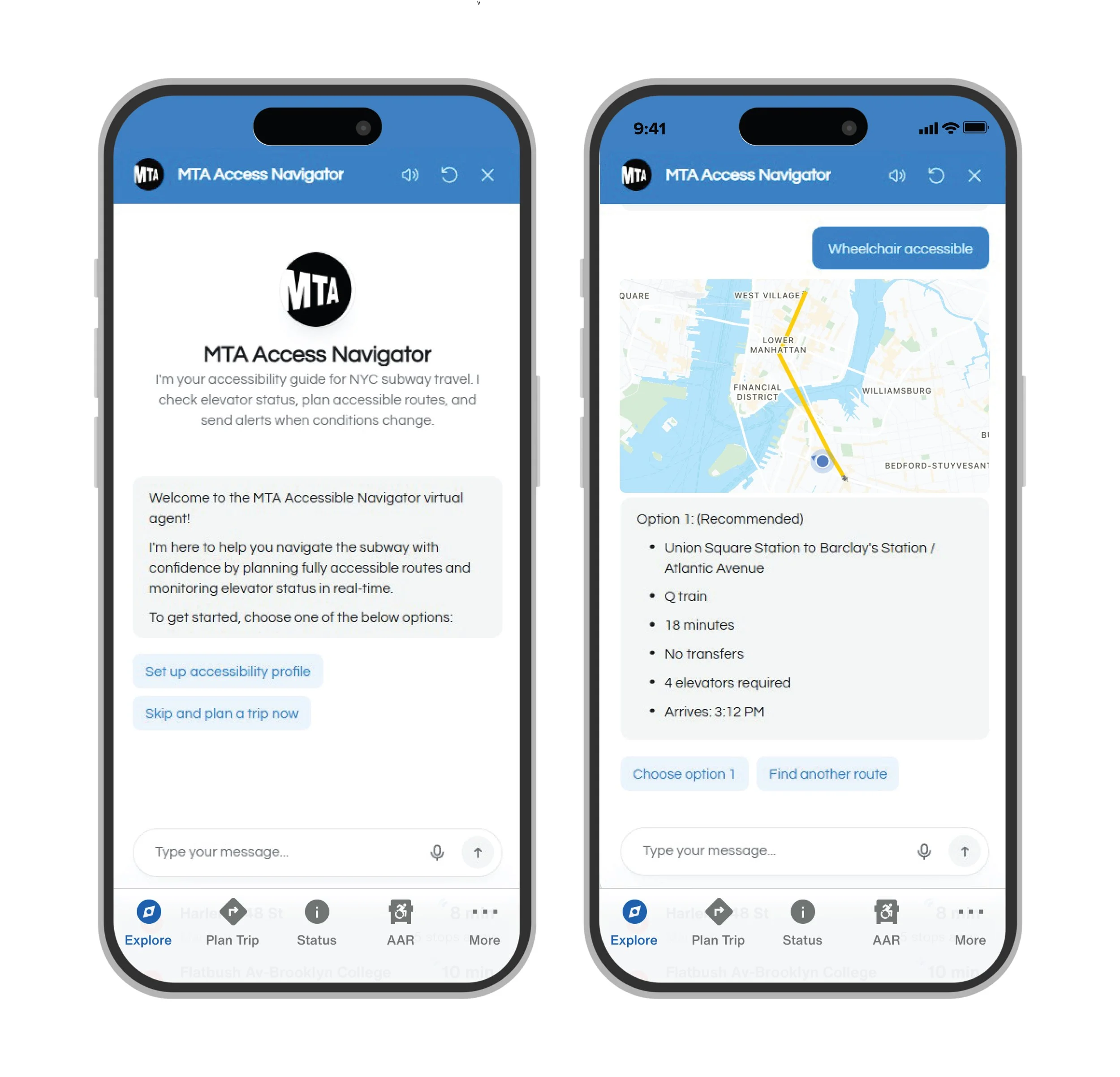
Digital Prototype
This flow illustrates the redesigned food logging process, from navigating the home screen to selecting and logging a meal with detailed nutritional information.
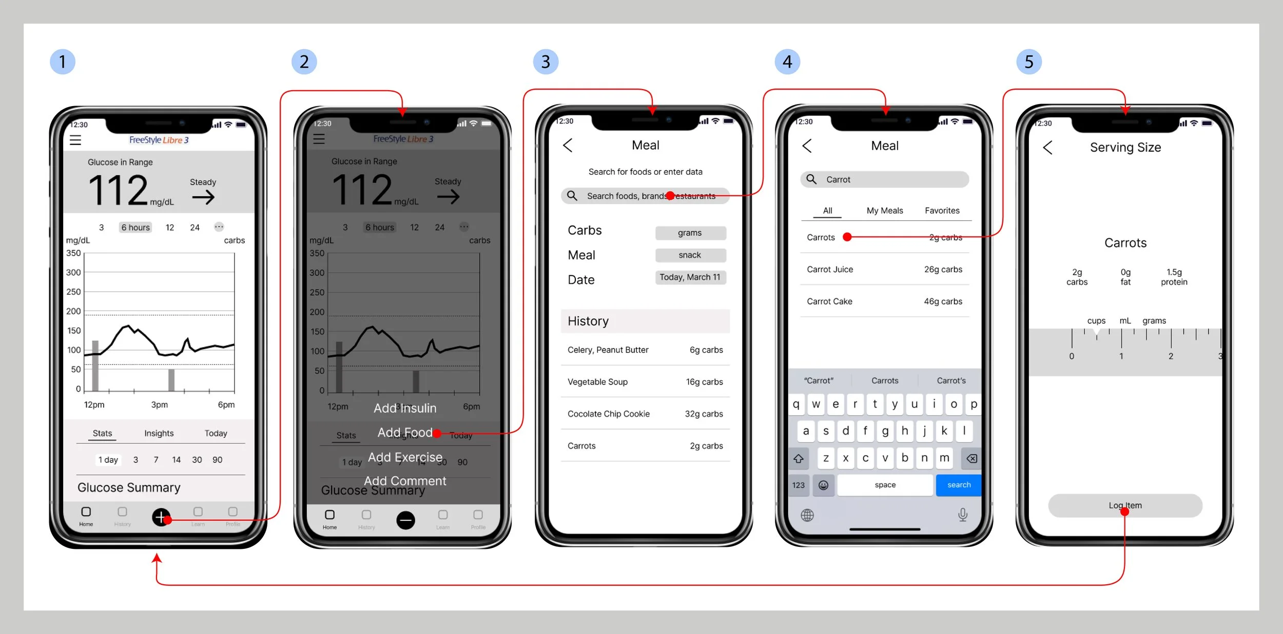
Key Design Highlights
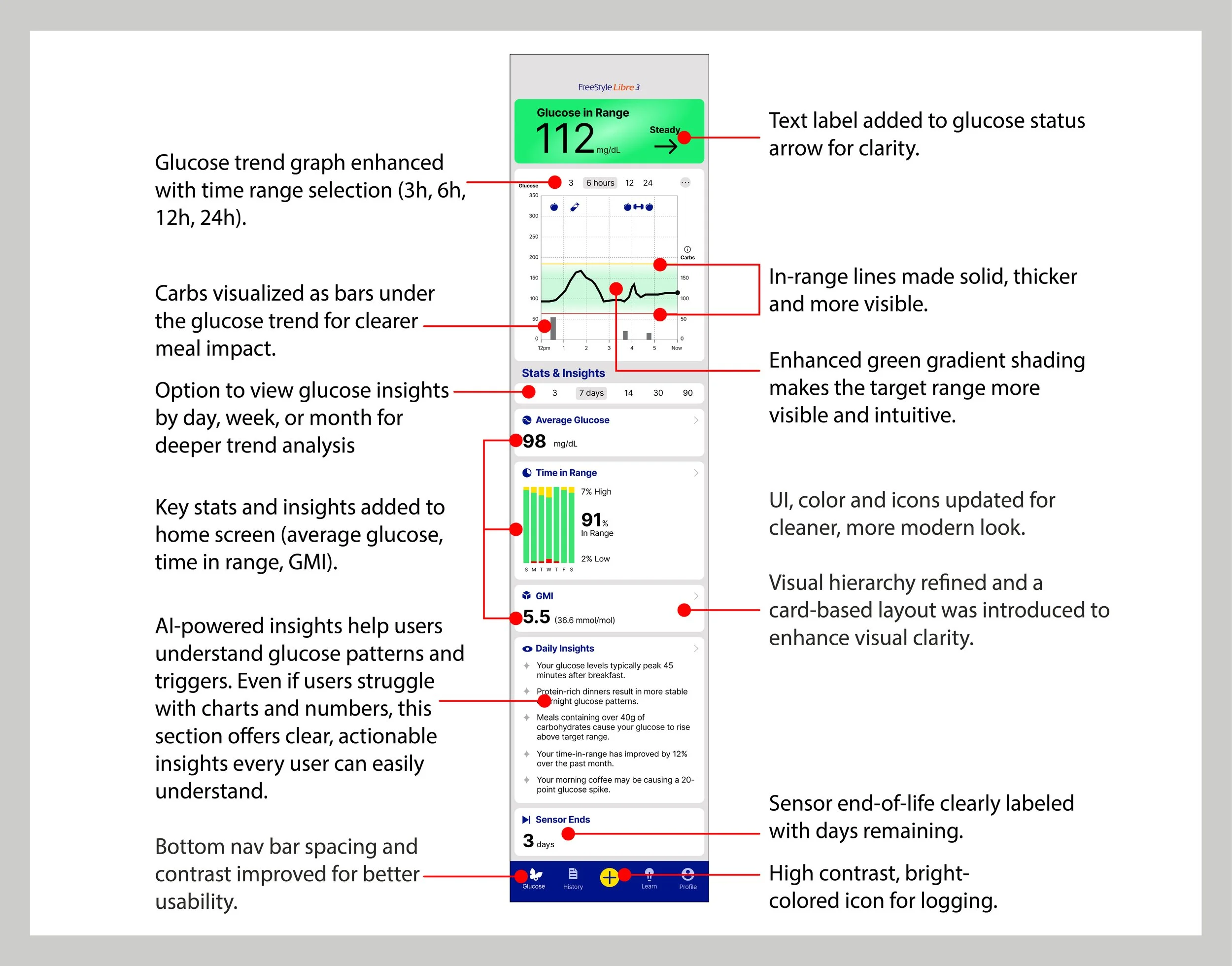
Informed by another round of user testing, I created high fidelity mockups. The final design reflects user testing feedback, and includes a number of improvements and new features including:
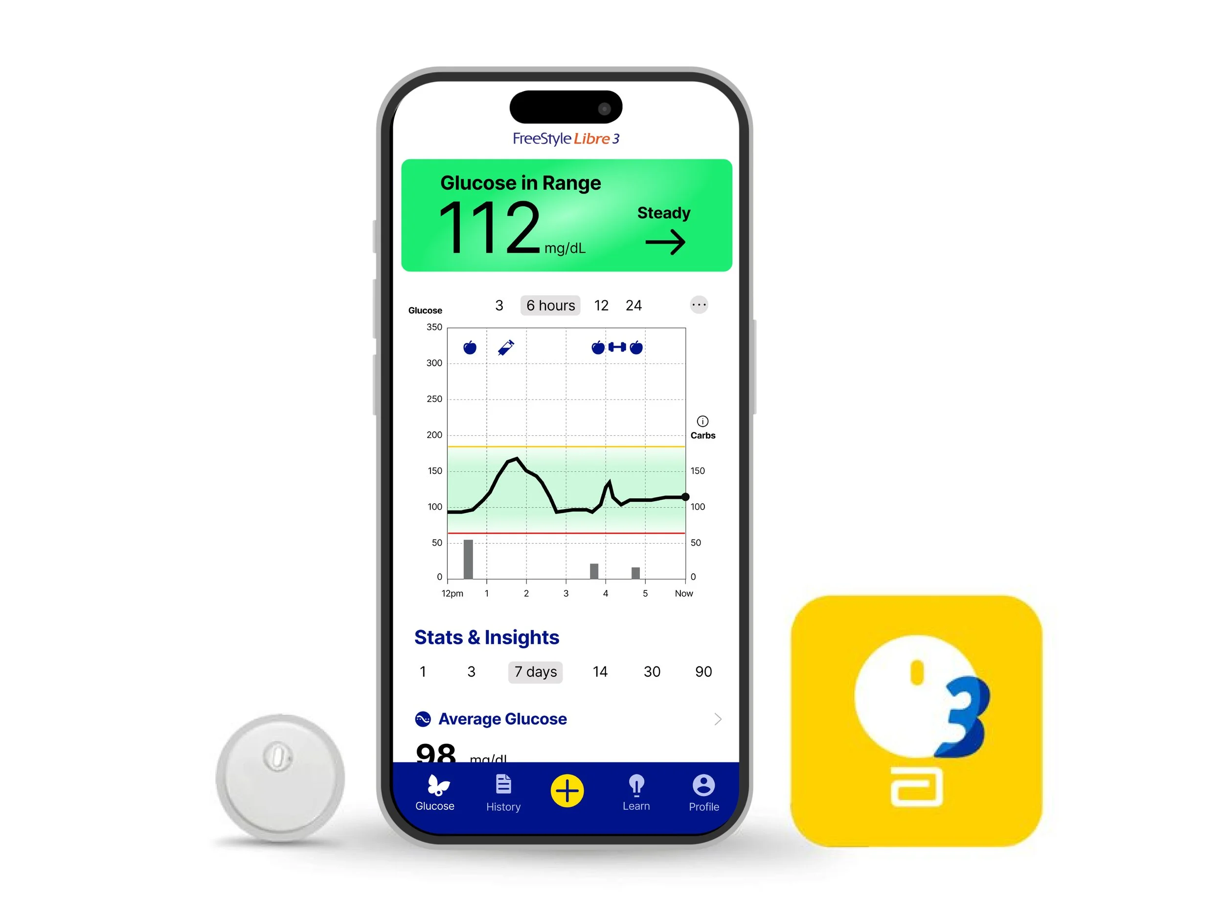
Personalized AI Insights:
“Your glucose typically spikes 45 minutes after breakfast”. This is clear, actionable feedback users could understand and use.
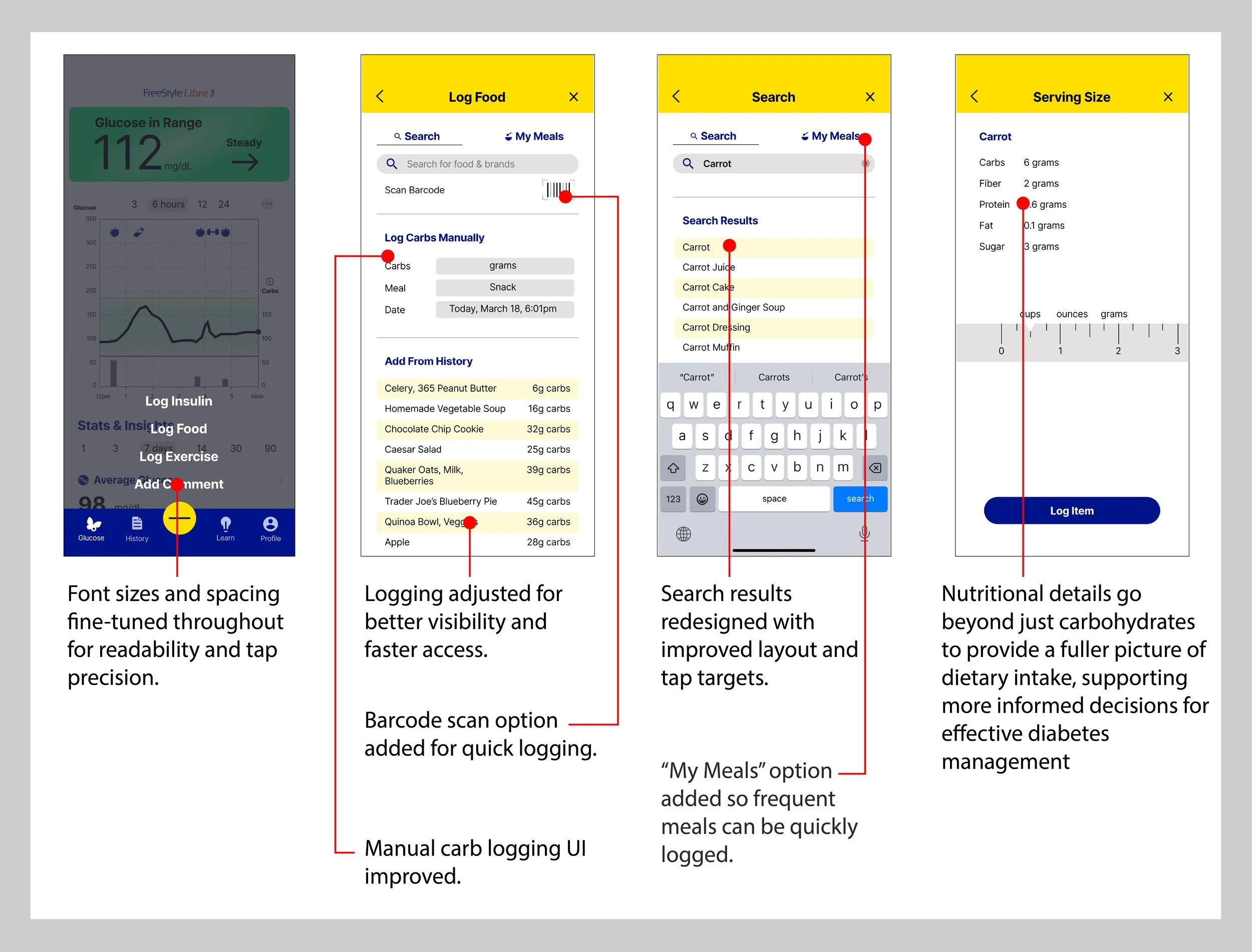
Refined Food Logging:
Redesigned logging screens help users input carbs and food accurately and see how nutrients affect glucose.Simplified Navigation:
Replaced the hamburger menu with a bottom nav bar to surface key features like logging and reports.Sensor End Graphic:
Redesigned to clearly show when the sensor expires, eliminating guesswork and anxiety.Centralized Key Stats:
Home screen now shows real-time levels, trend graph, and insights. No more digging through menus.Improved Accessibility:
Contrast, text size, and tappable areas were adjusted to meet WCAG guidelines and support users with low vision or dexterity issues.
Final Prototype
The screens are designed to support better glucose insight through clarity and convenience, and the flow enables an easy yet comprehensive food logging process.
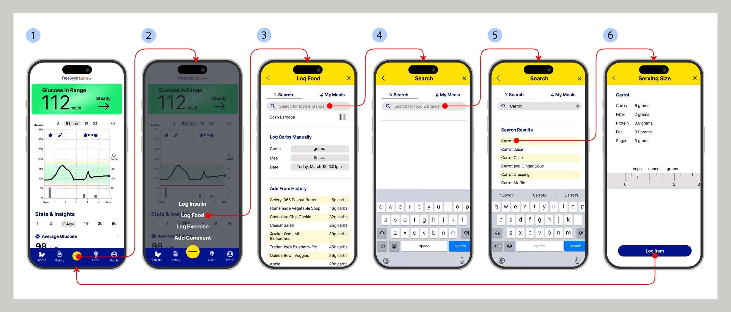
Here’s a video of the prototype, or try out yourself.
Usability Testing
User testing of the high fidelity mockups with 5 users showed that the redesigned app was more visually appealing, easier to navigate and understand, and provided meaningful insights—resulting in strong positive feedback.
"The numbers and graphics are way easier to understand."
“It feels more modern and less medical. The layout makes more sense and I’m not searching around for everything”.
"Logging food feels easier now, and like the app is doing most of the work for me."
Some users reported that while logging food took more steps, it was ultimately more intuitive and they trusted the results more due to the increased accuracy of the logging tools.
Remaining issues included:
Confusion around some chart labels.
Users expressed that they’d like even more help logging food such as a photo tool that would log their meals for them.
Users wanted explanations for each of the types of data shown on the homepage. Future iterations of the app would include educational screens built out for each section of data.
05. AI Insights
One of the central goals of this redesign was to help users feel more confident and proactive in interpreting their glucose data. To support that, I incorporated AI-powered features designed to deliver personalized insights, anticipate user needs, and increase trust through transparency.
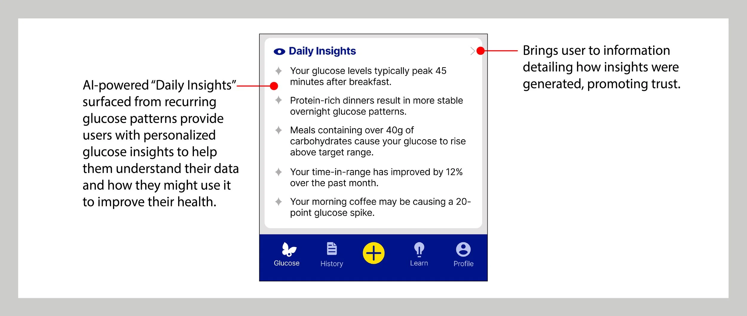
Predictive Glucose Pattern Recognition
To reduce data overwhelm and support decision-making, the redesigned app includes an AI feature that identifies recurring glucose trends and surfaces clear, actionable insights. For example:
“Your morning coffee may be causing a 20-point glucose spike.”
These insights are displayed prominently on the home screen, offering users contextual pattern awareness without requiring them to analyze charts themselves. The phrasing is intentionally simple, encouraging understanding without clinical jargon.
Value for users: Builds trust and autonomy by helping users anticipate how their habits affect their health.
UX approach: Insights appear after new data is logged, or based on a time-based trigger, and users can learn about how the insights are generated.
Ethical layer: Users can tap the information arrow next to the Daily Insights section to view a brief explanation of how the insight was generated — including what data it draws from and how frequently it appears. This promotes trust and transparency, helping users understand the AI without overwhelming them.
Smart Logging Assistance
To streamline the food logging process and reduce cognitive load, the redesigned app uses AI to identify recent meal patterns and surface them contextually at logging time. For example, if a user has logged oatmeal every morning for the past week, the app will automatically display oatmeal at the top of their history list when they go to log breakfast.
Value for users: Speeds up logging, reinforces habit consistency, and minimizes repetitive input, especially for users with predictable routines.
Design detail: The system dynamically reorders the “Recent Foods” list based on time of day and frequency to reinforce personalization.
UX strategy: By offering familiar, just-in-time suggestions, the app creates a sense of support without overstepping into automation, leaving final choices in the user’s hands.

Why This Matters
These AI features demonstrate how predictive modeling and personalization can be used not to replace human judgment, but to support confident, informed decision-making in a sensitive health context.
From complexity to clarity: Instead of requiring users to interpret raw graphs or search through extensive logs, the app surfaces the most relevant insights at the right time — reducing friction and helping users act with confidence.
Trust through transparency: By clearly showing where insights come from and allowing users to explore how the system learns, the design builds trust in AI without sacrificing user agency.
Behavioral reinforcement: Context-aware suggestions gently encourage helpful routines (like consistent breakfast logging) while maintaining user control. This kind of AI-powered scaffolding supports better health outcomes without feeling invasive.
Together, these enhancements turn static data into personal, actionable insights, bridging the gap between technology and everyday health management.
06. Accessibility
Accessibility improvements included:
Text color contrast meets WCAG standards.
Increased font sizes and element spacing wherever possible. The text on the graph had to stay small due to size constraints of the phone screen.
Improved clarity of all interactive elements.
Improved data visualizations’ legibility. Consolidated all data visualizations to the home screen for ease of use.
Eliminated some small, hard-to-tap elements like checkboxes.

07. Takeaways
Impact
While this was an academic project, user testing validated key redesigns. Users reported:
Greater confidence interpreting their glucose data.
Higher trust in the logging process.
A clearer, more emotionally supportive interface.
What I Learned
Designing for health means designing for trust. By listening to real users and focusing on emotional clarity and accessibility, I created a product that helps people make smarter, healthier choices. Even small UX changes, like clearer logging menus or a redesigned icon, can make a huge difference in someone’s health journey.