
Rebuilding Trust in Social Commerce
Live Shopping Platform Design
My Role: Product Designer & UX Researcher
Duration: 14 weeks (2025)
Tools: Figma, UX Metrics
01. The Problem: Live Shopping Is Chaotic and Users Don't Trust It
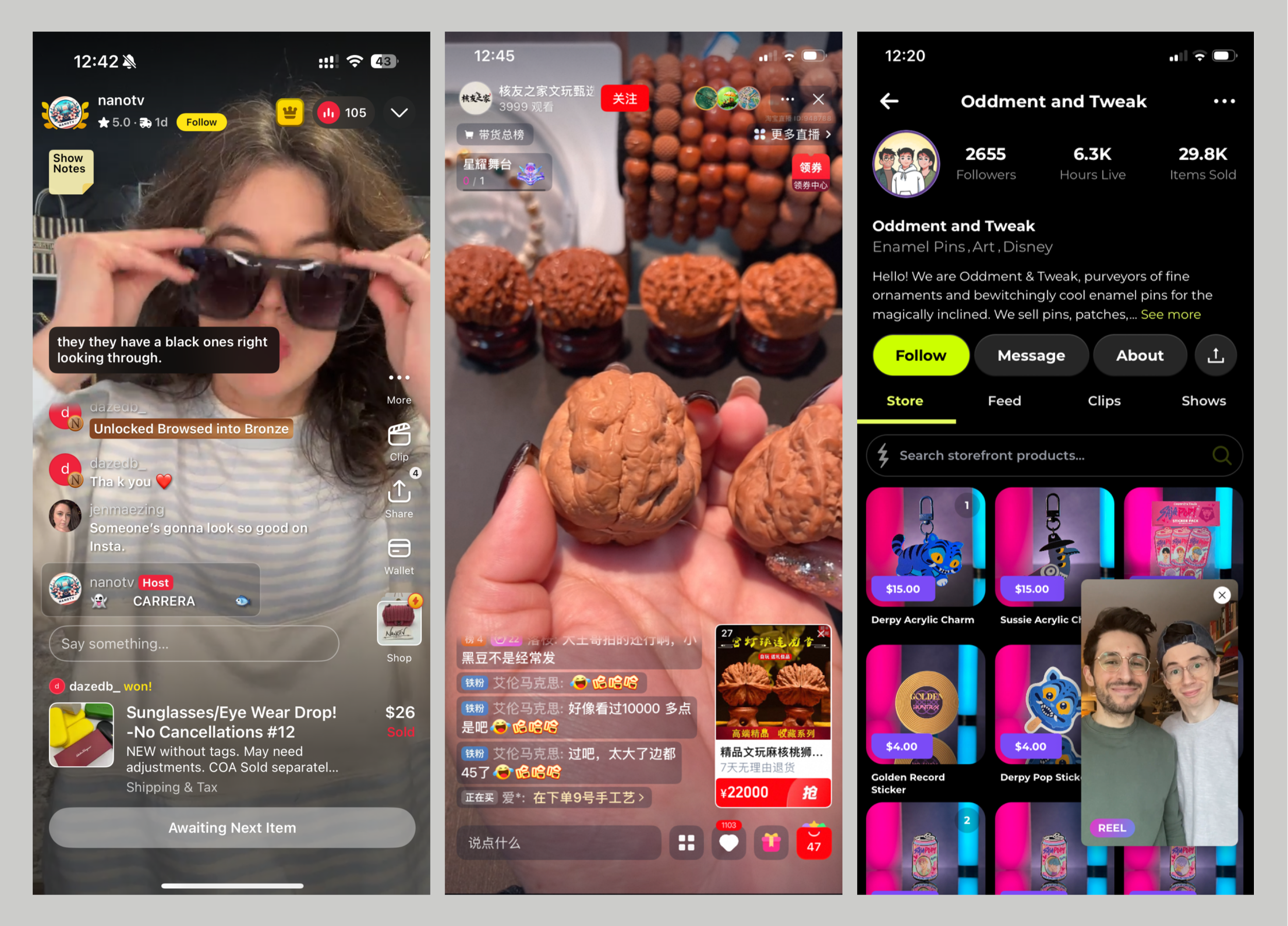
Live shopping is booming, but it's broken. Platforms like TikTok Shop and Whatnot create chaotic, high-pressure experiences that leave users overwhelmed and distrustful. Despite the hype, most people watch but rarely buy.
Problem Statement: Current live shopping experiences fail both creators and consumers. Users perceive them as cheap, chaotic, and untrustworthy, while influencers lack a dedicated platform to showcase their products without getting lost across fragmented social media channels. Low-quality, scattered experiences undermine trust, engagement, and monetization for everyone involved.
How Might We…
…Make live shopping feel trustworthy, curated, premium, and engaging?
…Help influencers build and monetize their audience in one cohesive space?
The Solution: Livly reimagines live shopping as a boutique experience where buyer’s experience is #1, trusted influencers host curated events, verified reviews build confidence, and discovery feels effortless instead of overwhelming.
Through user research, we discovered that trust (not technology) was the #1 barrier to purchase. So we designed every feature to build credibility: transparent seller metrics, comprehensive product information, verified customer reviews, and an AI assistant that helps without pressure.
The result is a live shopping experience that feels like discovering products with a trusted friend, not being sold to by a stranger.


02. Trust, Not Technology, Blocks Purchases
Existing Platforms Prioritize Chaos Over Credibility
Before designing anything, we needed to understand what existed and why it wasn't working. We analyzed leading live shopping platforms like TikTik Shop, Whatnot, Popshoplive, Taobao, Jamble, Amazon Live, and Instagram. We found common patterns:
Cluttered and chaotic interfaces that prioritized quantity over quality.
Low quality sellers, products, and production value.
High-pressure tactics like countdown timers and limited stock warnings.
Minimal verification for sellers or product details.
Fragmented experiences across multiple platforms.
KEY INSIGHT: The opportunity was clear, users wanted live shopping to feel like a boutique instead of a yard sale.
Users Watch Live Shopping But Rarely Buy
To start, we conducted six 15-minute interviews with women aged 25 to 30 years old, who shop online frequently and follow influencers.
KEY INSIGHT: User interviews revealed that while most users had watched live shopping, few had ever actually made a purchase.
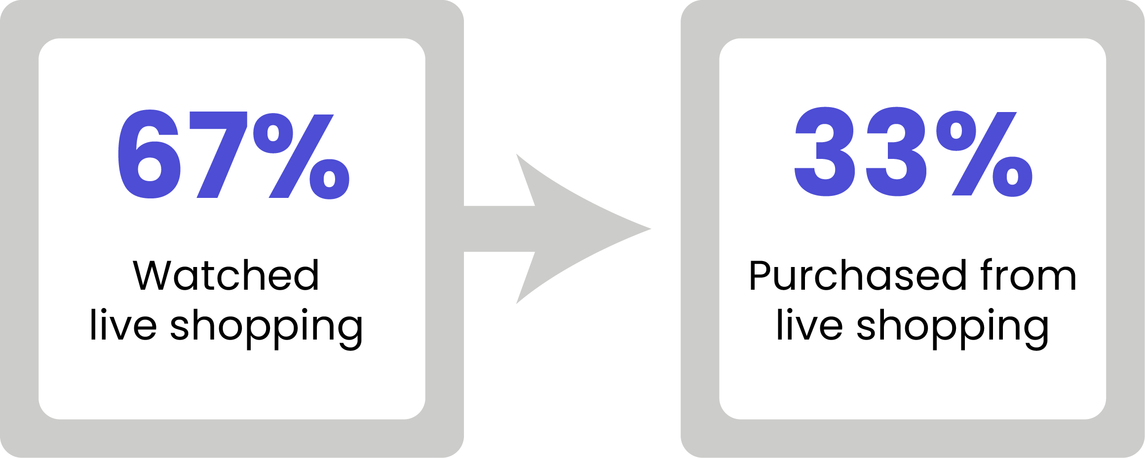

“I’ll watch live shopping for entertainment, but I never actually buy anything. I don't trust it."
"It feels too chaotic. I can't get clear information about the products."
"The pressure to buy stresses me out. I need more time to think before I buy."

Six Non-Negotiable User Needs We Designed Around

-
Trust & Authenticity
Users won’t participate or make purchases if they don’t trust the platform, hosts, and products. Trust, authenticity, and credibility are the #1 user needs.
-
Fun Experience
Users want a fun, exclusive, boutique shopping experience that feels premium and relationship-driven. The platform must create a sense of connection, calm, and credibility (not chaos).
-
Influencer Connections
Users enjoy discovering products through influencers they connect with, making genuine creator-audience relationships key to the experience.
-
Low Pressure
Most users dislike the high-pressure selling tactics of most live shopping. Give them excitement without stress.
-
Product Descriptions
Users want clear and reliable product details (zoom-ins, replays, stills, reviews, ratings) that demonstrate a high level of product quality.
-
Personalization
Users want relevant hosts and product recommendations, and they want their chat questions answered in real time.
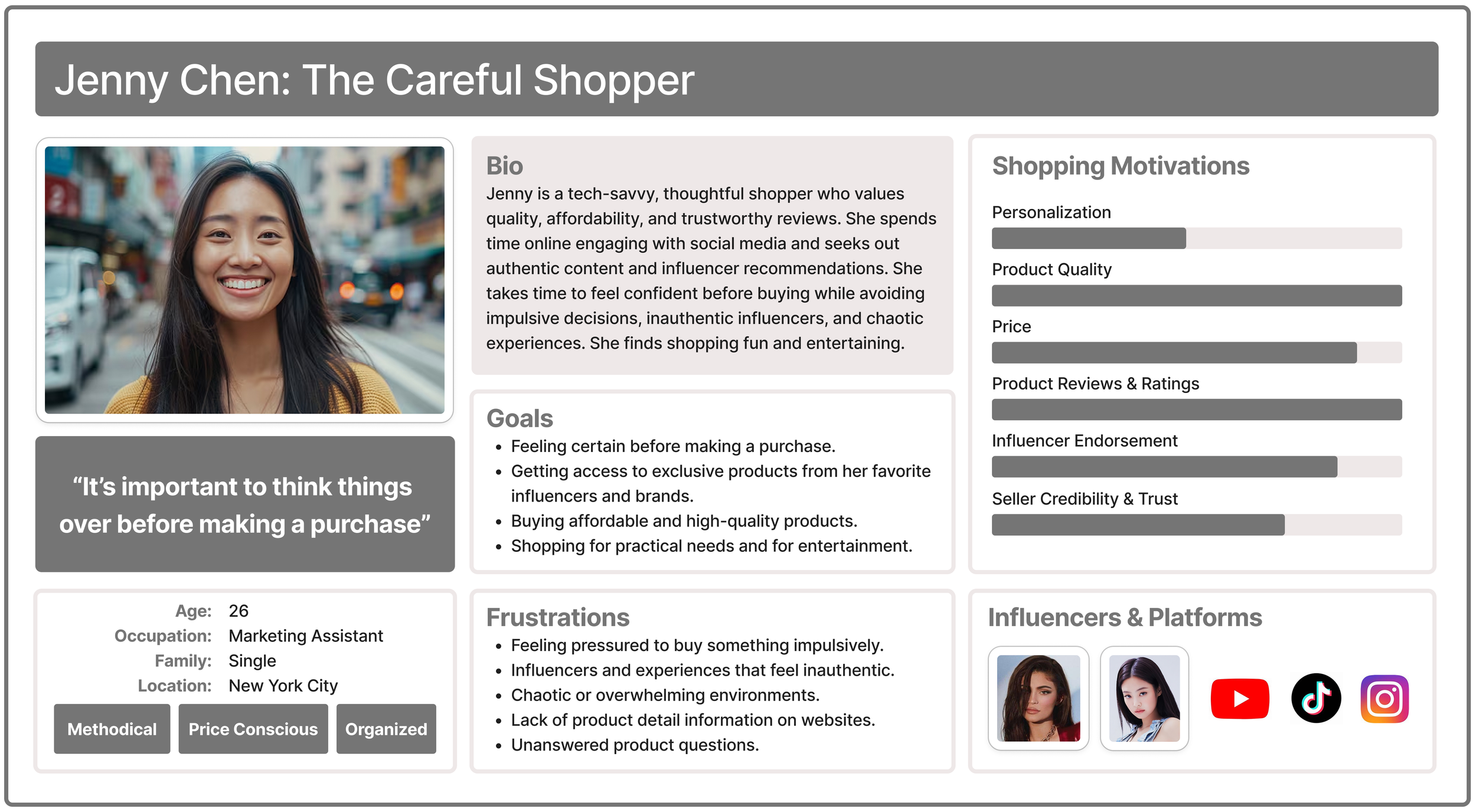
Meet Jenny: Our Thoughtful, Trust-Driven Shopper
To keep our user needs front and center, we created a persona based on our research.
Jenny is a 26-year-old marketing assistant who loves online shopping but approaches it methodically. She values quality, affordability, and trustworthy reviews. She follows influencers for authentic content but avoids impulsive decisions and chaotic experiences.
Target Users Defined
Our research indicated that our target users were Gen Z and younger Millennials who:
Enjoy discovering new products through interactive, social platforms.
Value style and authenticity in the influencers they follow.

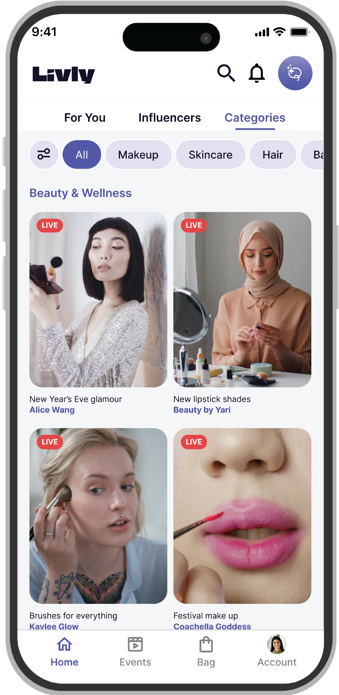
03. Building a Structure That Feels Effortless, Not Overwhelming

Six Design Principles That Prioritize Clarity Over Clutter
Based on our research, we established six guiding principles for structuring the app:
Be thoughtful about organization to help users confidently navigate and make decisions.
Keep the interface clean and minimal, avoid cluttered layouts or unfamiliar icons.
Provide clear and extensive details through quality descriptions, photos, and reviews.
Keep it engaging and fun, but without sales pressure (no bidding, no countdown timers).
Emphasize the "live" experience as the app's core identity.
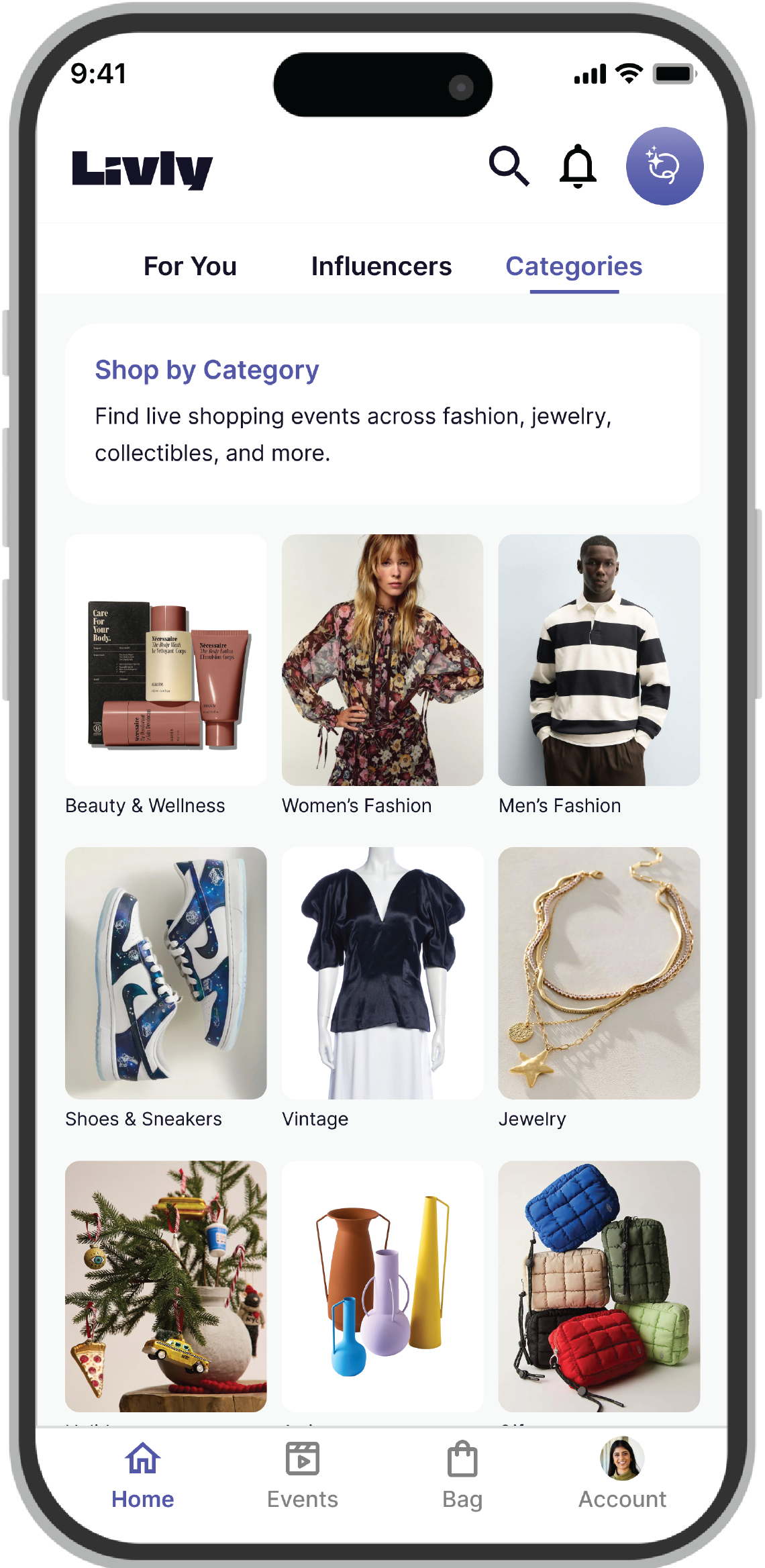
Encourage discovery of both products and influencers for inspiration.
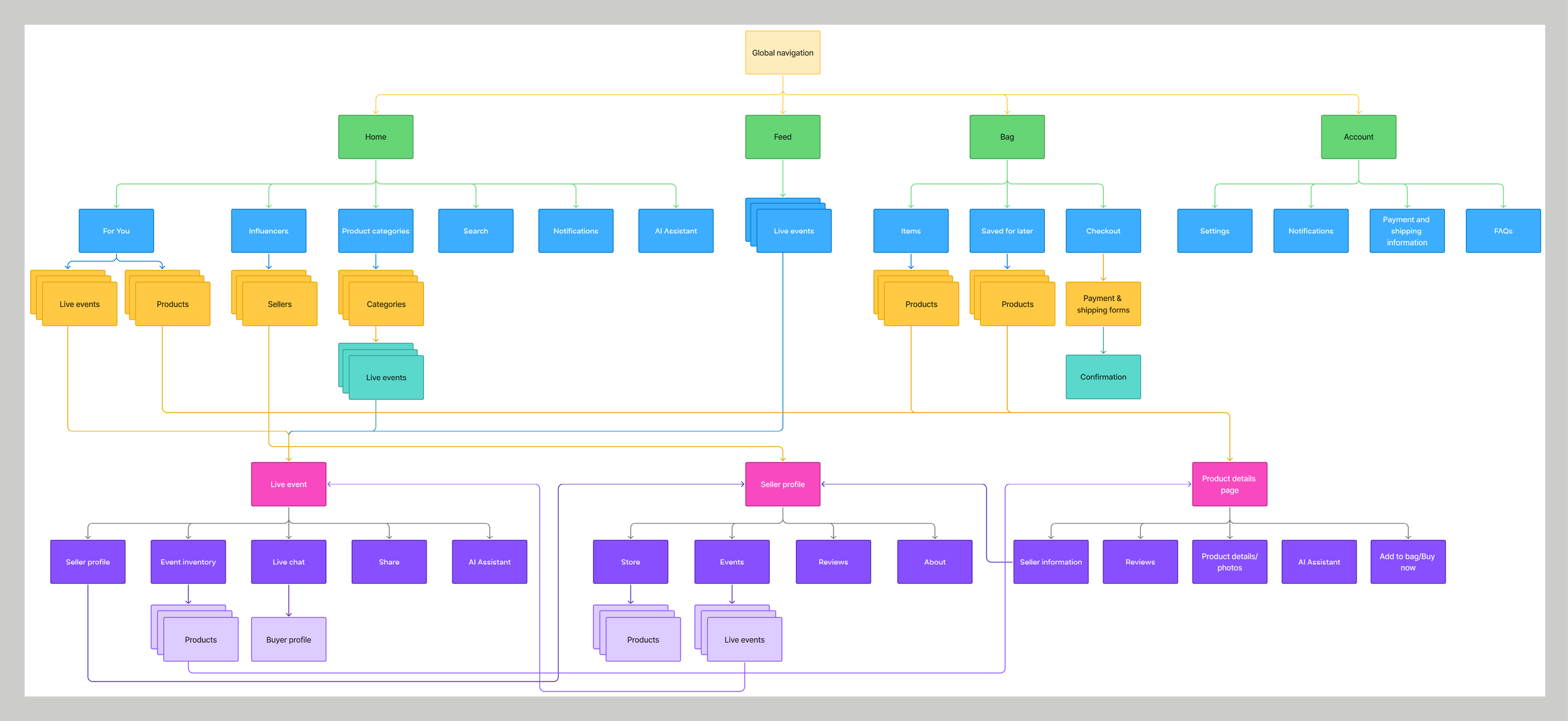
Tree Testing Revealed Users Want Quick Access to Both Products AND Influencers
We needed to validate our navigation structure before building wireframes, so we ran a Tree Testing study of our initial sitemap with 8 participants to see if they could find key information.
Success rate: 82.8%
Key insight: Users looked at products and influencers equally for inspiration and discovering trends. This finding was critical. It meant we couldn't prioritize one over the other. Both discovery paths had to be equally accessible and seamless.


Sitemap: Discovery Without Fragmentation
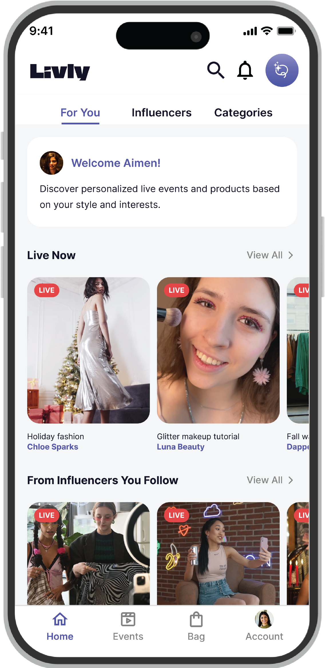
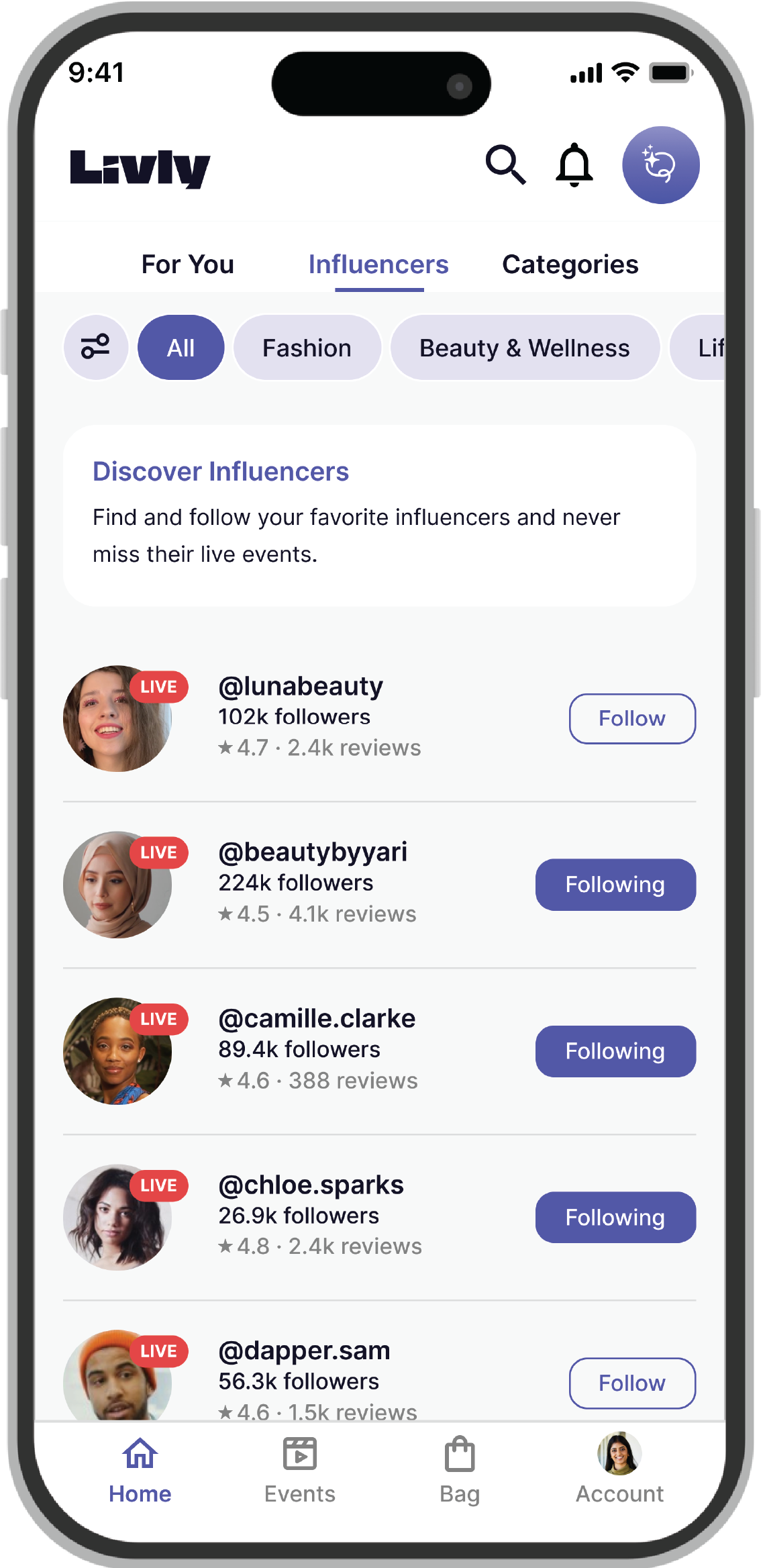
Our initial structure separated discovery into different sections, but our testing revealed users wanted it all in one place. This change made discovery effortless by letting users switch between event feeds, influencer profiles, and product categories without leaving the home screen.
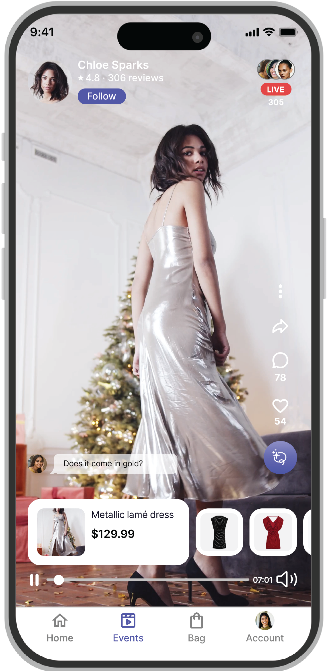
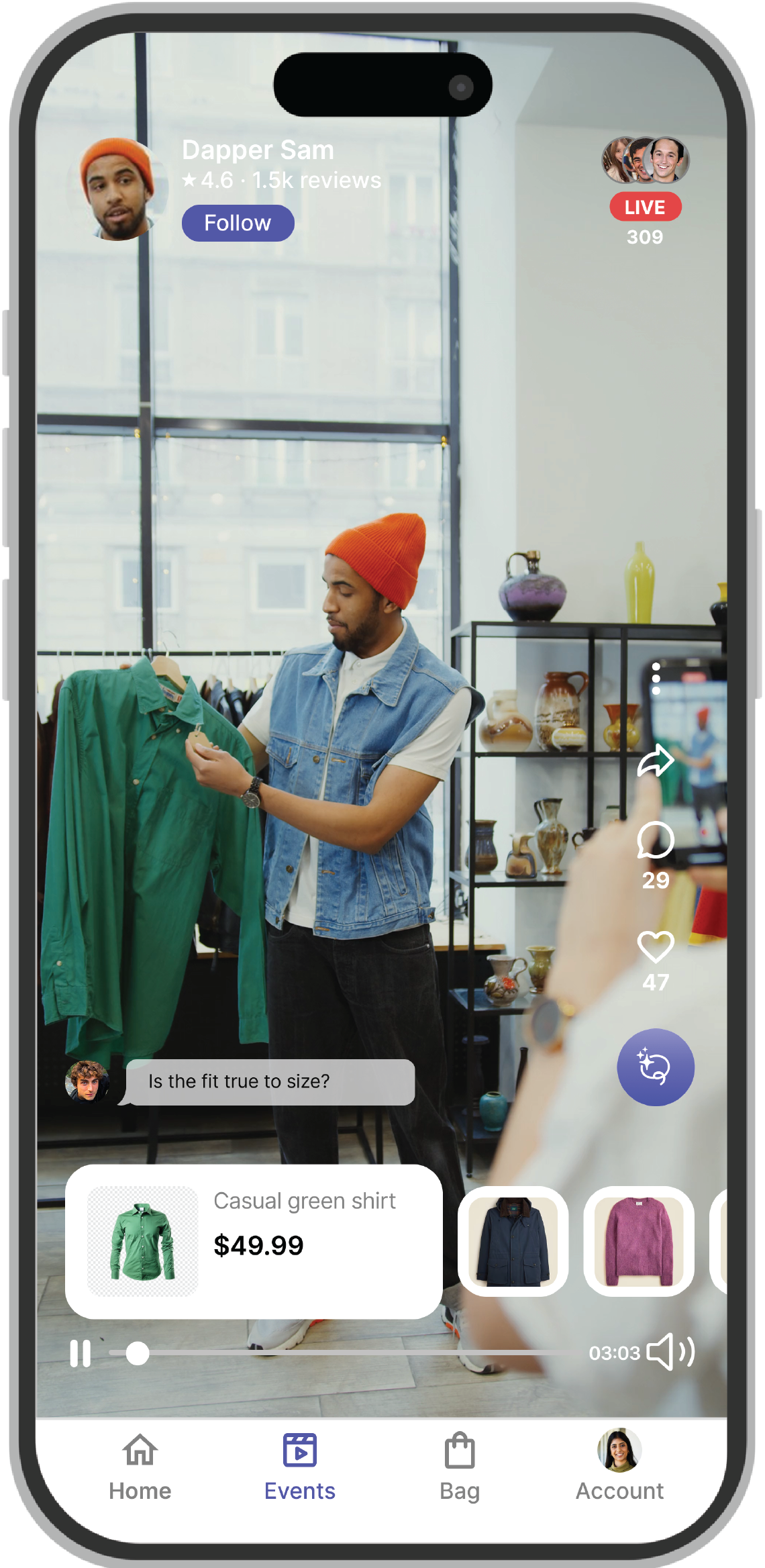
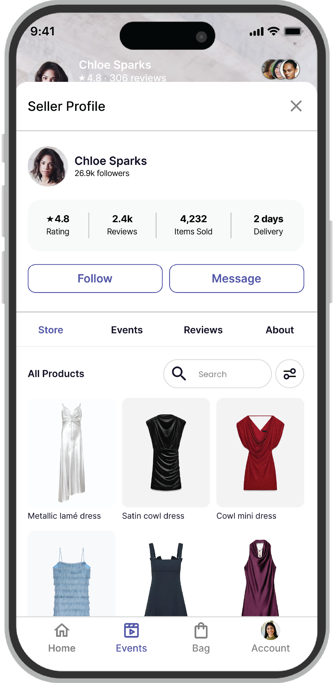
We also simplified the live event structure, ensuring users could quickly jump between the stream, product details, seller profile, and chat without losing context.
04. Designing Trust Into Every Interaction
Three Critical Flows That Had to Feel Premium and Trustworthy
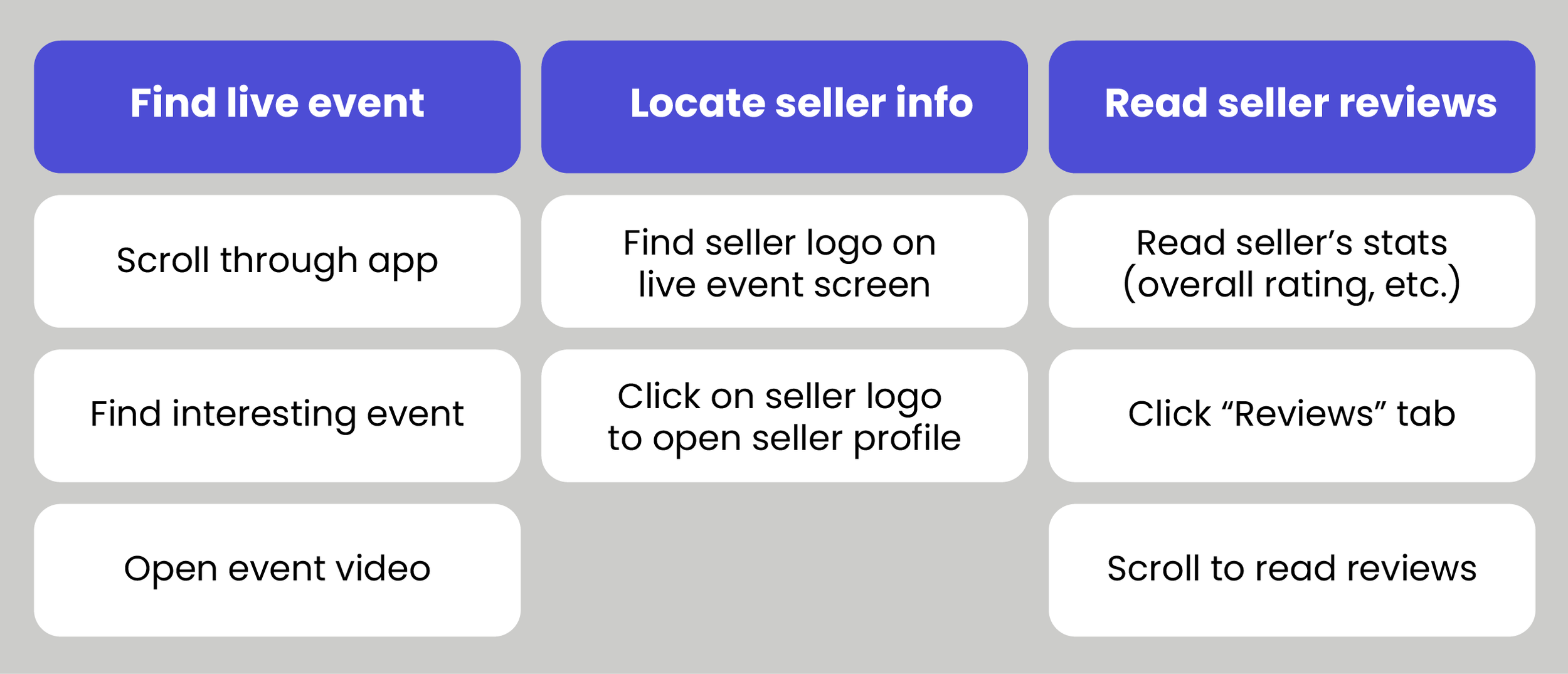
We identified three task flows that our MVP needed to support:
1. Find and purchase an item from a live event
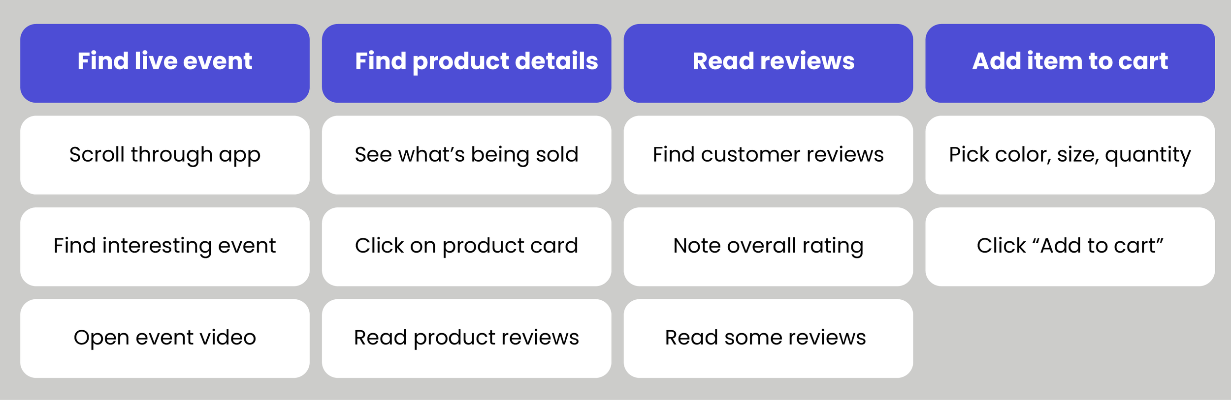
2. Explore influencer's full product range

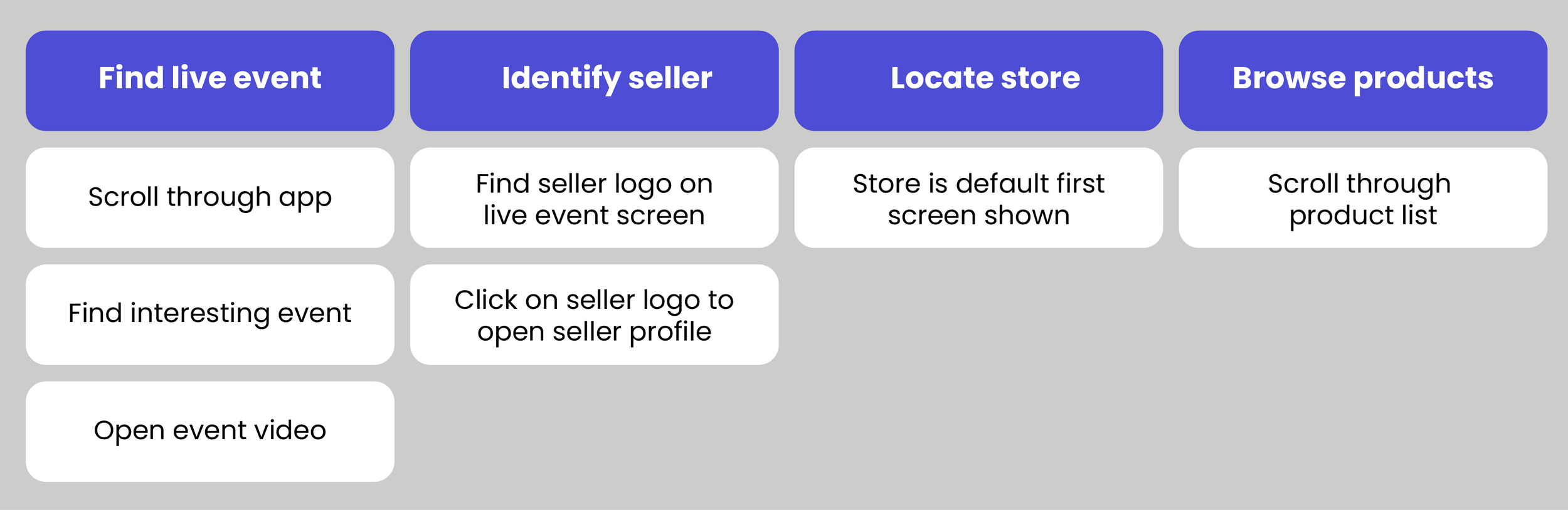
2. Verify seller trustworthiness

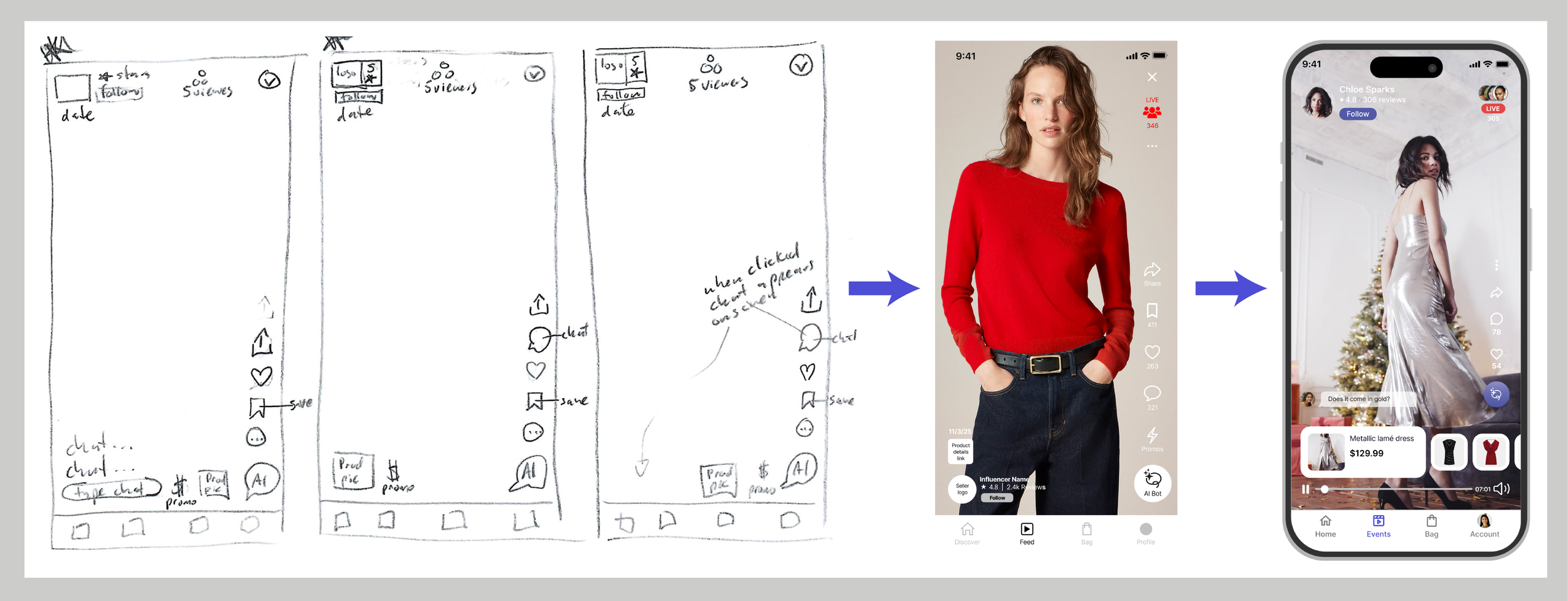
Rapid Sketches Tested Trust-Building Design Ideas
We started with rapid hand sketches. They helped us quickly test different approaches:
What design patterns would work on the homepage?
How could we build trust through our design choices?
How could we keep the live video screen clean and minimal, while still including all the necessary elements?
What are the most important elements to include on each screen?
Where should product cards appear during a live stream?
Where should seller information live?

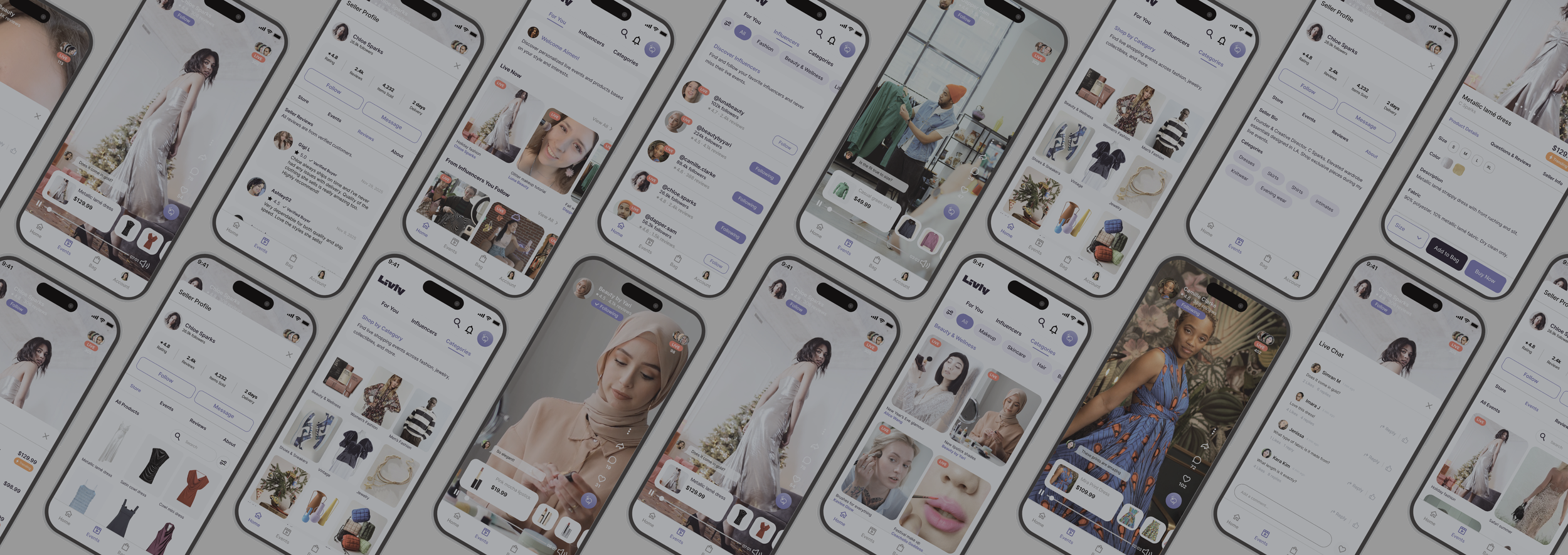
Low Fidelity Wireframes Validated Core Flows
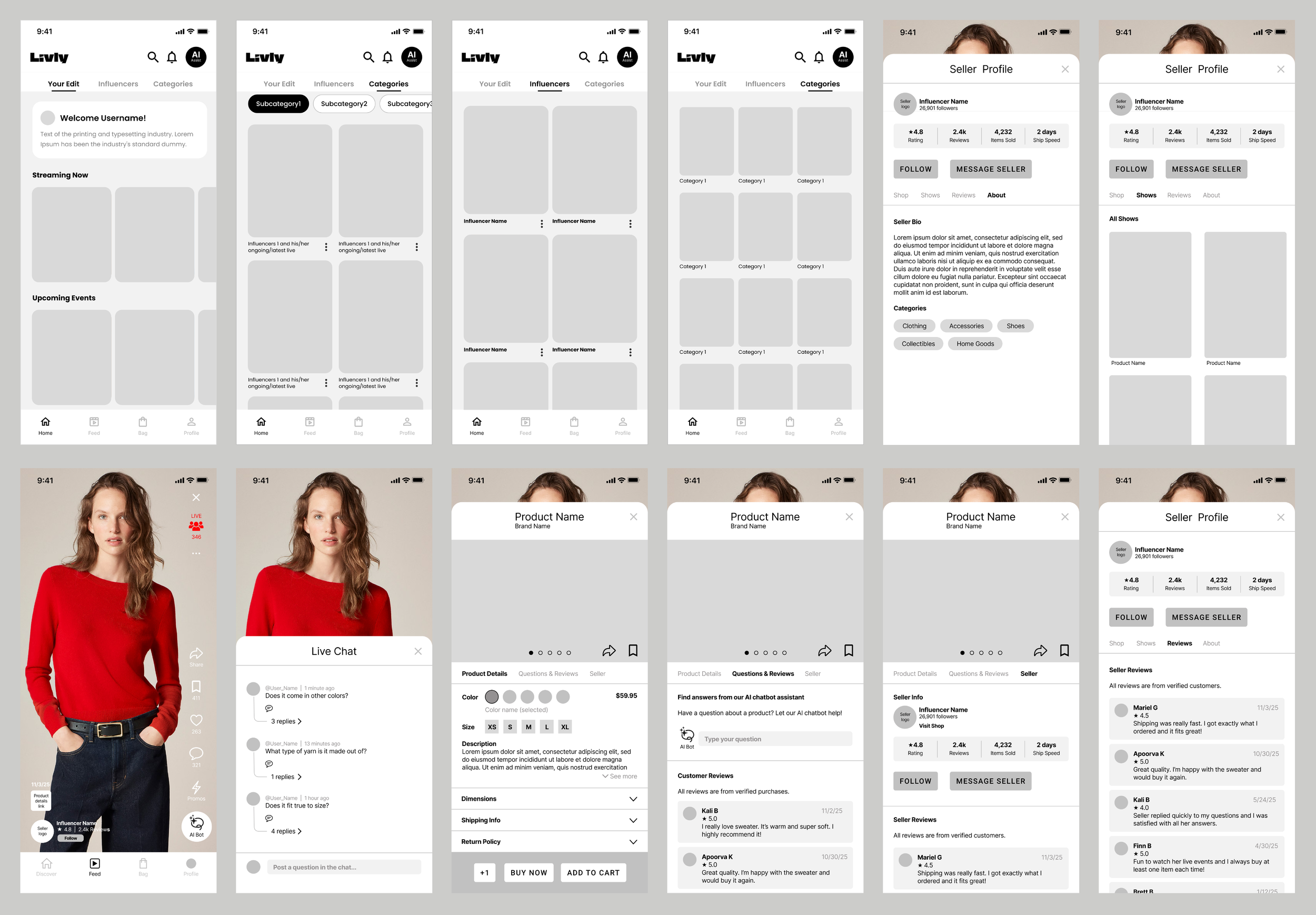
Medium Fidelity Mockups Refined Trust Elements
We took insights from user research and testing to improve and iteratively design our app.
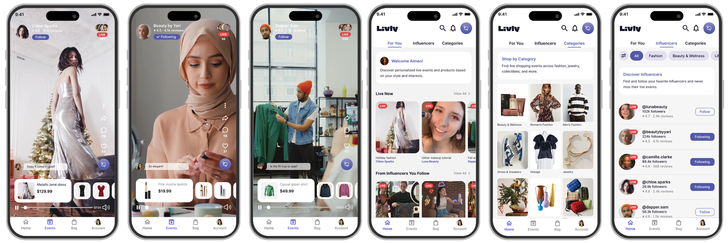
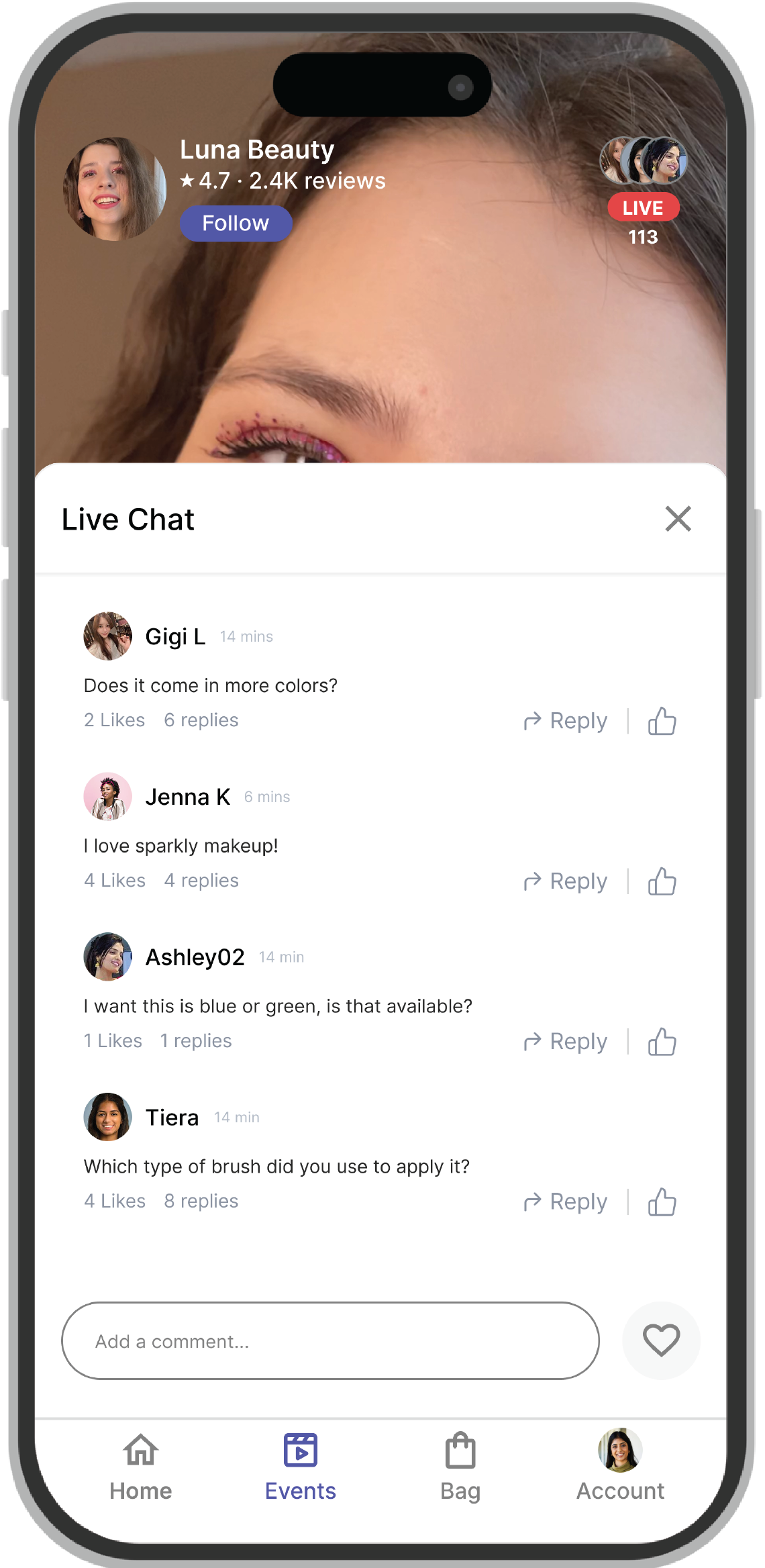
05. The Solution: Trusted Sellers, Verified Reviews, High-Quality Product Info
Live Demo
This video documents the happy path through the app. Try out the Figma prototype.
06. Validation: Trust-Building Features Worked, Iconography Didn’t
User Testing
We conducted five 30-minute moderated user tests with our low-fidelity prototype, asking participants to complete our three core task flows. Every piece of feedback pointed us toward specific improvements in our medium fidelity prototype.
What confused or frustrated users:
Certain icons on the live event screen were redundant or unclear.
"Your Edit" tab name (sounded like manual customization). We subsequently changed it to “For You”.
No indication of stock levels.
No way to filter search within a seller's store.
Missing visual indication of live chat activity.
What users liked:
Simplicity of layout.
Clear navigation between sections.
Seller metrics and reviews (built trust immediately).
Comprehensive product information.
AI assistant concept.

07. Impact: A Marketplace Built on Trust
Everyone Wins When Trust Comes First
Livly creates value for both sides of the marketplace. By solving for both, we created a sustainable ecosystem that benefits everyone.
For Buyers:
Discover products through trusted influencers.
Make confident purchases based on transparency.
Enjoy curated, pressure-free shopping experiences.
Get personalized recommendations.

For Influencers:
Dedicated platform to showcase products.
Build audience in one cohesive space.
Monetize authentically without algorithm battles.
Own the relationship with their community.
Next Steps: Seller Tools and Deeper Personalization
If we continued working on Livly, our roadmap would include:
Iterate and create a high fidelity prototype with a polished visual design and interaction features.
Influencer/seller experience: Design the tools creators need to host events, manage inventory, and engage their audience.
Post-purchase features: Develop order tracking, easy returns, and review prompts to close the loop.
Live testing: Partner with real influencers and buyers to validate our designs.
Community features: Explore ways for users to connect with each other, share finds, and create wish lists together.
Deeper personalization: Use behavioral data to improve "For You" recommendations and surface relevant events at the right time.