Loyalty Through Digital Design
Mobile Ordering & Rewards System
Solo Project
Role: UX Designer & Researcher
Duration: 2 months (2024)
Tools: Figma, Adobe Photoshop
01. Project Overview
This project explores how a small, independent bagel cafe could leverage digital tools to strengthen customer loyalty and compete in a market dominated by large chains. The focus was on designing a mobile app experience that balances modern convenience, such as mobile ordering and rewards, with the warmth and character of a local favorite. The app aims to enhance user engagement, streamline ordering, and reflect the unique personality of the brand.


02. Framing the Challenge
Problem Statement
Many people want to support small businesses but still expect the features, convenience, speed, and polish of digital experiences offered by larger brands. Small businesses often lack the resources to develop these offerings and face difficulty standing out on third-party food delivery platforms. As a result, they struggle to meet modern customer expectations while preserving their unique identity.
How Might We…
…design an ordering experience that is quick, intuitive, and satisfying for time-pressed users?
…infuse the app with a distinctive brand personality that sets the business apart from larger competitors?
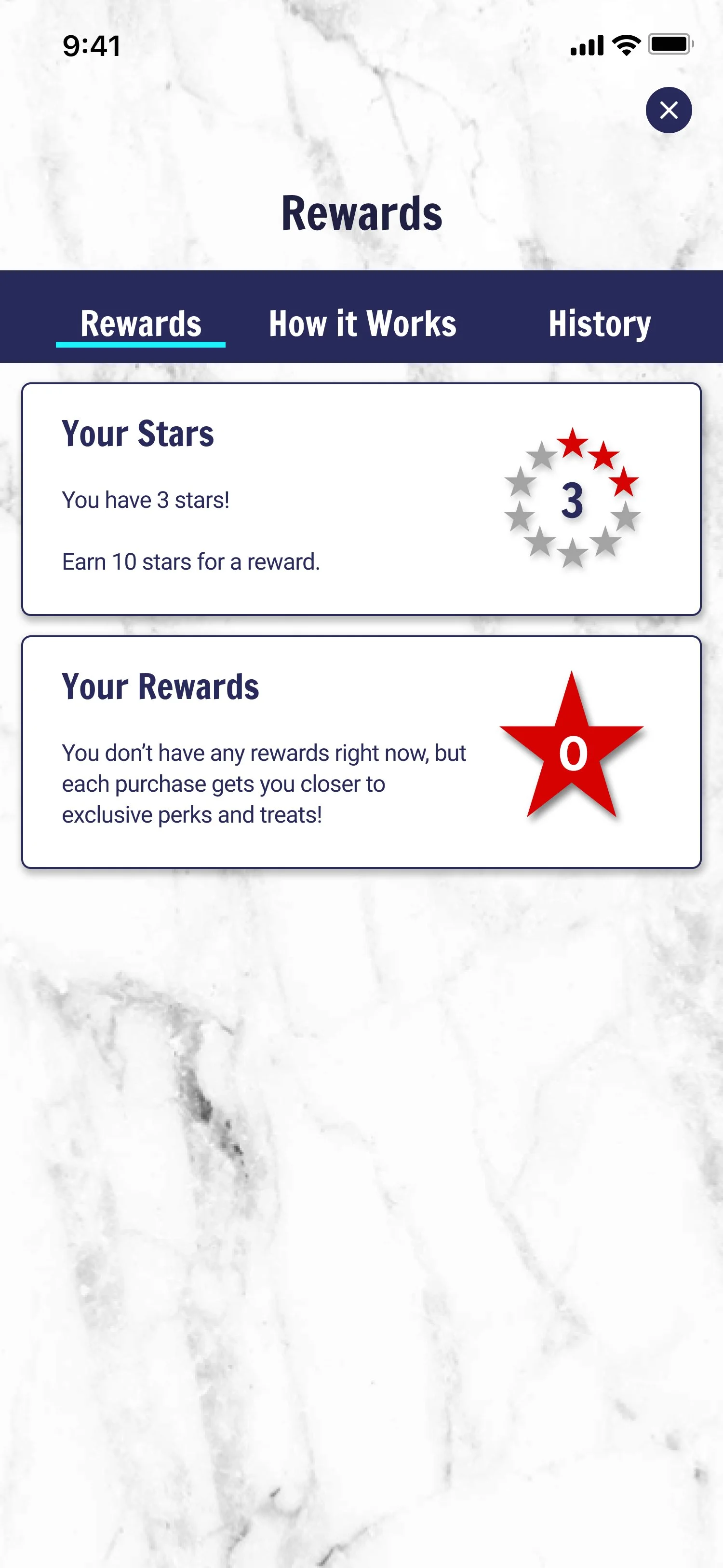
…create a loyalty program that rewards frequent customers and encourages deeper engagement?
Hypothesis
By creating a branded mobile app that offers streamlined ordering, a thoughtful rewards program, and a unique visual identity, the business will increase user satisfaction, build customer loyalty, and position itself more competitively in the food service space.
03. Define & Empathize
User Research: Key Insights and Pain Points
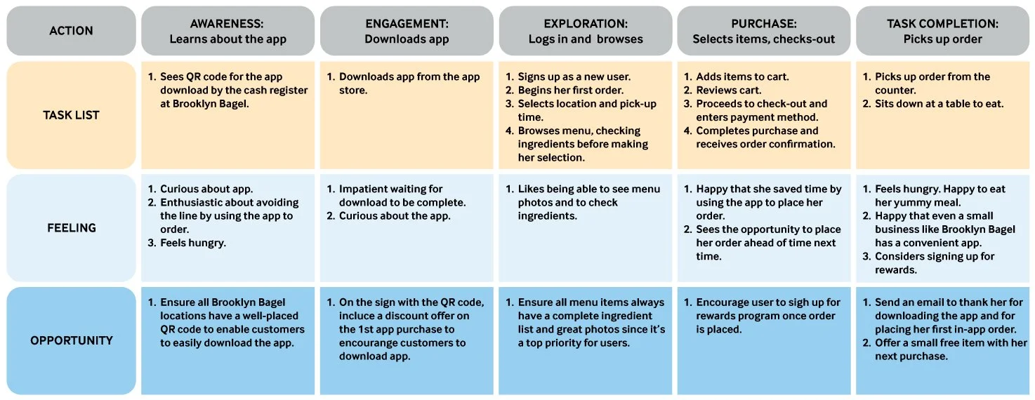
The user research began with interviews of three women and two men who frequently purchase breakfast or lunch in New York City from both small businesses and larger chains. The group consisted of working professionals and college students. Each participant answered questions about their daily lives, whether they make an effort to support small businesses, decision-making processes for meal purchases, and the food-ordering apps they typically use.
Initially, I expected convenience and time savings to be the primary factors influencing their choice to use food-ordering apps. However, the interviews revealed additional reasons including a lack of cooking skills, a desire to try new and exciting dishes, life stress, and other personal challenges.

Understanding the User
After analyzing the user interviews, I created 2 personas and their user journey maps, storyboards, empathy maps, and problem statements.
I also developed the following problem statement for the first persona, Cheryl:
Cheryl is a busy professional who loves supporting small businesses. She needs a quick and efficient way to place and pick up her orders, so she can enjoy her food without cutting into her work time.

User Journey
Cheryl’s user journey map highlighted how the app could benefit her. It enables her to support a small business, skip the hassle of standing in line, and earn loyalty rewards. Ultimately, the app enhances her experience by making it quicker and more efficient, saving her valuable time.
04. Ideation
Competive Research

The competitive research I did revealed key insights about how direct and indirect competitors had built their apps, and provided inspiration for this app. I studied the branding, menu and cart layouts, check-out processes, and rewards programs of competitors.
Branding Design:
The branding is consistent throughout the apps, which helps build trust and recognition. The use of each brand’s colors, fonts, and logo across different screens creates a cohesive experience. The branding elements are well-integrated into the UI.
Enticing, Easy-To-Navigate Menus:
The menu layouts were intuitive, with clear categories and subcategories that made it easy for users to find what they were looking for. The use of icons and images alongside text helped in quick identification of menu items. The menus were visually appealing with high-quality images and a consistent color scheme. The use of whitespace ensured that the menus don’t feel cluttered.
The Cart:
The cart layouts were user-friendly, with clear information about the items added, their quantities, and prices. Users could easily edit or remove items from the carts. The carts were designed to feel clean, uncluttered, and well-organized. Important information like item names, prices, and total cost is prominently displayed. The “Edit” and “Remove” buttons are easily accessible, making the carts easy to manage.
Quick and Easy Check-out Process:
The checkout process was streamlined and straightforward. It guided users through each step, from reviewing their order to selecting a payment method and confirming the order. The checkout screens were designed to be clear and uncluttered. Call-to-action buttons like “Proceed to Checkout” and “Confirm Order” were prominently placed. The use of progress indicators helped users understand where they were in the checkout process.
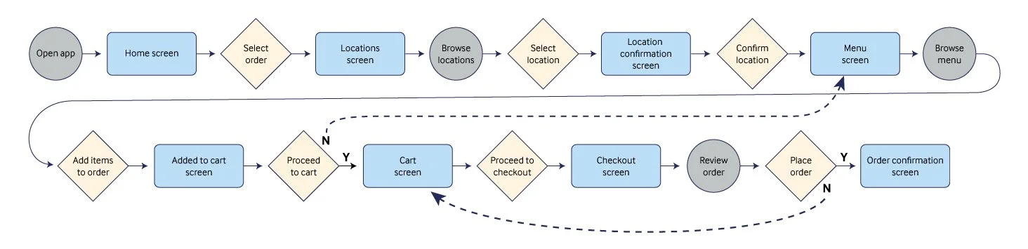
User Flow
Before starting the wireframes, I worked out the user flow.
User task: Using the app, place an order for pick-up at a nearby location to save time and skip the in-store wait time.
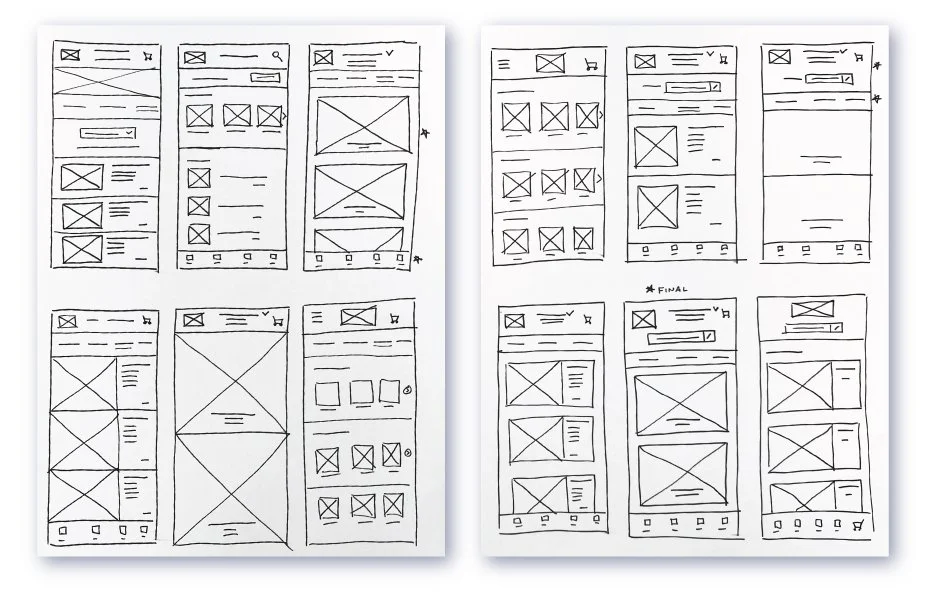
Paper Wireframes
The competitive research I had done revealed key insights about how direct and indirect competitors had built their apps, and provided inspiration for the wireframes.
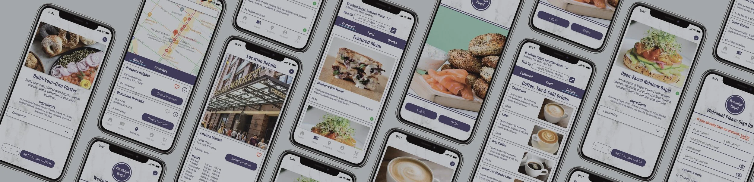
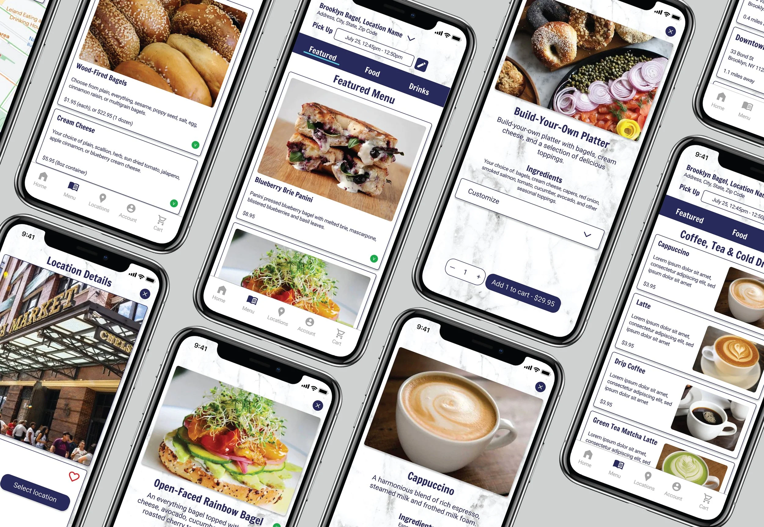
MENU SCREEN
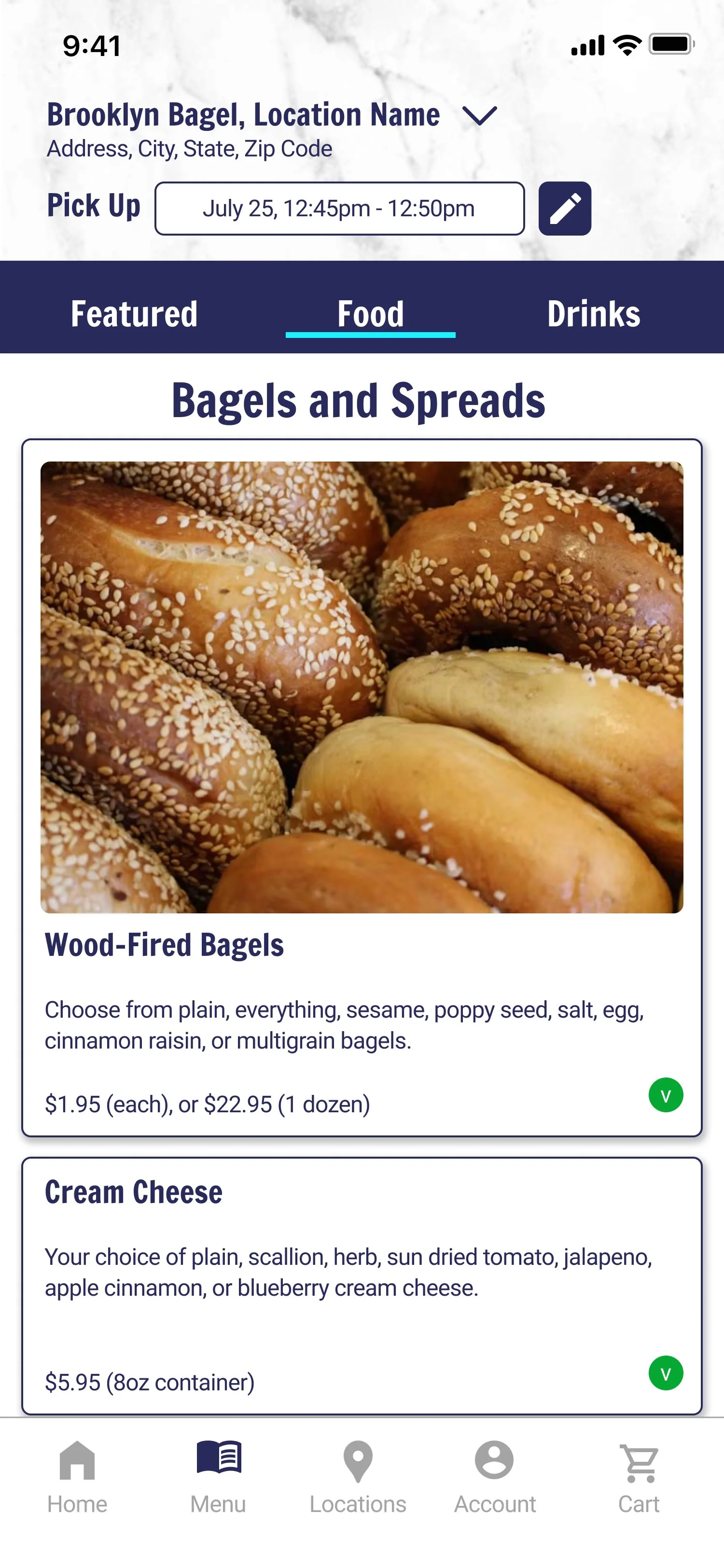
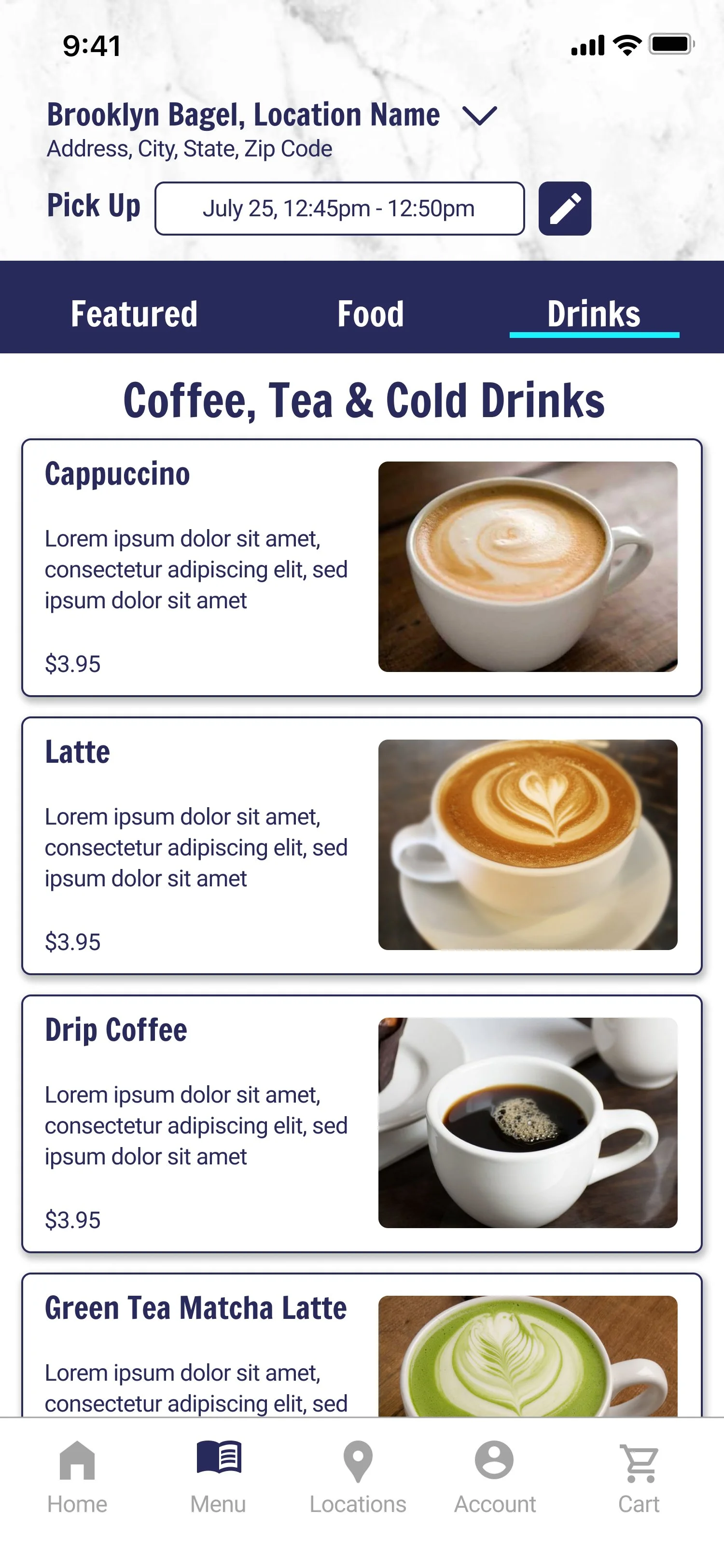
The menu is a key feature of the app and it needed to be inspiring and easy to navigate. I experimented with different layouts , testing various product image sizes and configurations. Ultimately, I chose an option with large, clear product images that would give the user clear, enticing images.
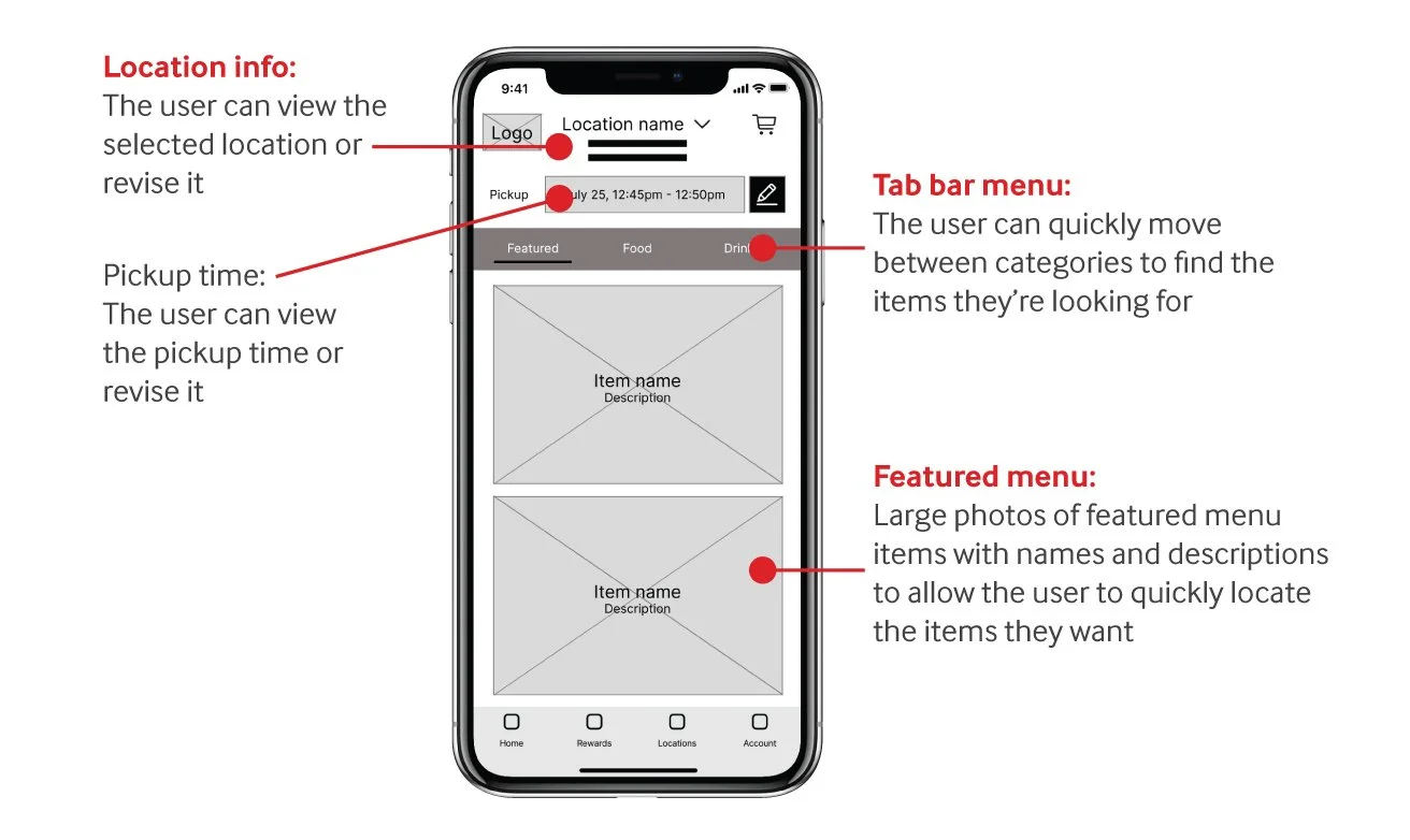
Digital Wireframes
MENU SCREEN
The objective was to design a menu screen with accessible and appetizing photos to entice users. The menu is organized into easy-to-navigate categories at the top of the screen. Additionally, it allows users to revise the pickup time and location directly from the menu screen.
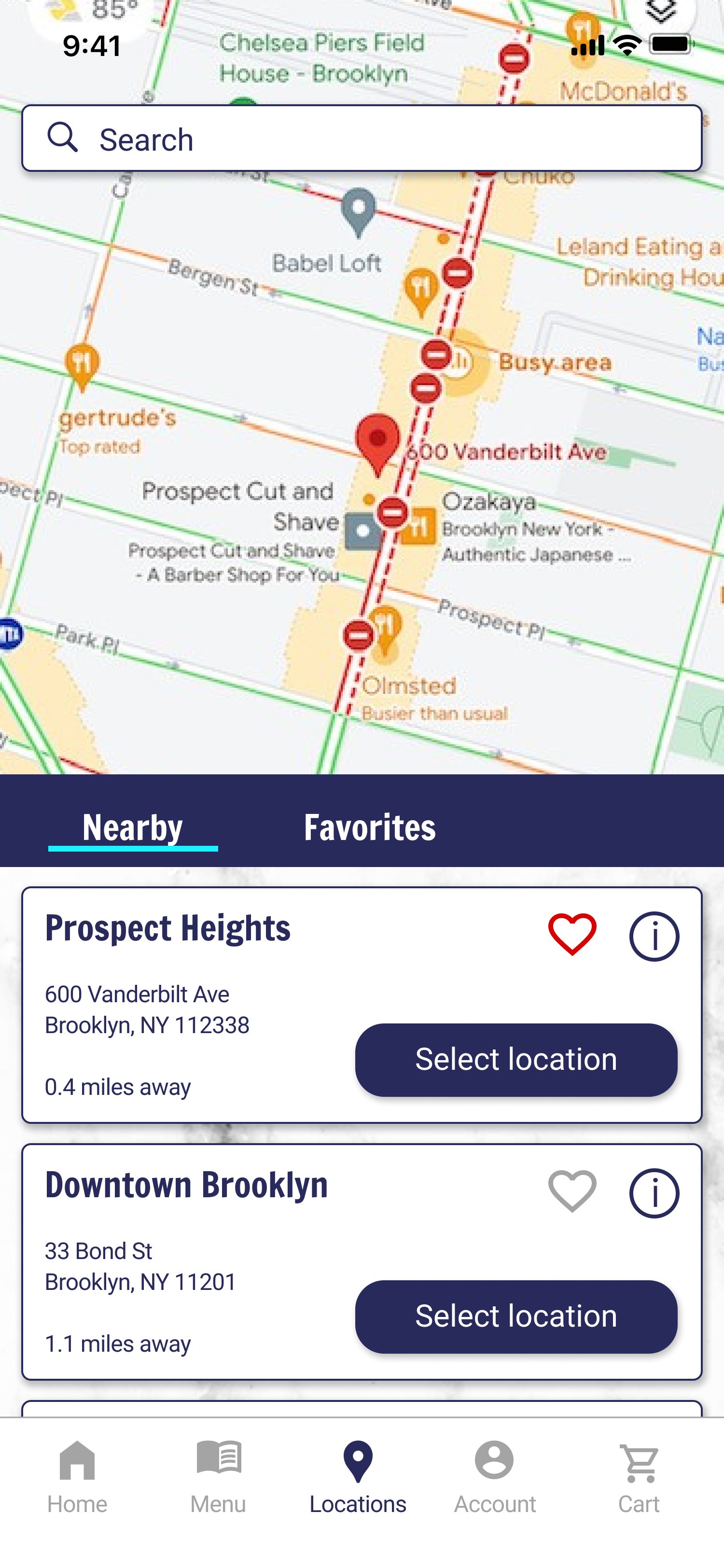
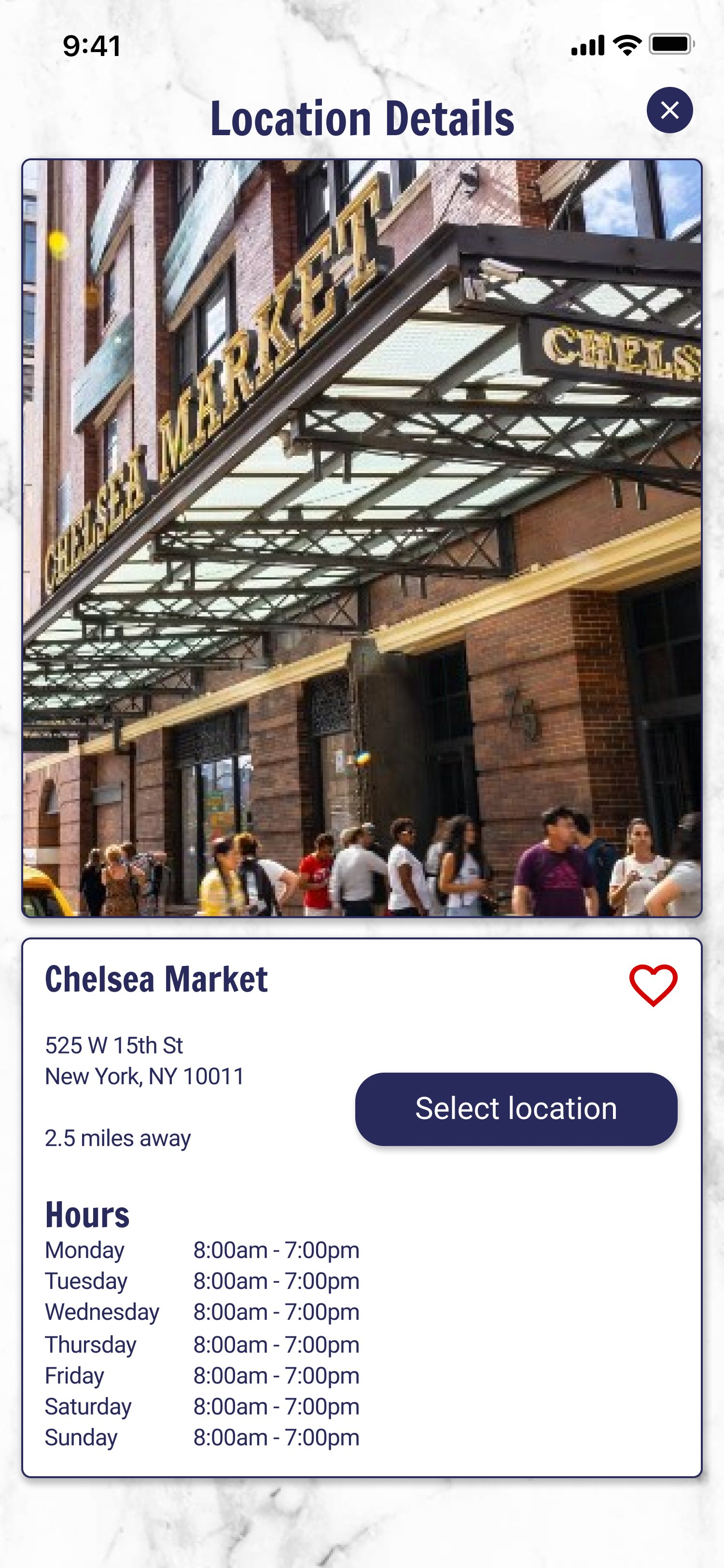
LOCATION SEARCH SCREEN
To enhance the user experience when searching for a location to order from, I included a large map. This allows users to easily visualize their proximity to various locations. Additionally, I displayed the full address details of each location for clarity, and allowed the user to favorite their preferred locations.

First Prototype
Click here to try out the first prototype, or watch the video below.
05. Testing & Iteration
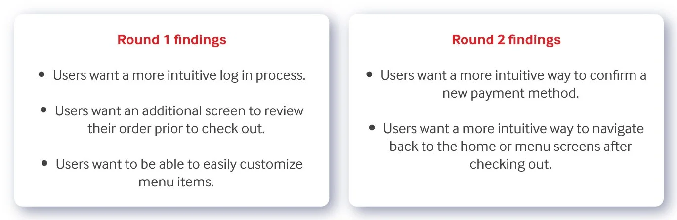
Testing
I conducted two rounds of usability studies. The first round, which tested the digital wireframes, provided valuable feedback that informed the design of the mockups. The second study, focusing on the high-fidelity prototype, revealed several useful insights that guided the final iteration and enhanced the app’s navigation and usability.
Refining the Design: Mockups
BEFORE AND AFTER
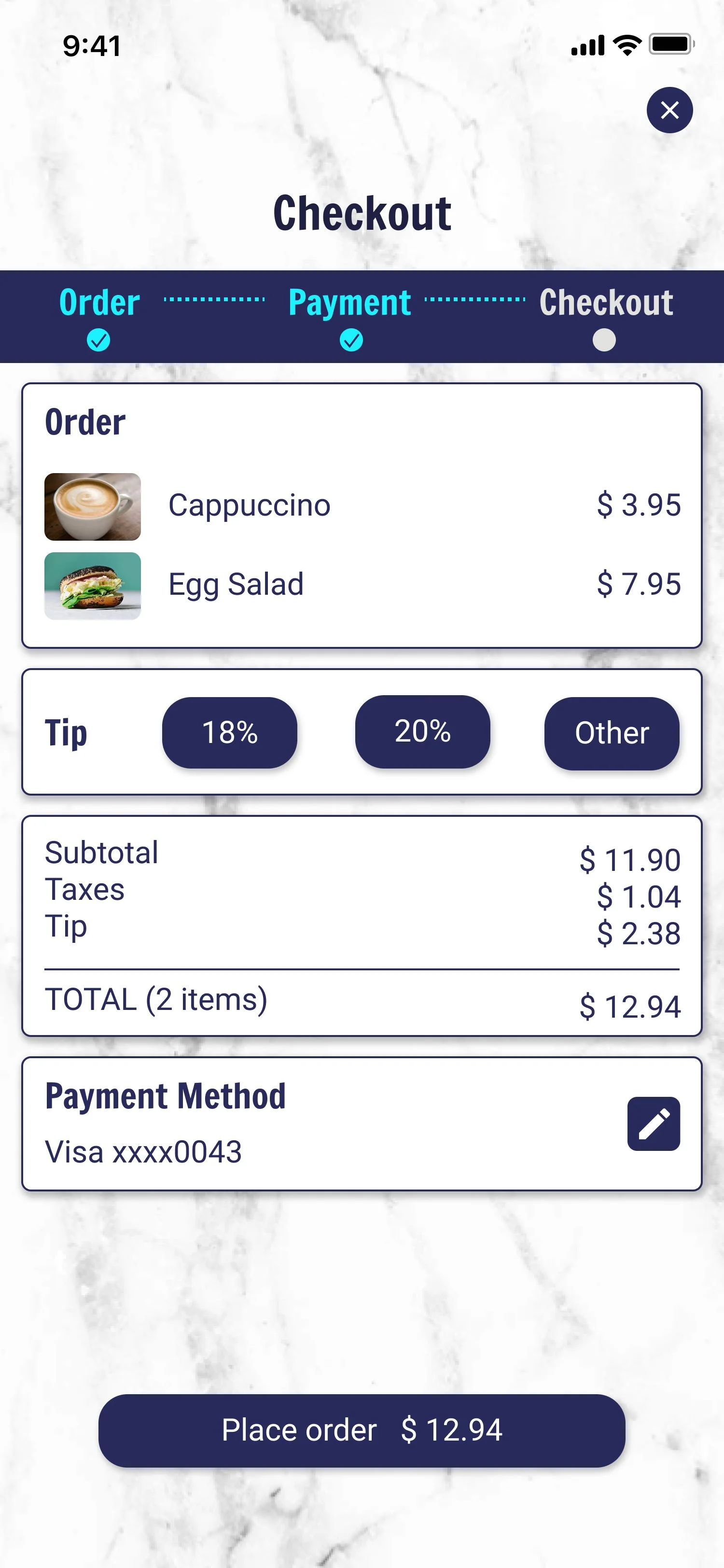
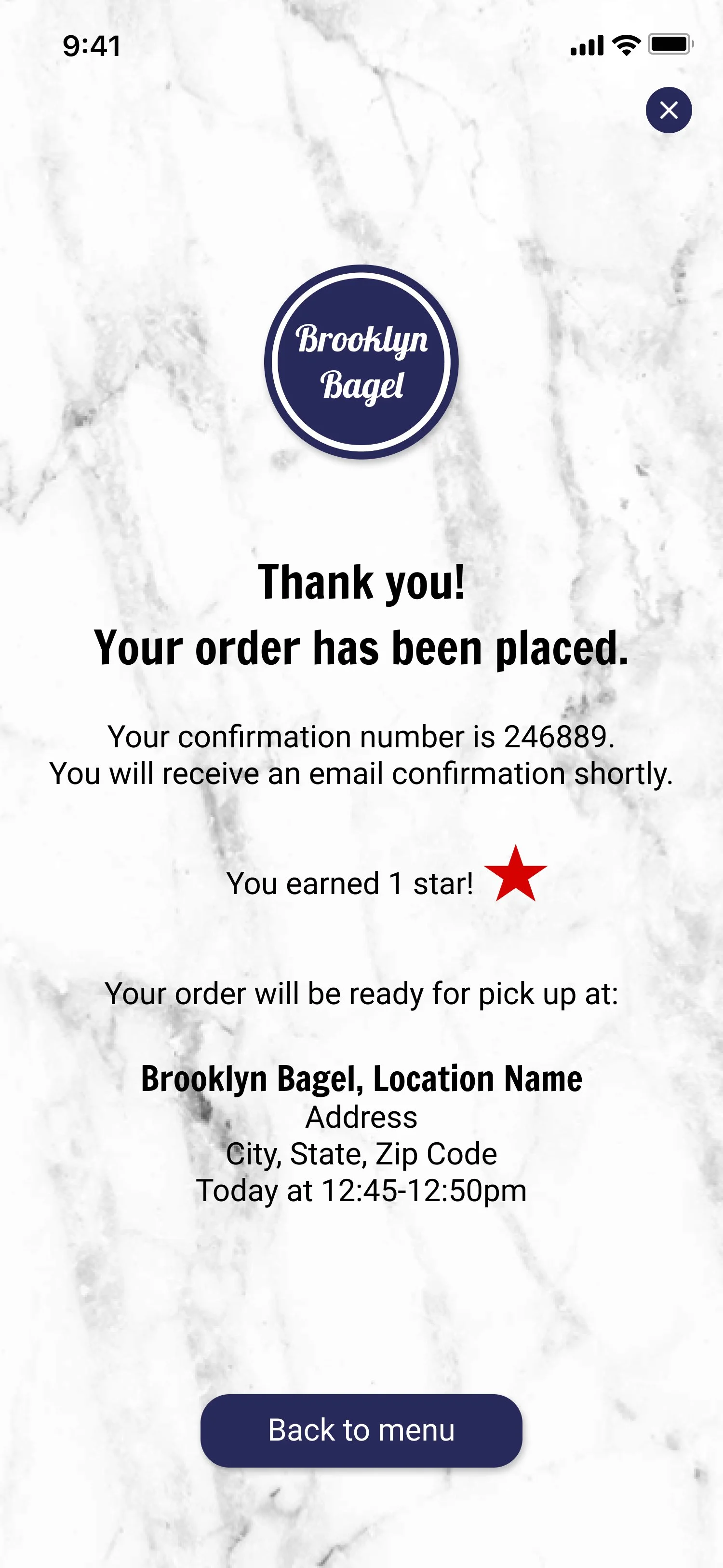
The second usability study revealed that users wanted to review their order on a separate screen before checking out. In response, I separated the checkout process into two screens: the cart and the checkout. Additionally, I added features to edit the order, pick-up time, and location directly from the cart.

Refining the Design: Key Mockups
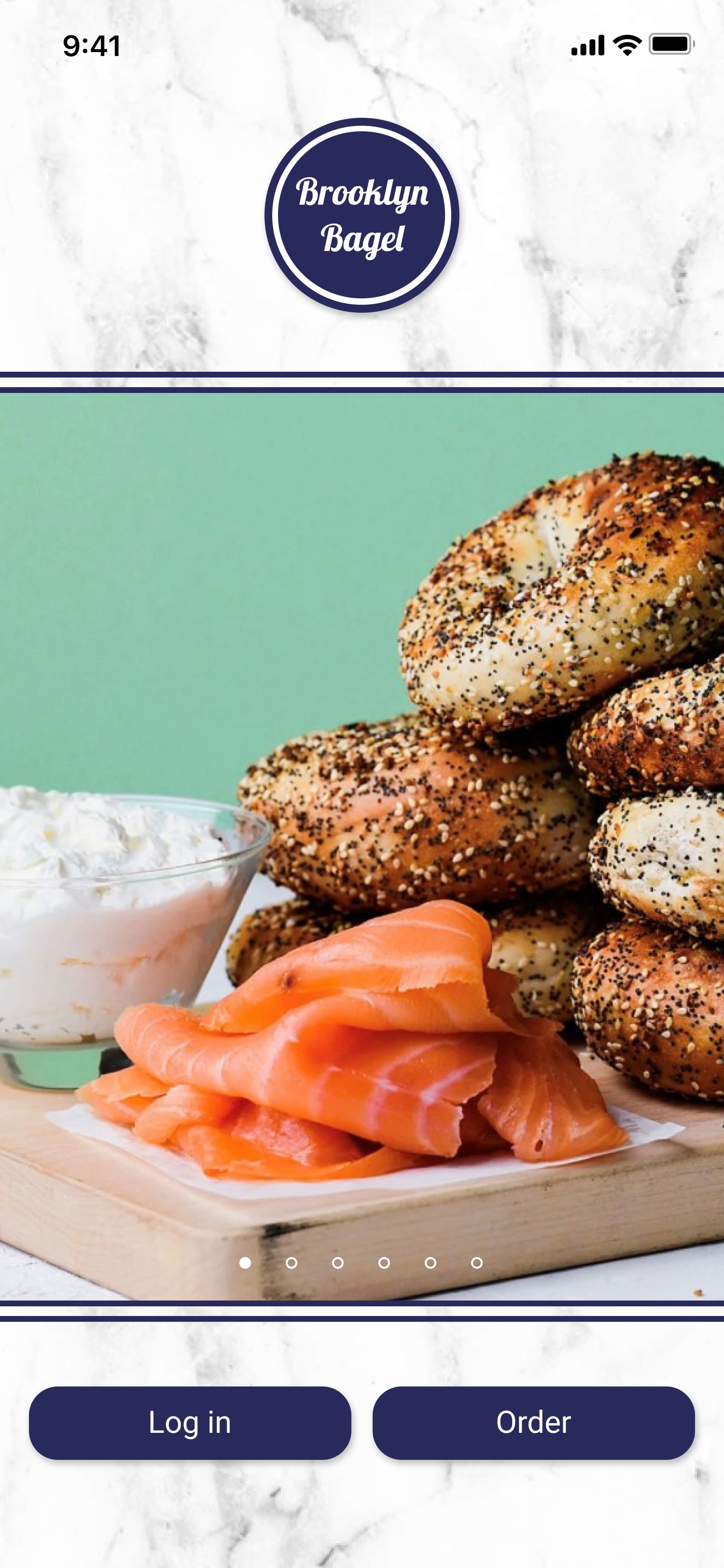
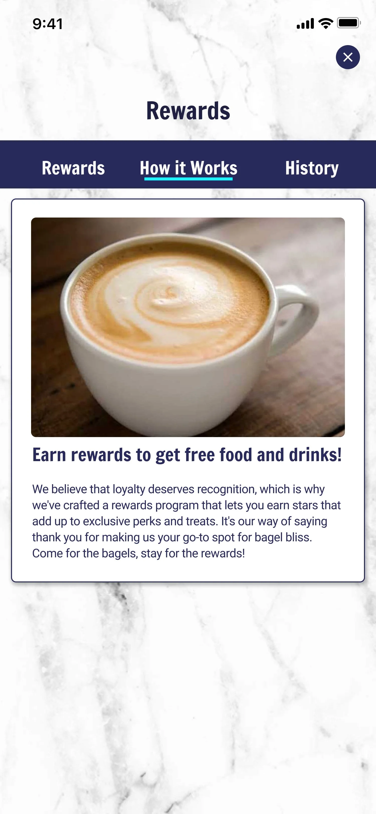
The final mockups address the needs expressed by users throughout the usability testing process. The interface reflects the brand’s clean, modern aesthetic and showcases appetizing photos from the artisanal menu.

High-Fidelity Prototype
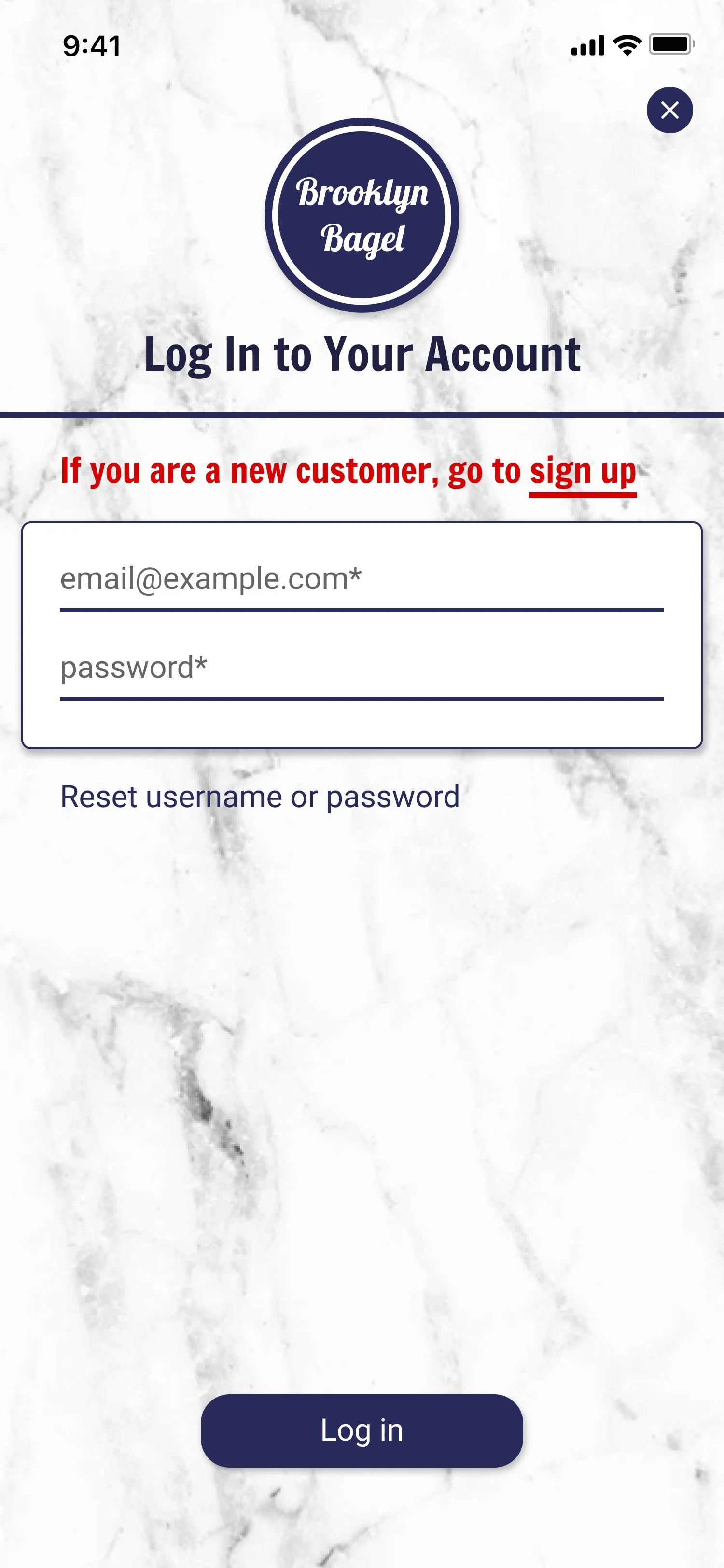
The high-fidelity prototype provides a more intuitive user flow and navigation. It also incorporates key improvements to the login and checkout processes based on user feedback. Click here to try it out or watch the video below.
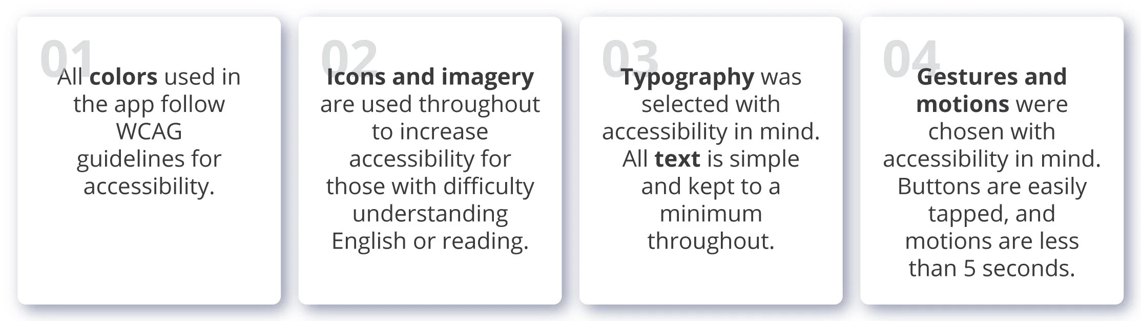
06. Accessibility
Key Considerations
I adhered to accessibility guidelines throughout the project’s design to ensure that people of all abilities can enjoy the app.
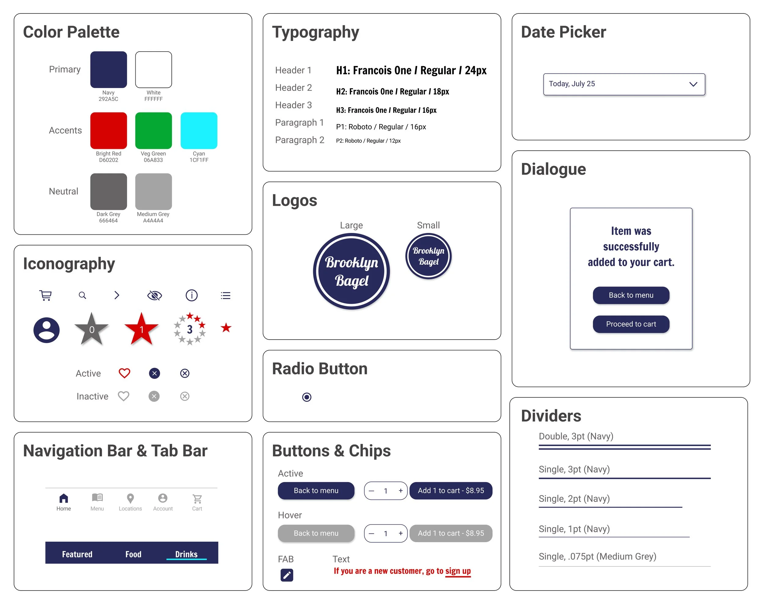
07. UI Kit

08. Next Steps
If I Had More Time…
While the app received positive feedback from users, areas of additional development and iteration that I would pursue like to include:
Engage with more users and conduct another usability study to ensure all pain points have been addressed.
Conduct further user interviews to asses whether users would benefits from additional features such as personalized content.
Determine if AI features such as a chatbot to place quick orders would enhance the user experience.